




Celadyne
Powering the next era of clean energy.
NarrativeIdentityVisualsWebsite
ZeroMark is a US defense technology company that turns weapons that already exist into precision counter-drone systems. Founded by Joel Anderson, the company builds a bolt-on hardware and software layer for rifles, crew-served turrets and vehicle-mounted cannons, then connects them through one shared targeting network. We worked with ZeroMark on their brand, narrative, website and investor materials ahead of a raise.
Industry
Defense, Robotics
Deliverables
Brand Strategy, Visual Identity, Website, 3D Visuals, Pitch Deck
The Challenge
The beauty of ZeroMark is how the hardware and the software work together. The AI that tells friend from foe is what lets an operator on the ground know exactly what they are aiming at, and what else is in the line of fire. The brief was not to strip out the hardware. It was to show that this is a sophisticated AI software company as well. So the goal was one identity that stays credible to the warfighter while also landing with investors, future hires and press, without either side feeling like it was built for the other.
The Bet
We ran stakeholder interviews across the company and its investors, and one phrase kept surfacing: the last line of defense. It reframes the entire proposition. This is not a better weapon, it is the thing that stands between a soldier with no support and a threat that is rapidly approaching in the air. Everything downstream followed from that. The second half of the bet was economic. Cheap electronics have broken the cost math of modern conflict. A drone that costs a few hundred dollars can now do artillery-scale damage, and the systems built to stop it cost thousands of times more per engagement. ZeroMark does not ask a military to replace anything it already owns. It upgrades what is already in the field.
The Look
Logo
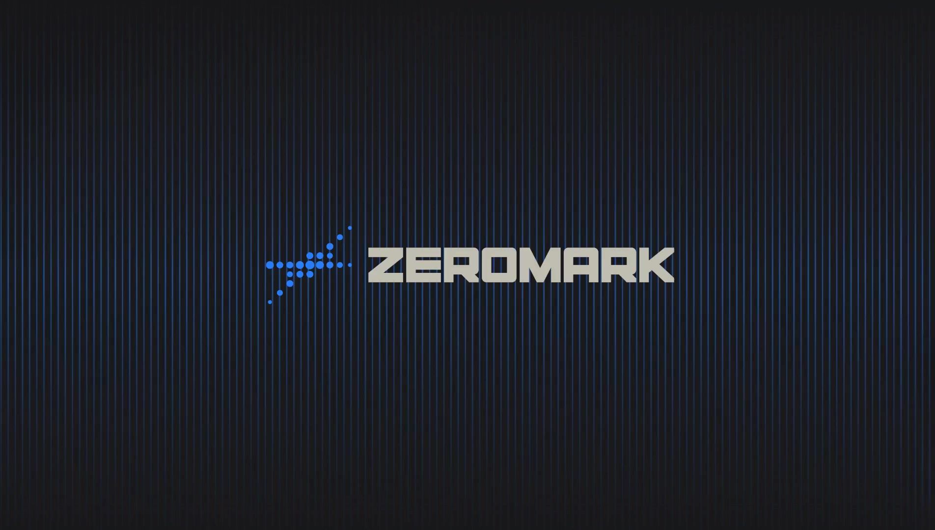
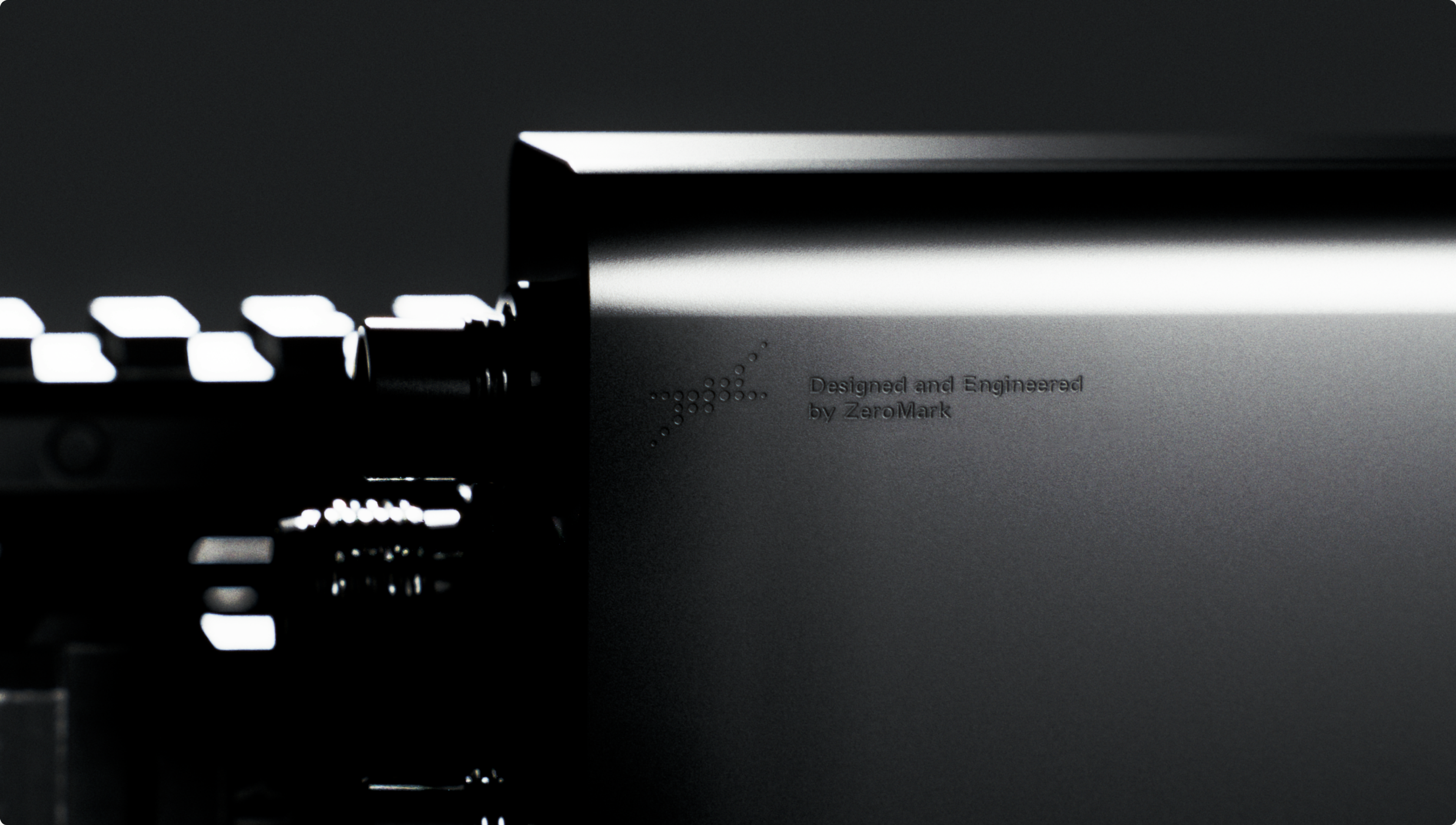
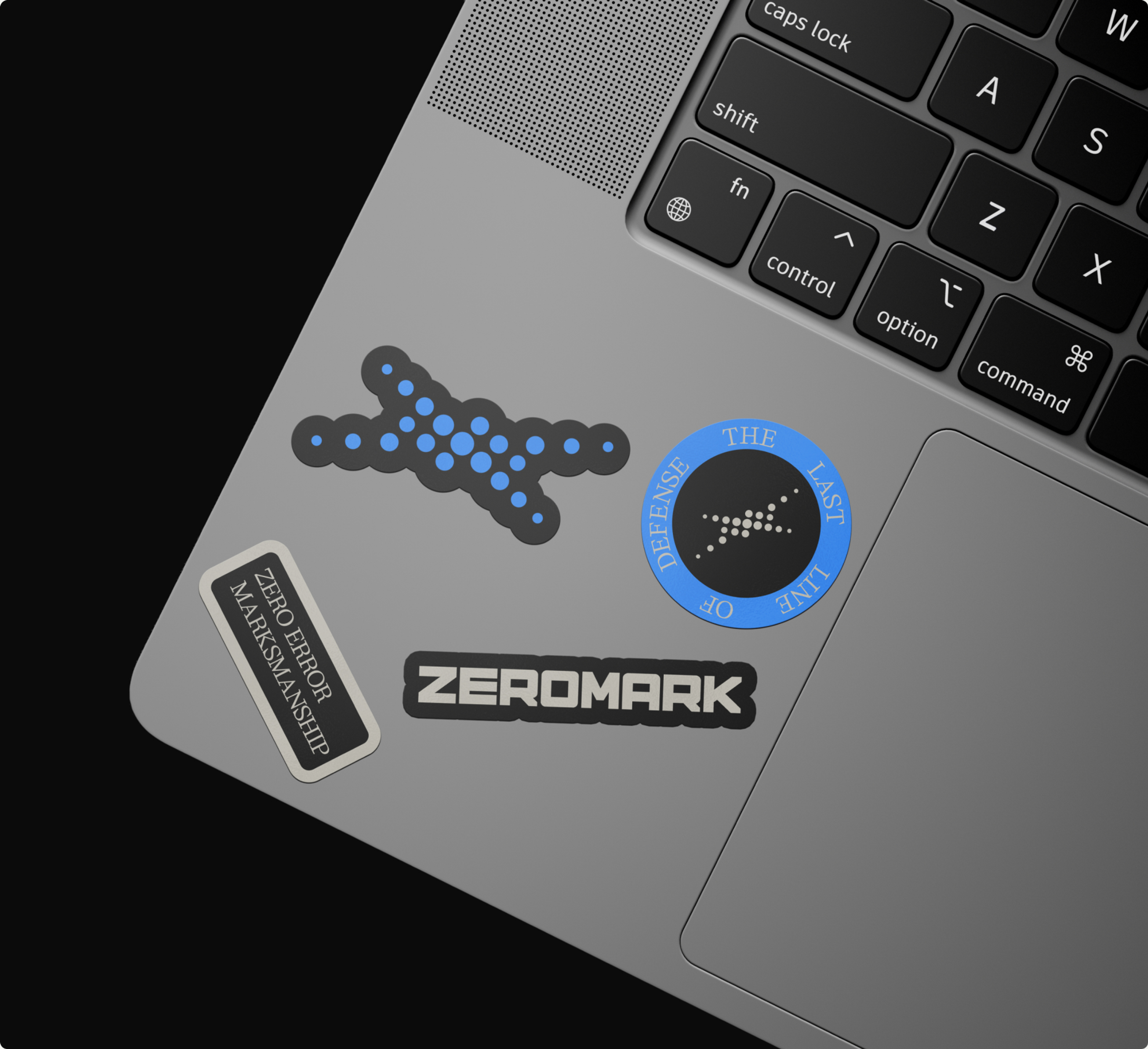
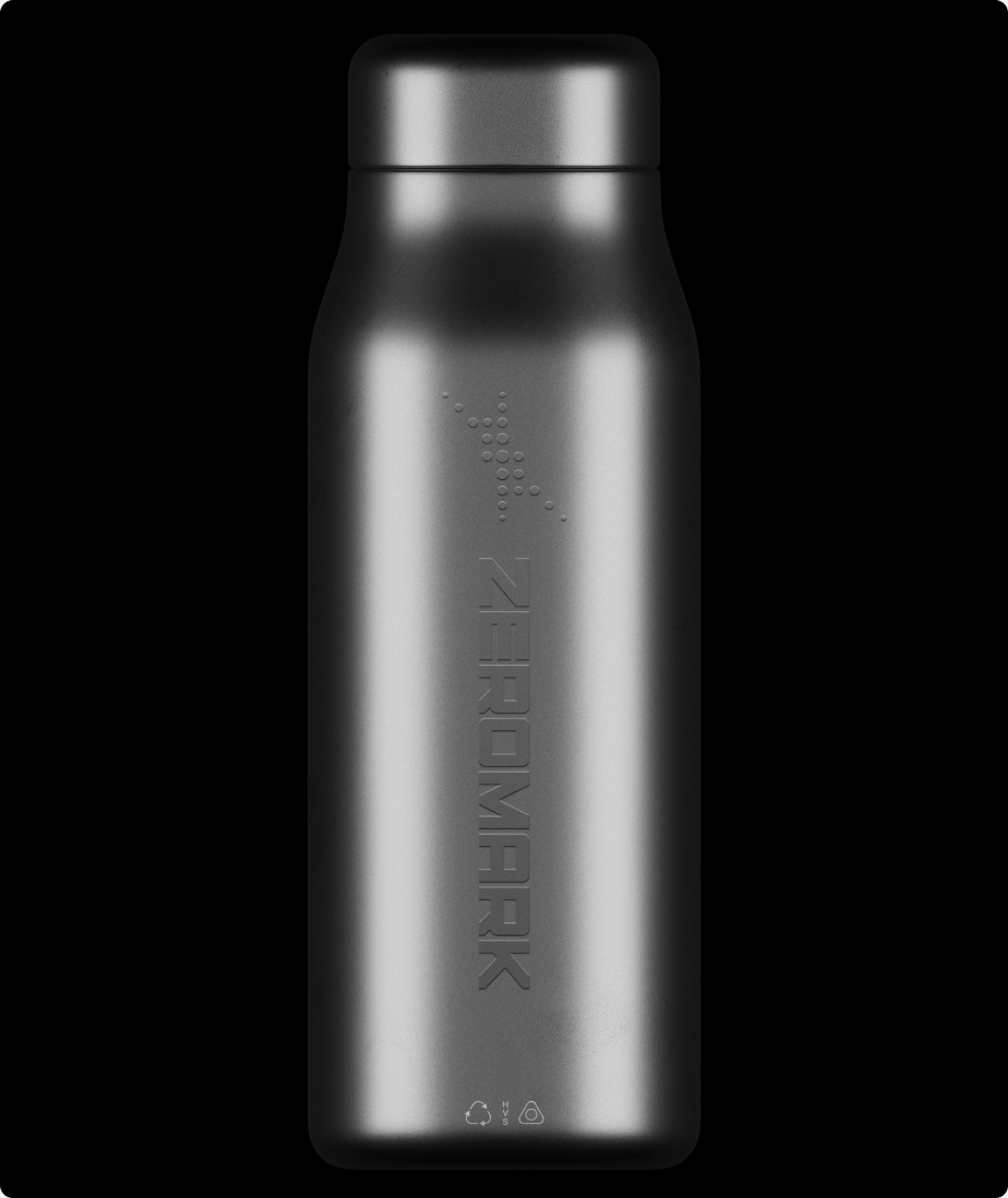
The wordmark is heavy and modular, built from square forms with every diagonal cut flat, so it reads as machined rather than drawn. The symbol is built from a matrix of dots, dense at the center and thinning as it moves outward, drawn from the way ZeroMark's own hardware sensors perceive a target. It resolves cleanly at small sizes, where the dots stop reading as dots and start reading as direction, and it animates well.

Type
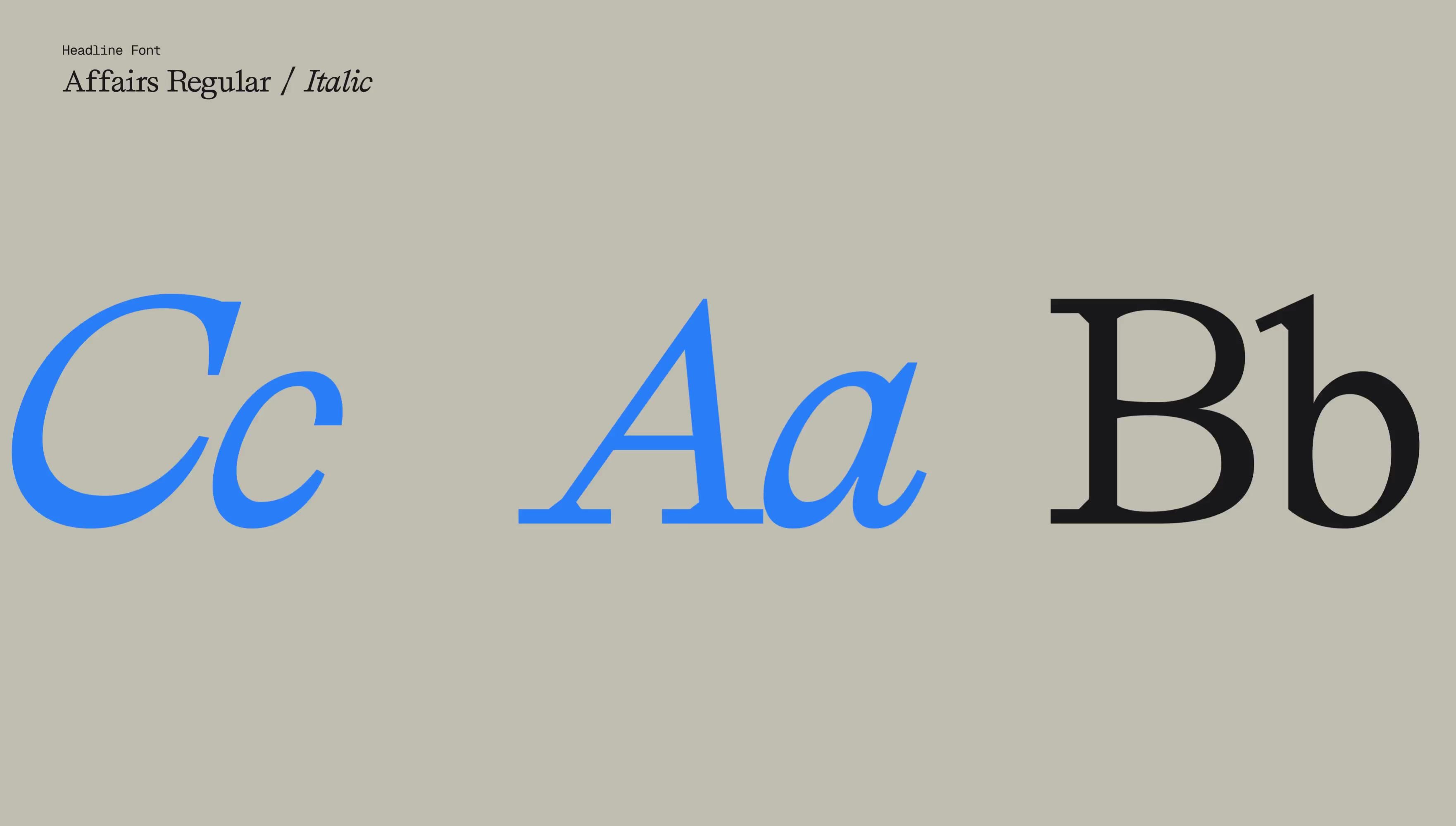
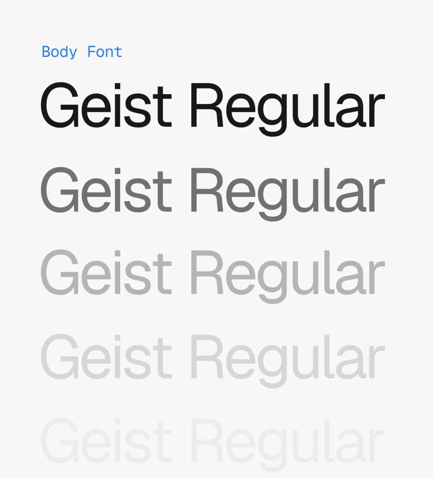
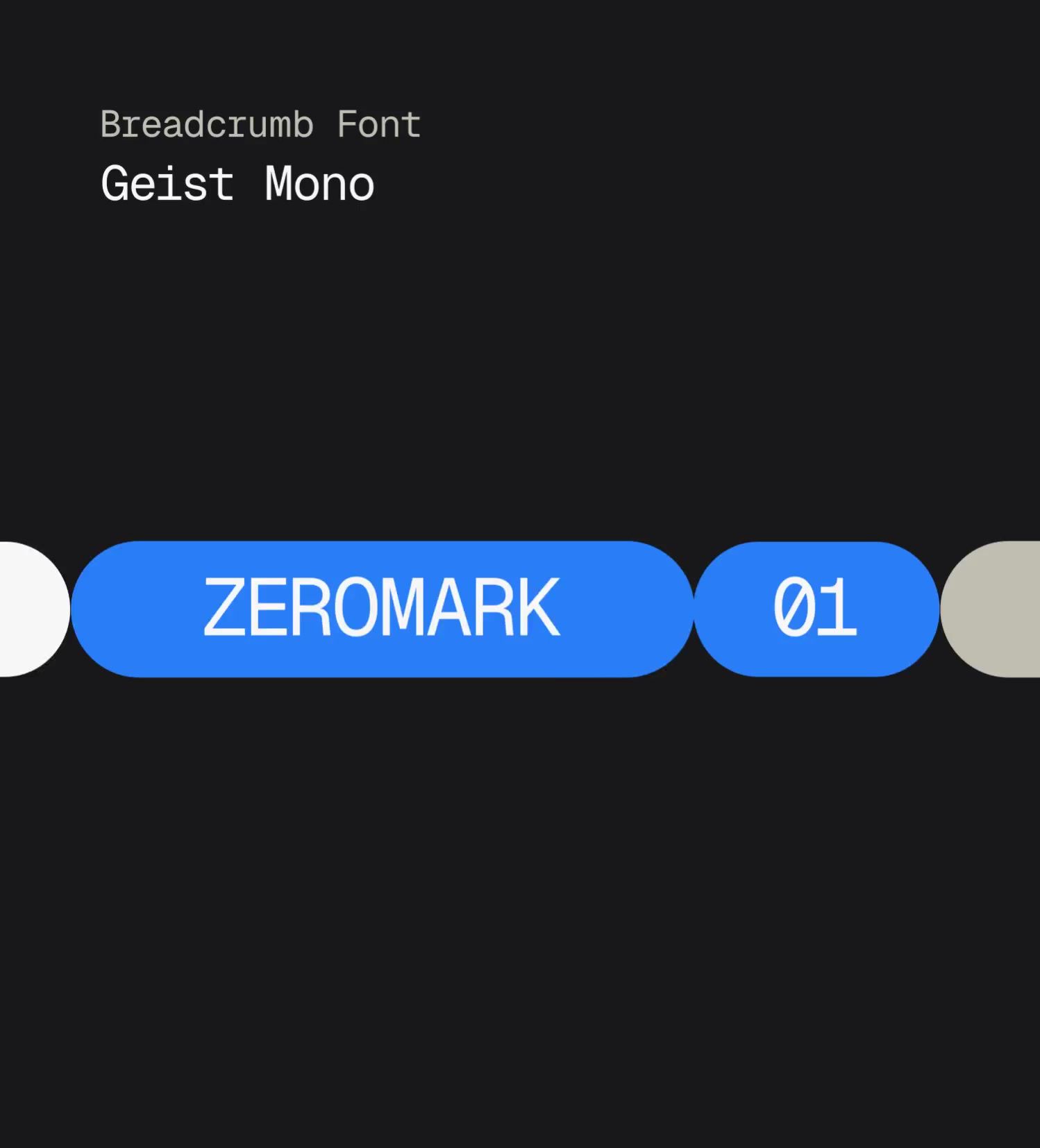
Against the chunky wordmark and animated symbol, everything else is quieter. Affairs carries headlines and pull quotes, a compact geometric serif with soft enough curves to hold character without turning ceremonial. Its italic does almost all of the emphasis work across the deck and the site, which is why single words keep lifting out of headlines rather than whole lines shouting. Geist Sans for body copy, and Geist Mono for labels, section markers, data and captions.
Color
The palette sits on near-black with a bright blue as the primary brand colour, and a complementary pale orange accent used primarily for marking augmentation in the product renders and enemy drones in the software visualisations.
Graphic Elements
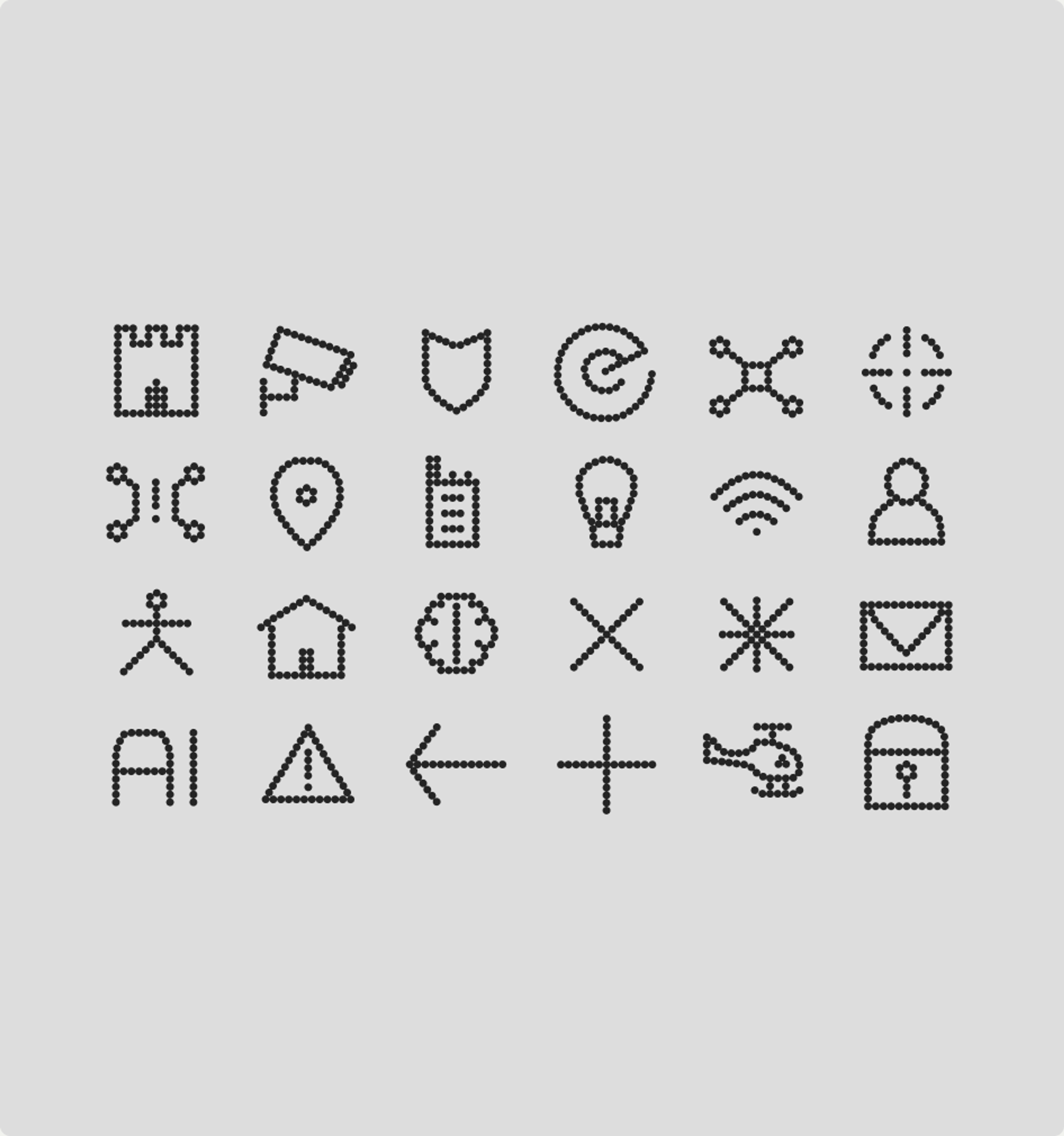
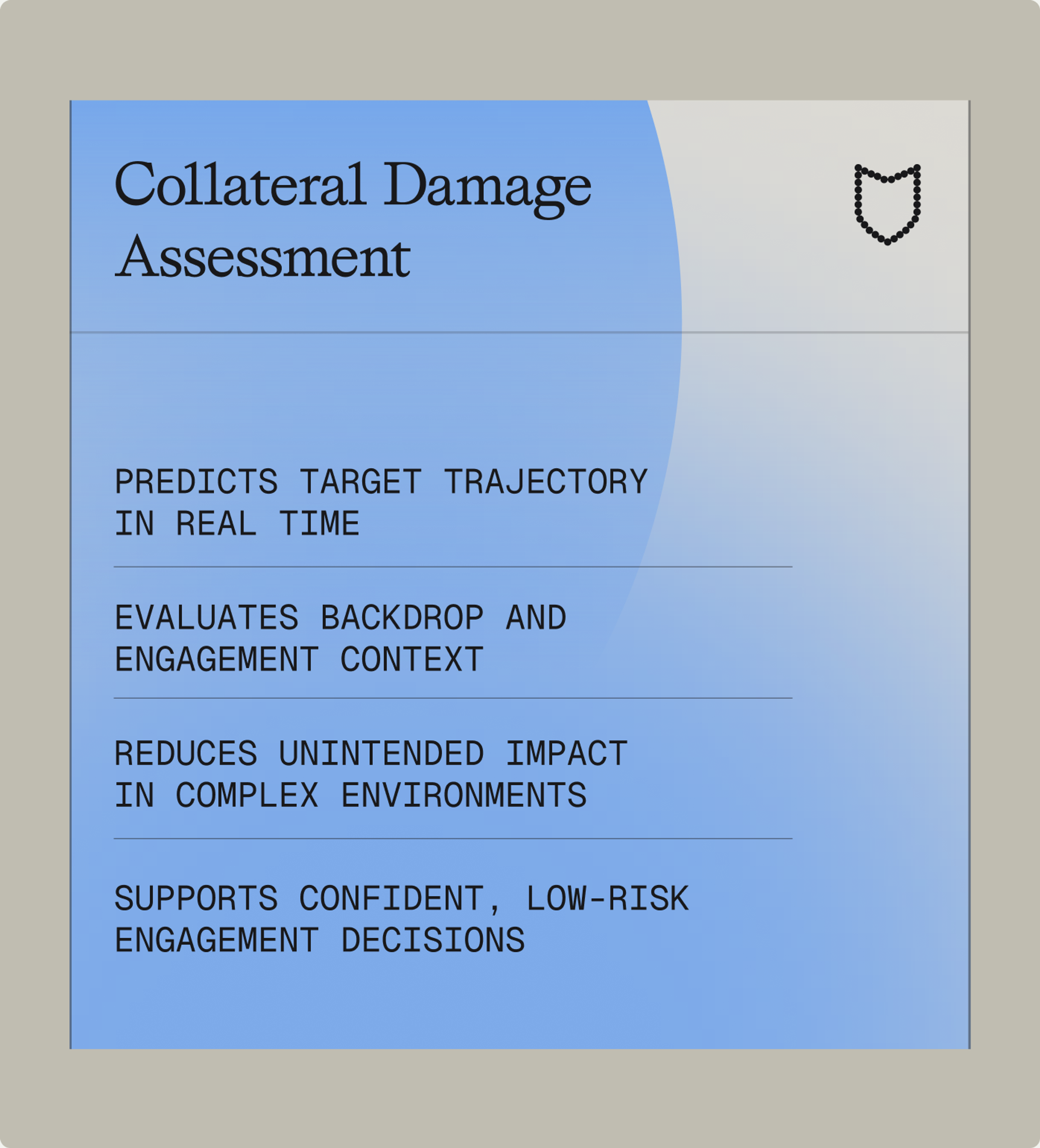
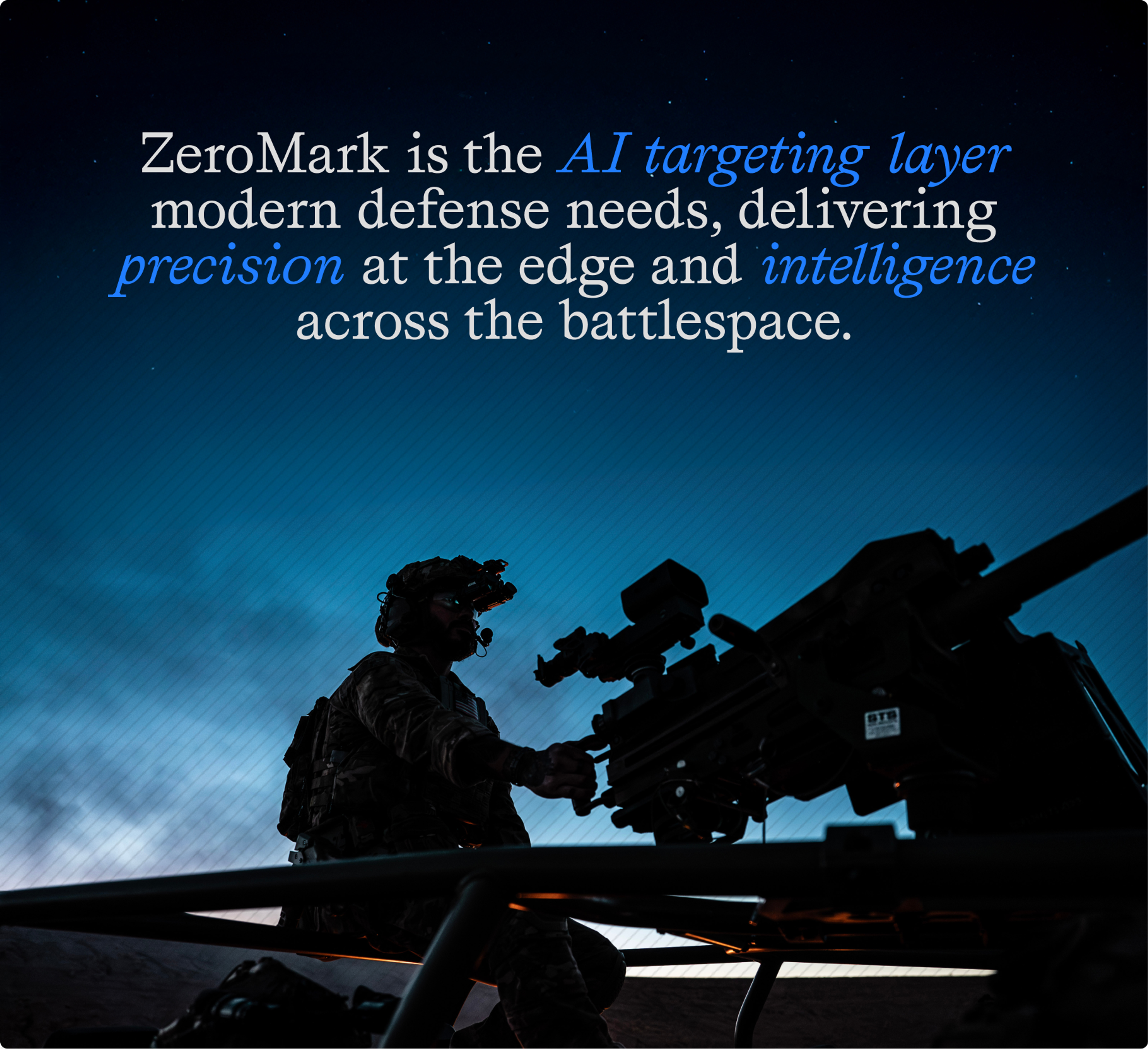
The graphic system behaves less like decoration than like something laid over the world, which is what the product does too. The dot logic from the symbol carries into a custom icon set. A diagonal line pattern sits across imagery and down the edge of layouts, adding texture without hiding anything. Boxes are framed by line accents, while feathered gradient circles keep the whole thing breathing. The hover states take it furthest. A CRT scan field and a halftone dot matrix resolve under the cursor, used sparingly, built to mimic the way the system itself identifies, tracks and adapts to a threat in the air.
The Imagery
ZeroMark had product photography. The problem was that it lagged the hardware by a generation, and even current photography could not make the argument the company needed to make. A photograph of an augmented rifle looks like a rifle. Bolt-on, not built-in, is the entire proposition, and in a photograph it is invisible.
Hardware
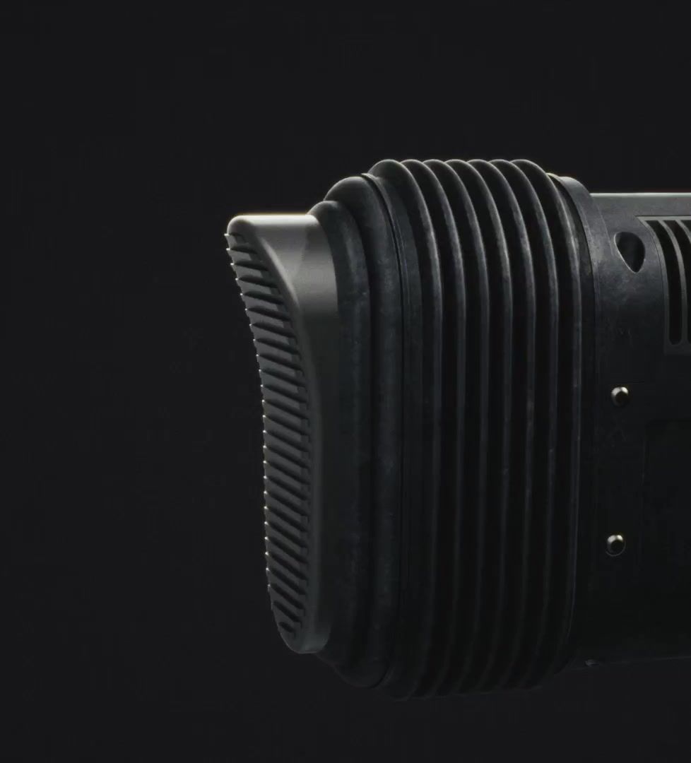
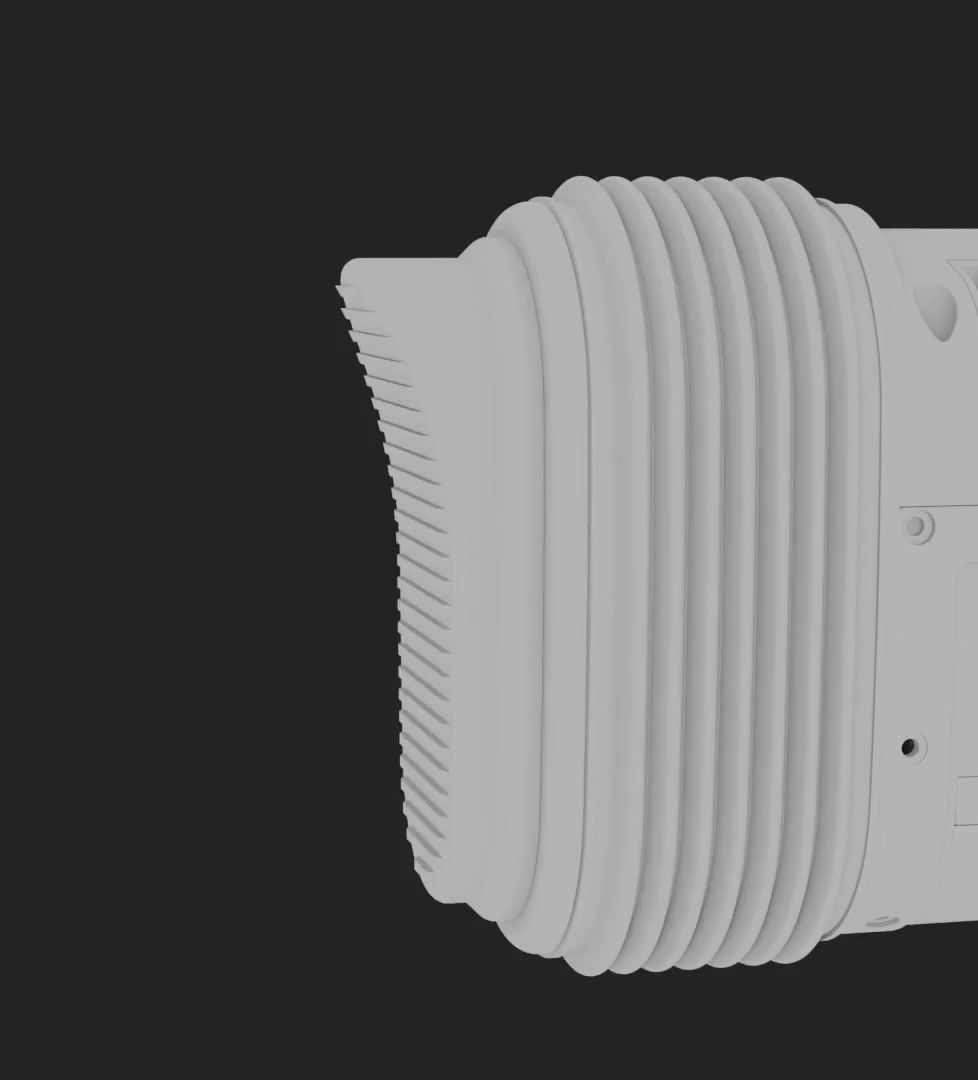
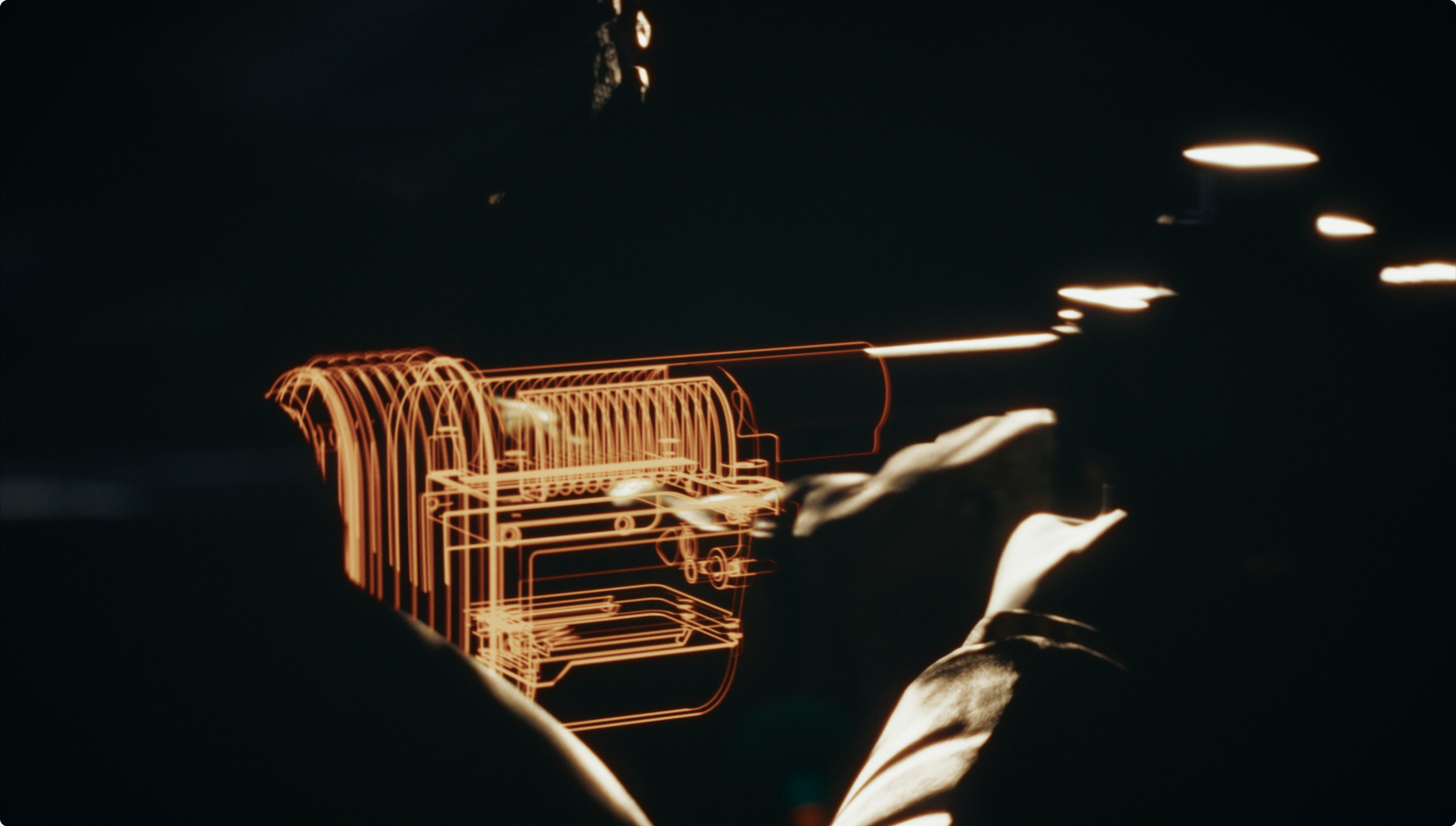
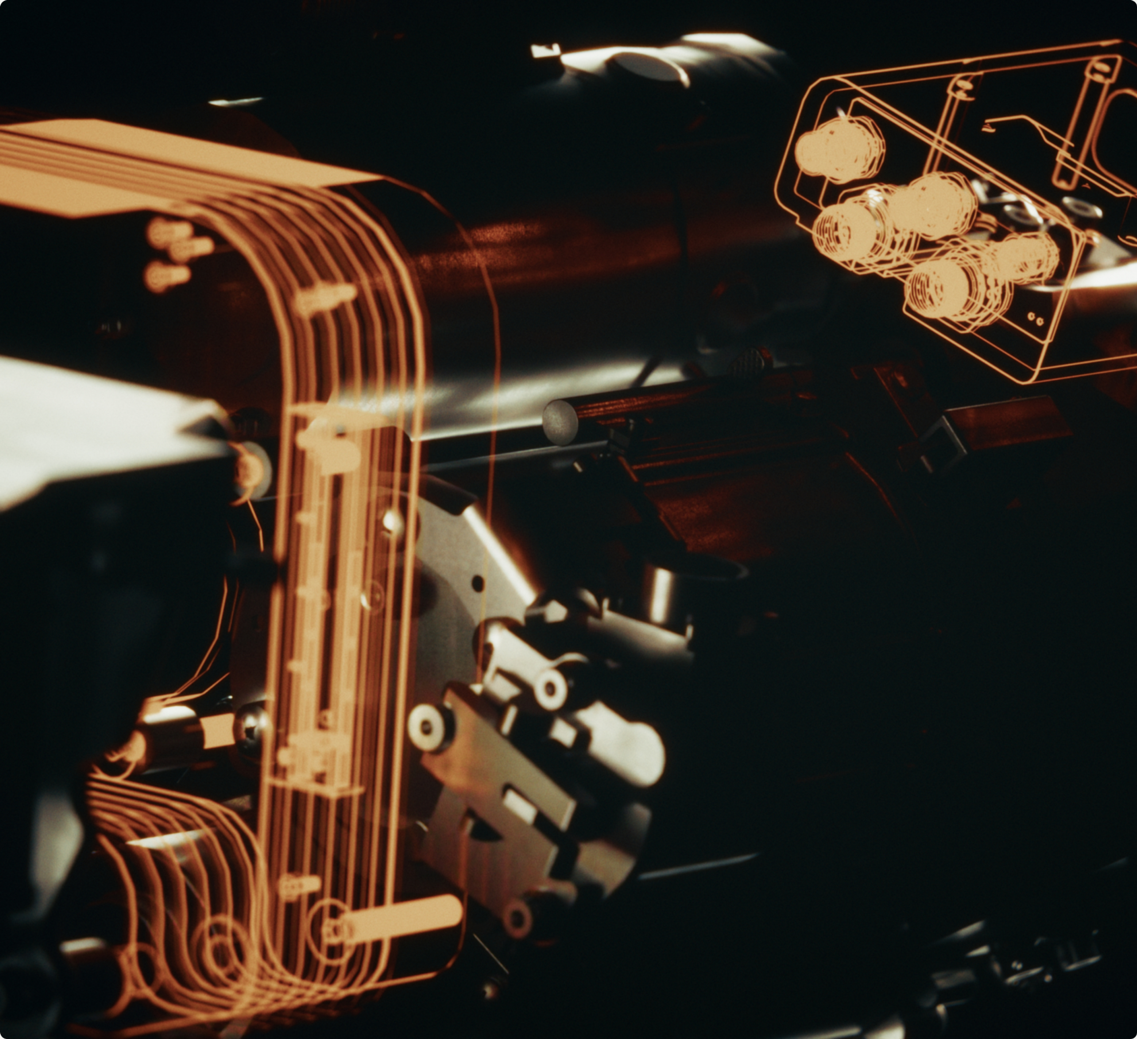
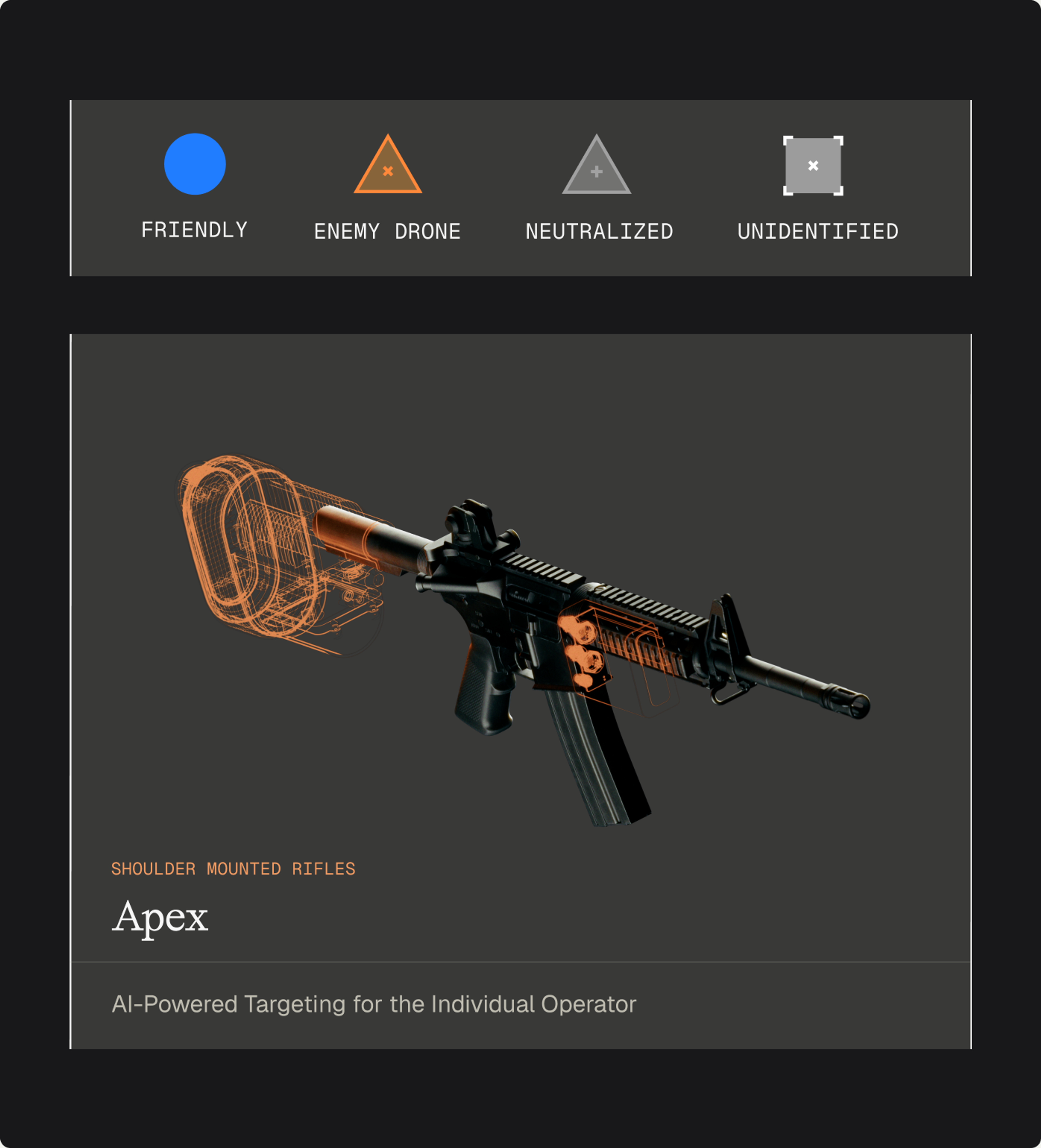
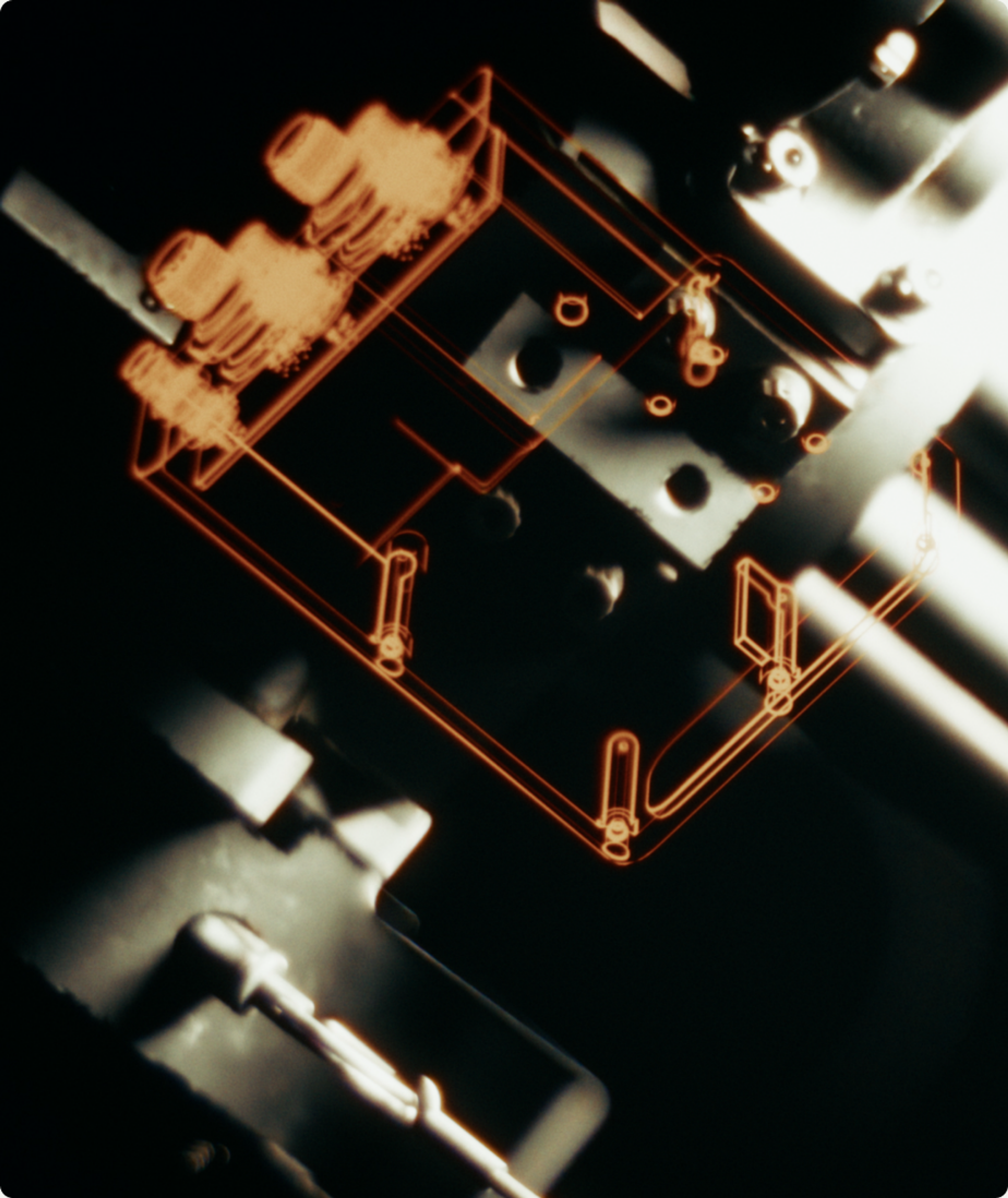
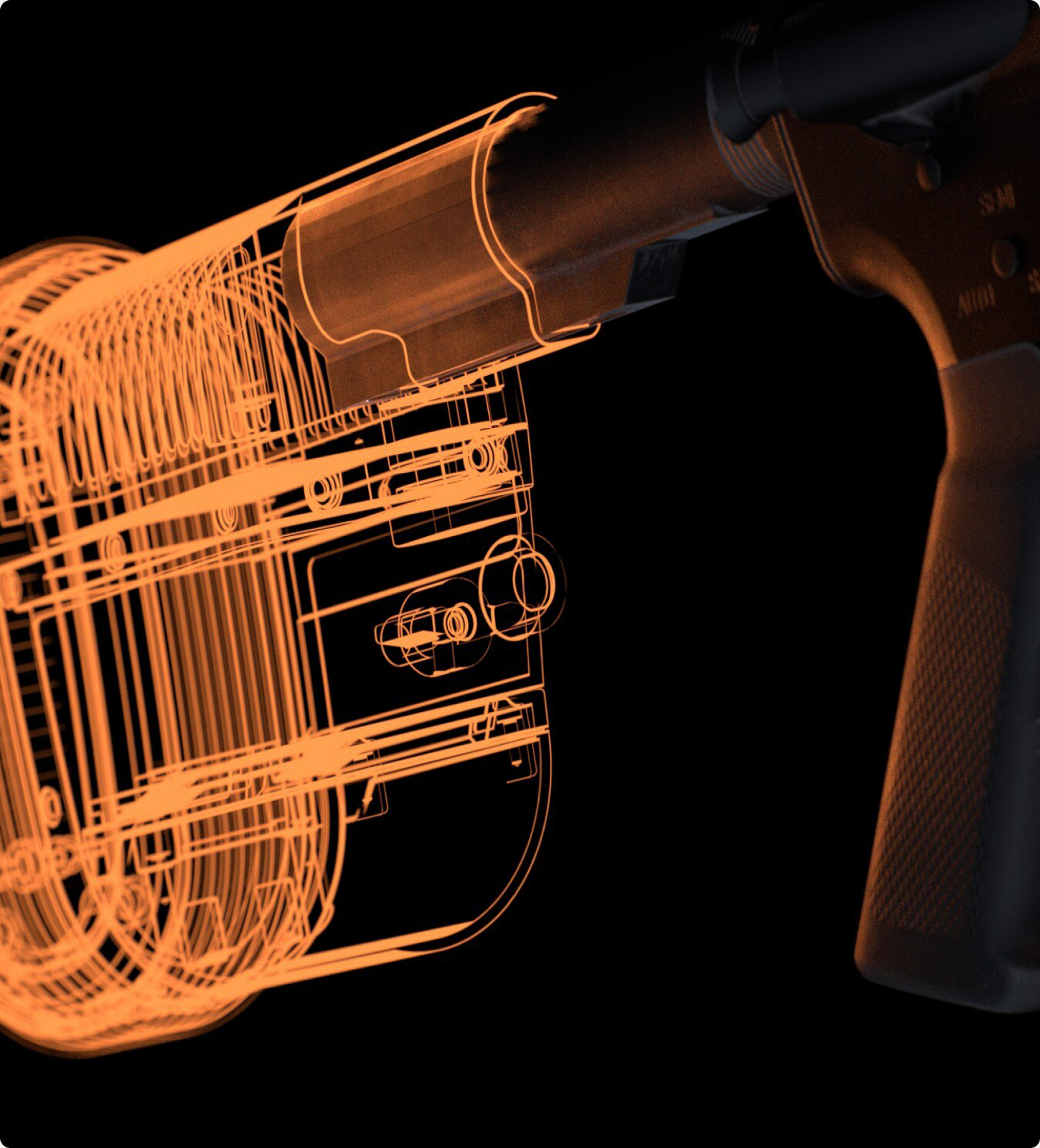
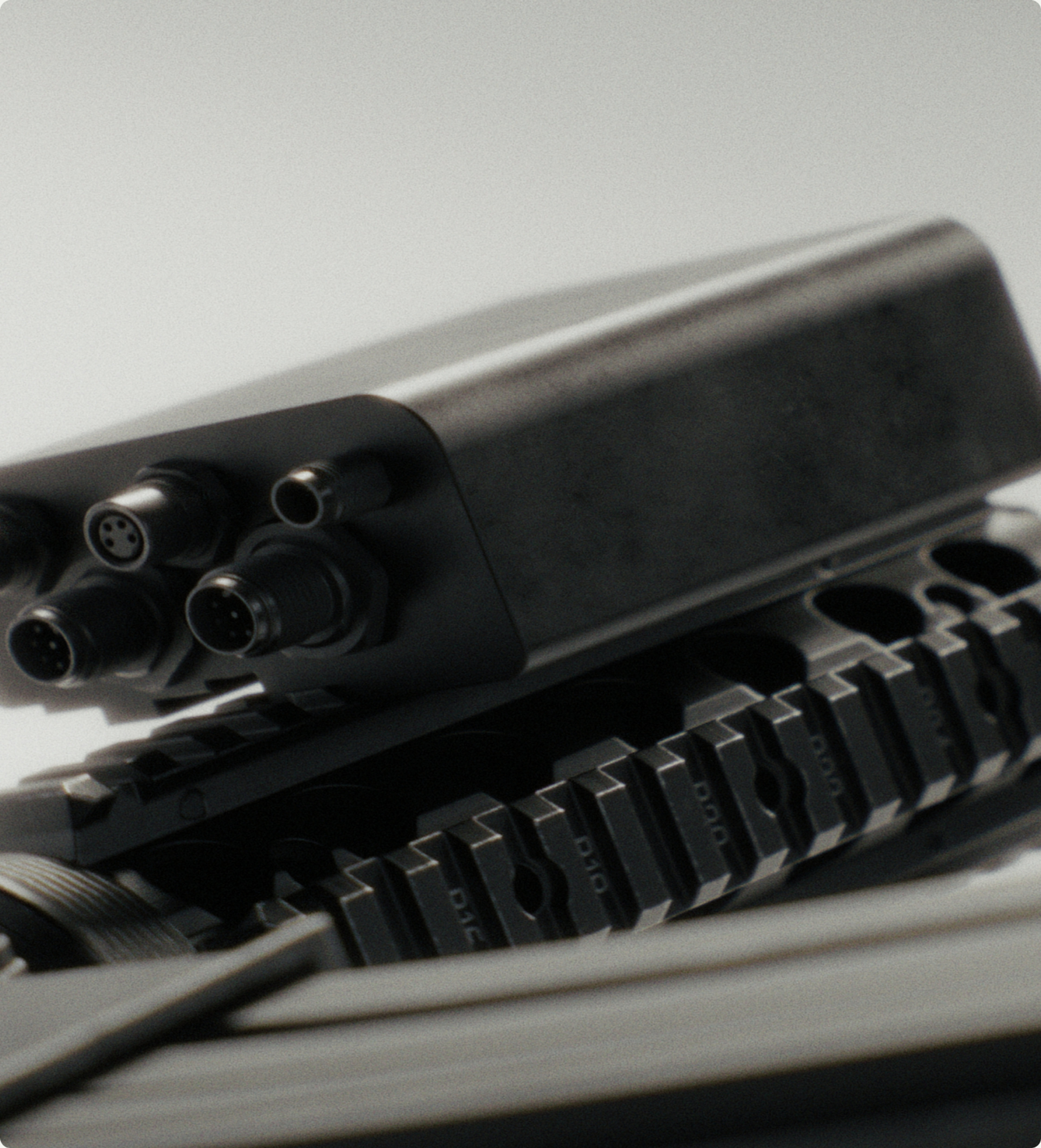
So the 3D was built to hold the two things apart. Working from CAD, stripped of anything export-controlled, we rendered the existing weapon plainly and put ZeroMark's component on top of it in orange wireframe. You can see where the weapon ends and the upgrade begins, which is the whole point. Each hardware line runs in three image registers: close-ups that give the product presence, functional breakdowns that show what is being added and where it sits, and in-field photography that return it to the environment it works in.
Software
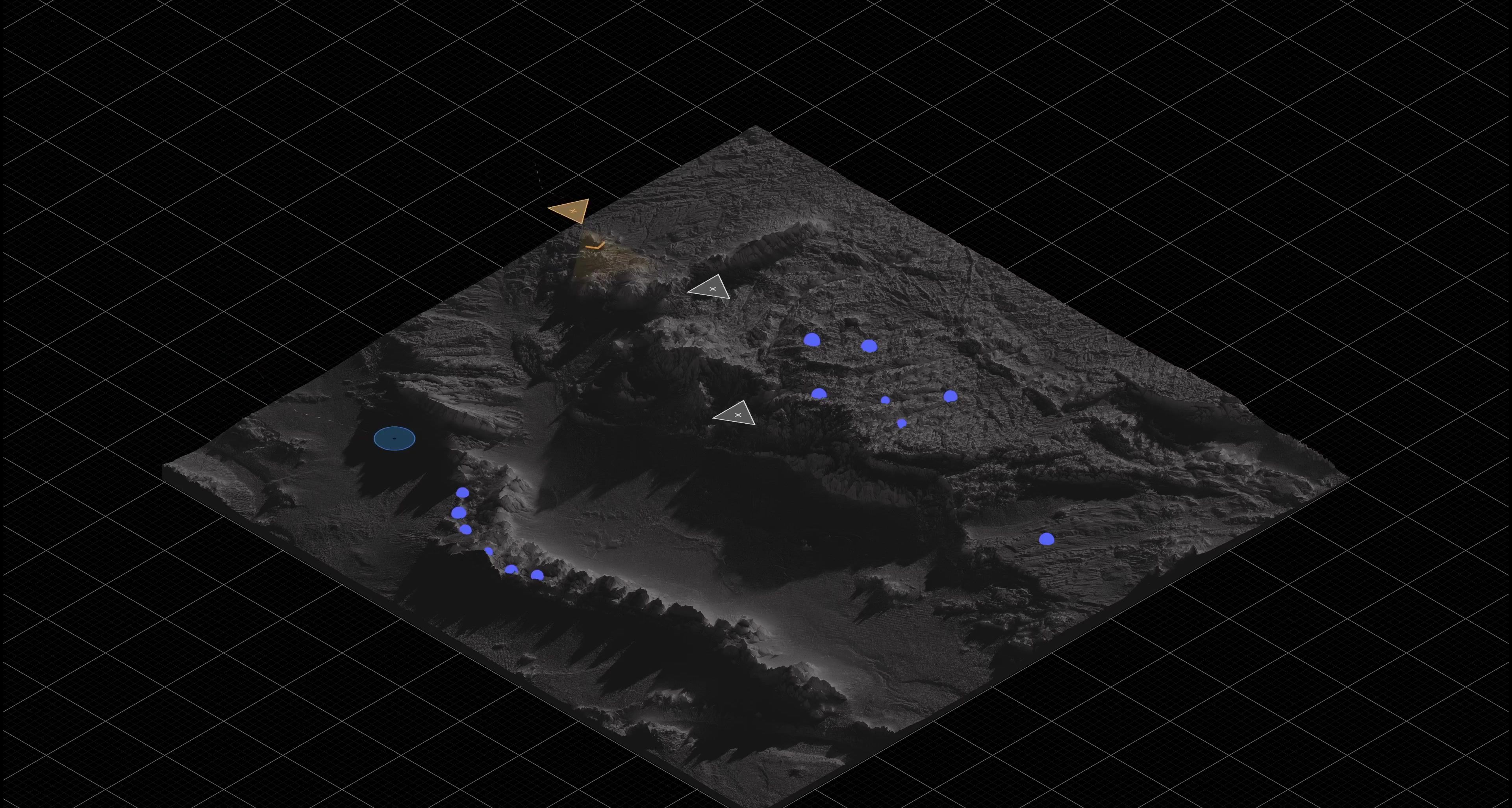
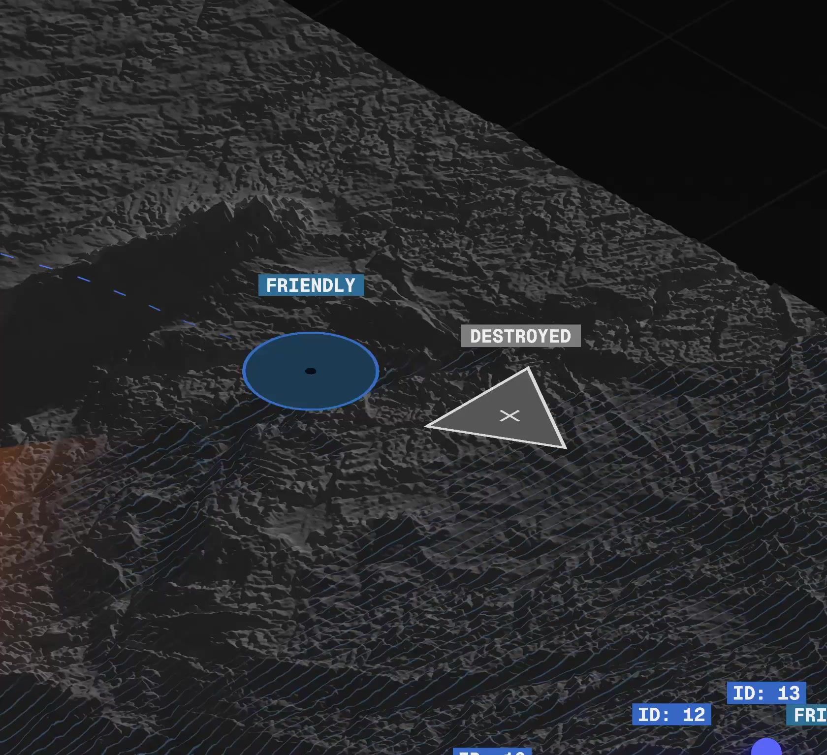
The centerpiece is a visualisation of Nexus, ZeroMark's edge command layer, featuring a battle-space with friendly units as blue markers, enemy drones as orange triangles and neutralised threats in grey. It is the clearest answer we found to a hard question: how do you show software whose entire value is situational awareness, without resorting to a screenshot?
The Rollout
ZeroMark had been a single landing page for most of its life, which for a company preparing to raise meant that the first place investors look was also the thinnest thing they would find. The identity shipped in stages. A stripped-back page went live first so the new mark was in market ahead of the raise, followed by the full site along with the rest of the brand assets. What we think matters most is that none of it required ZeroMark to become a different company. The operator-facing register is still there in the wordmark and the way the hardware is shot. What changed is that there is now somewhere for the rest of the story to sit.
Creative Direction
Carl Versfeld, Andreas Bergman
Graphic Design
Hélder Pina, Clara Norborg, Jane Kukharchuk
UX/UI Design
Alba Panyella, Monica Kelly
Motion
Hélder Pina
Strategy & Copywriting
Adam Reuterskiöld, Monica Kelly
3D
William Norberg
Project Management
Brittany Whyte, Naima Lorentzon
Web Development
GRAND st.