

The Climate Brick
The missing manual for scaling climate tech.
Brand RefreshVisualsWebsite
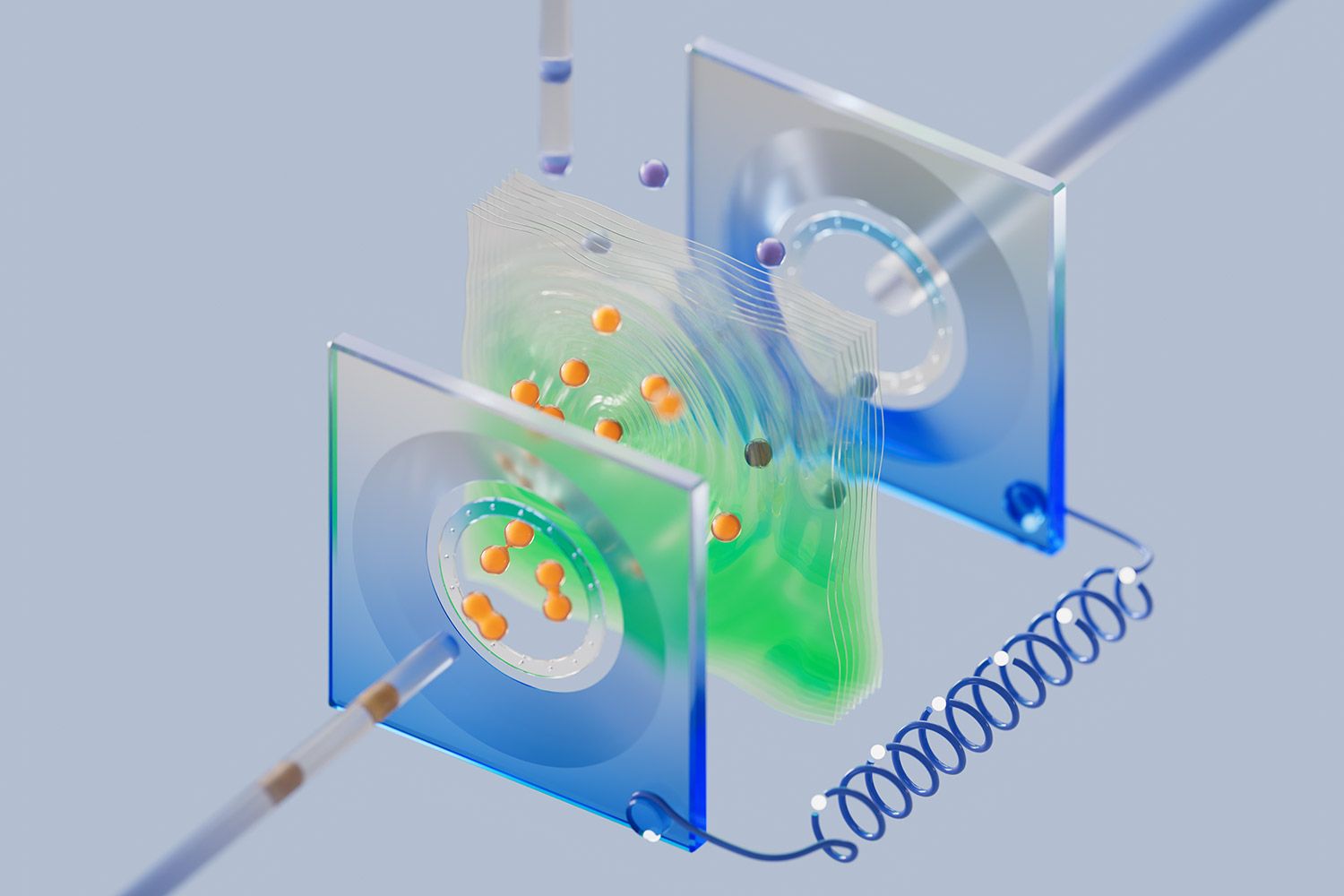
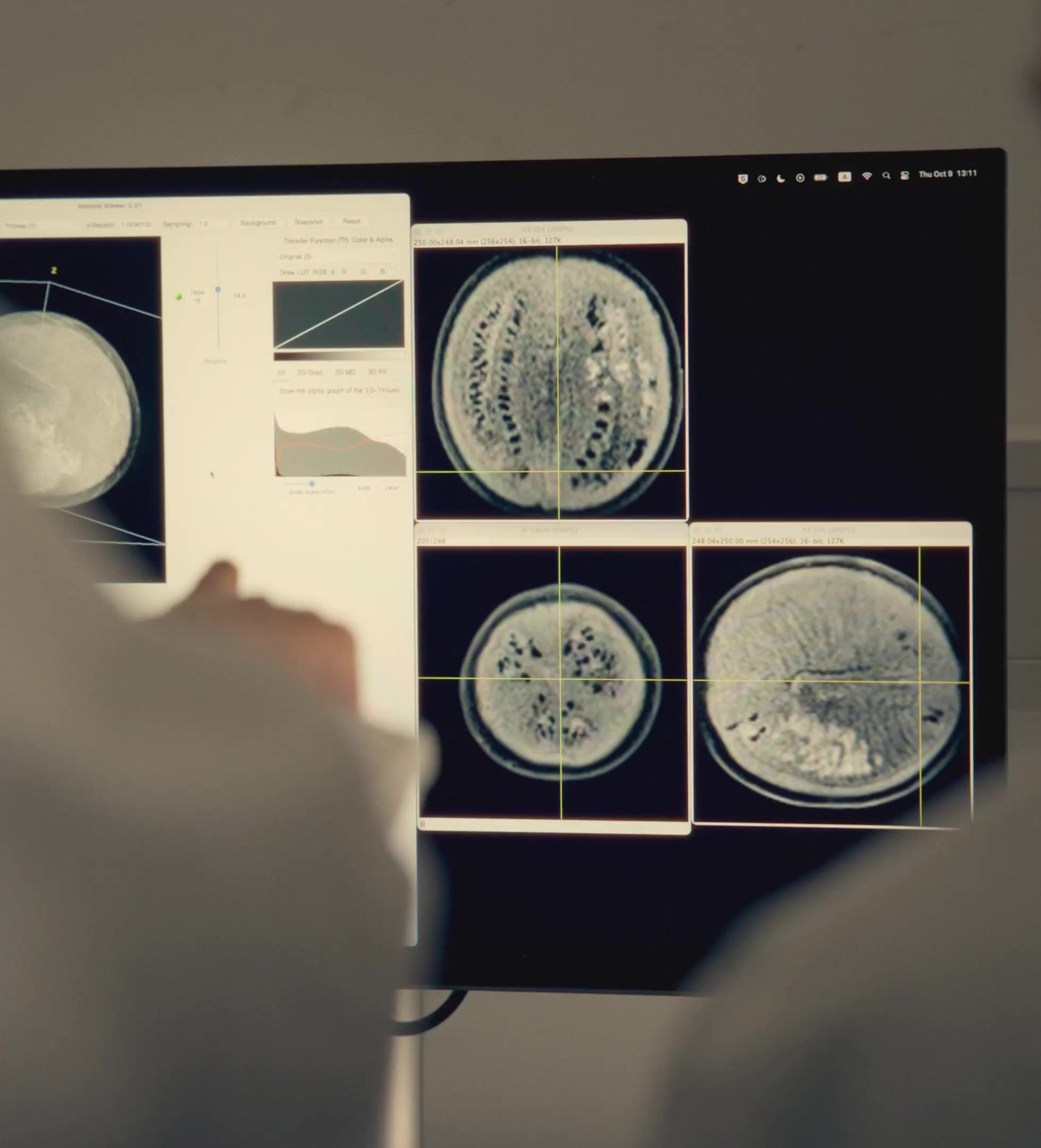
Orbem is a Munich-based deep-tech company that industrializes MRI (the same technology hospitals use to see inside you) and points it at eggs, fruits, and nuts. One scan, under a second, no cutting anything open. In the process, they're building the world's largest biological dataset. We partnered with them to rebuild their brand, quite literally, from the inside out.
Industry
Life Sciences, Food, Health
Deliverables
Brand Strategy, Visual Identity, Photography, 3D Visuals, Website, Brand Film
The Challenge
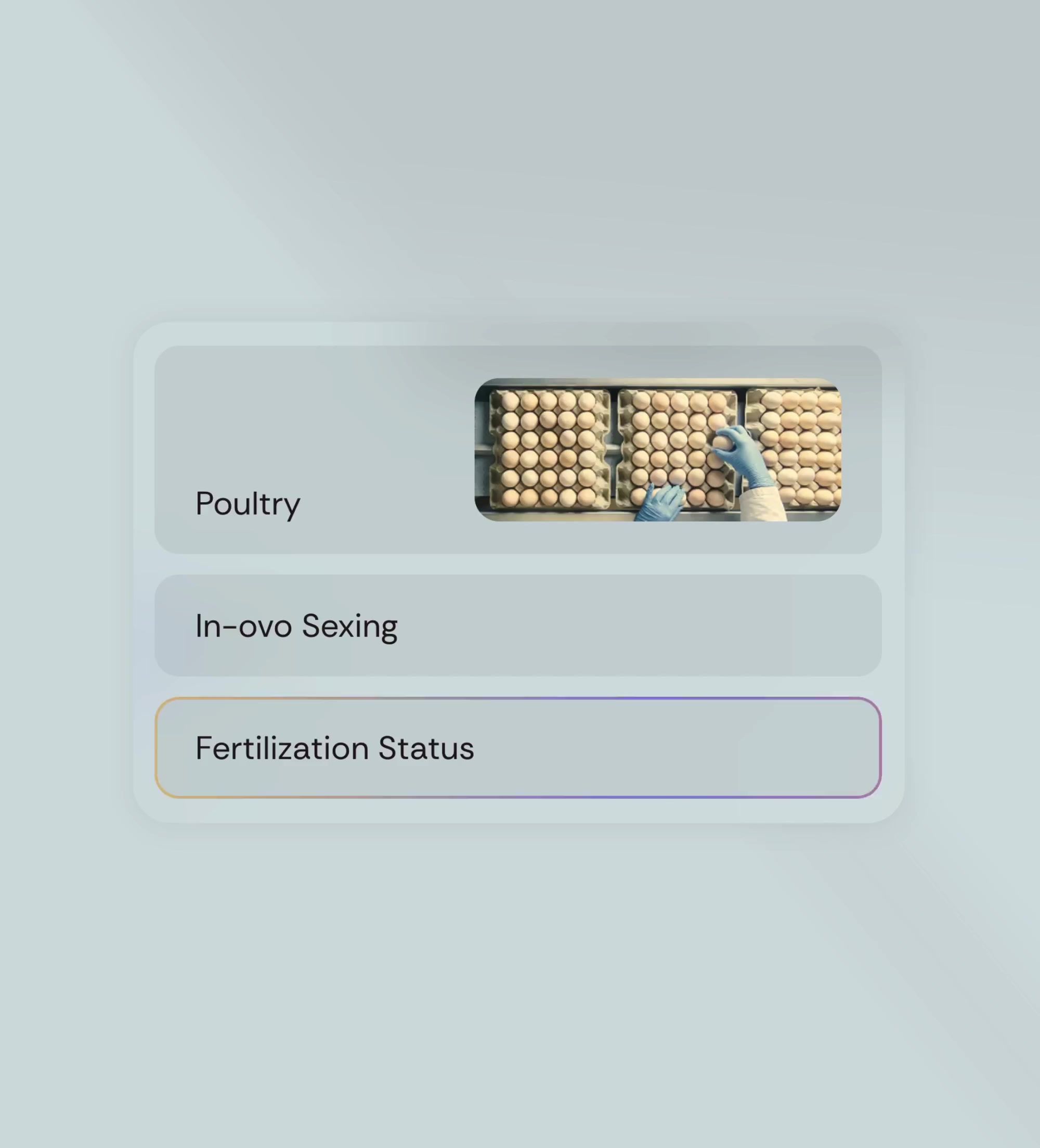
Orbem’s machines determine the sex of an embryo inside the egg in under a second, so billions of male chicks are never hatched into a system that has no place for them. One of the most humane advances the poultry industry has ever seen, and only the opening act. They came to us expanding into the US, building new product lines, and about to announce a major raise. But the old website skewed dark and vaguely crypto for one of the most optimistic teams we’ve ever met, and new hires admitted they researched the company elsewhere before applying. A decade of breakthrough science was wearing the visual equivalent of a grey hoodie.

The Bet
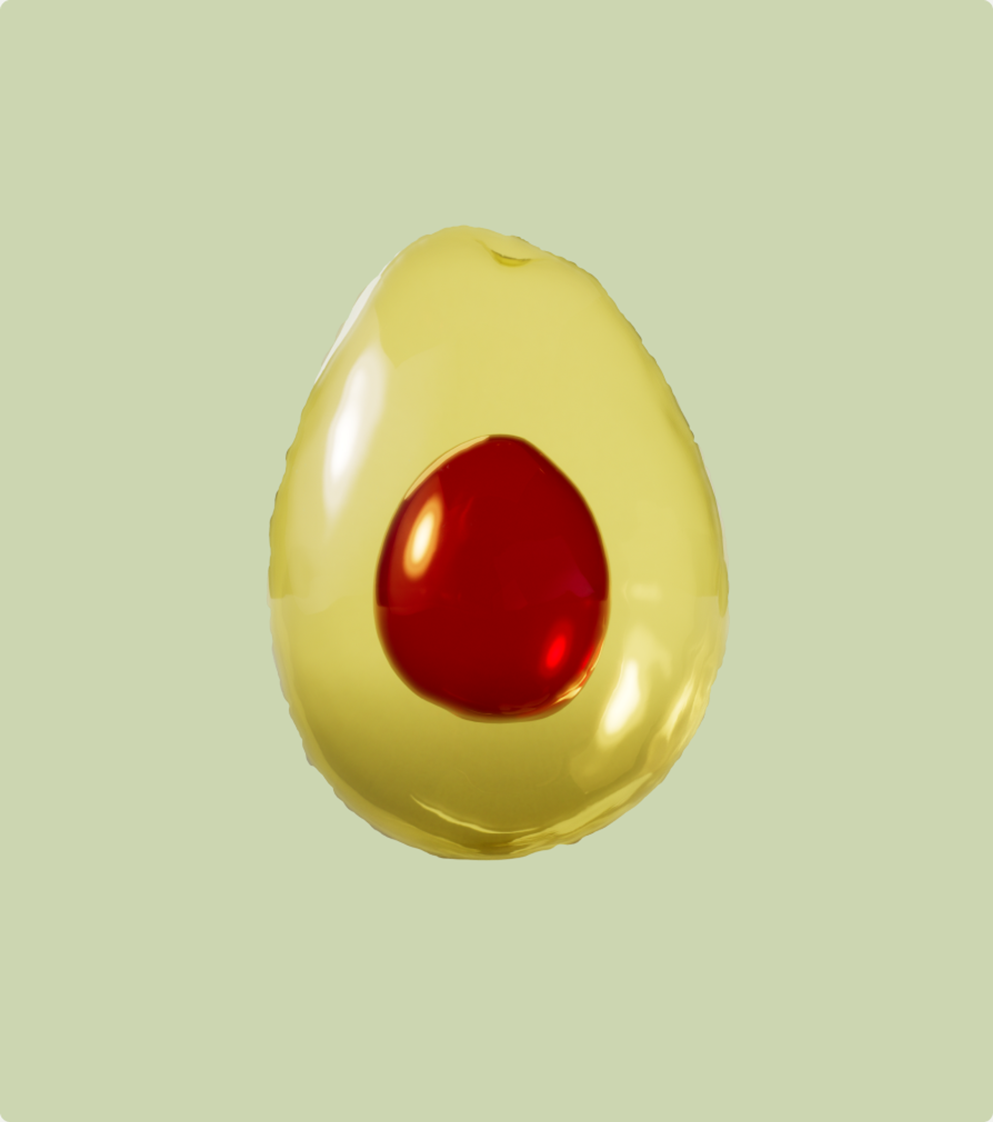
We started where every Omoi project starts: going deep. Stakeholder interviews, a content audit, and enough time with the science to be dangerous at dinner parties. The founders are researchers, so the instinct was to lead with the method: MRI physics, AI models, throughput rates. We think the opposite works better. Start with the problem, not the machine, and by the time you get to the technology you’ve earned the right to talk about it. Which is why the avocado does more work in this brand than the magnet. That reframe became the platform: The Inside Out Company. Literally, Orbem sees inside things. Philosophically, the world gets better when you see it from the inside out. Slightly clunky, completely unforgettable. That’s the point.
The System
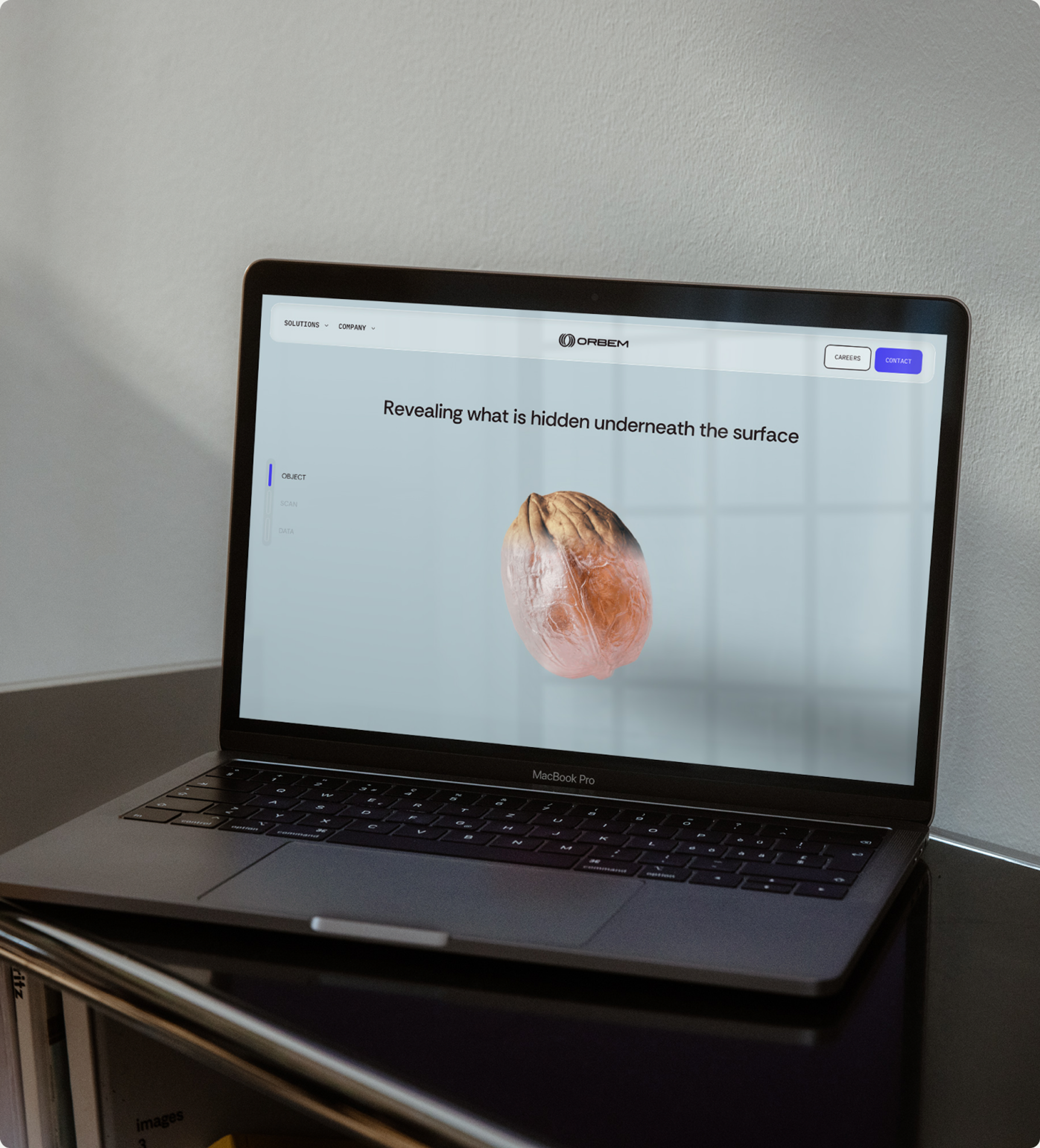
The identity runs on one structural idea, borrowed from what the technology actually does. Every scan has three layers: the object, the scan, and the data. So does everything we designed. We call it the three-layer approach, and it mirrors Orbem’s three internal teams: products, scanning, data. When a visual system rhymes with the org chart, you've found the real shape of the company.
The object
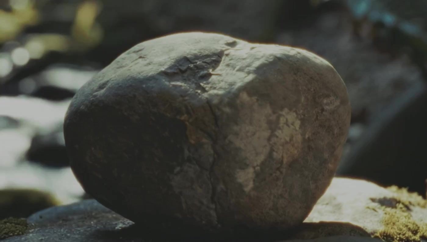
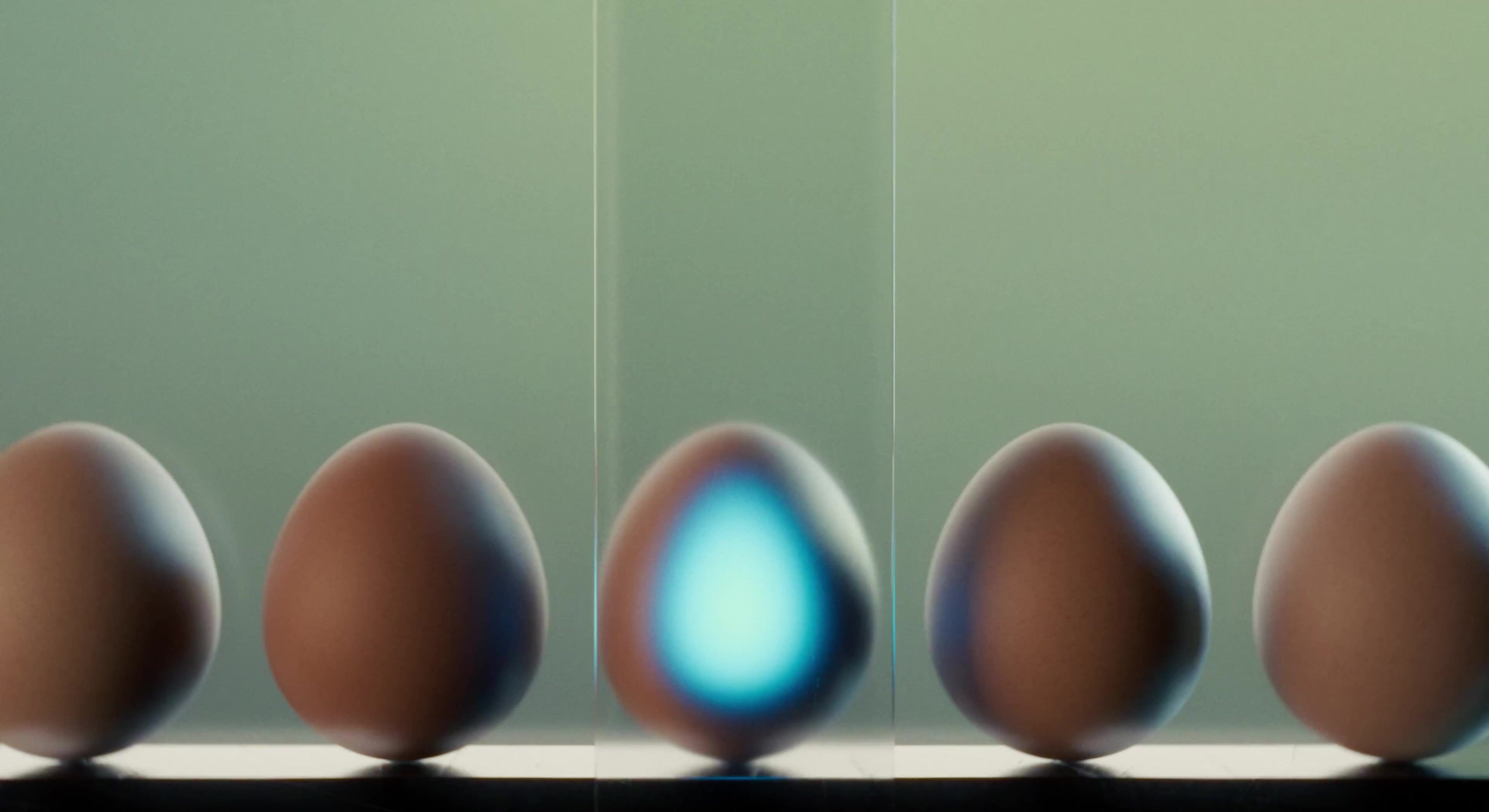
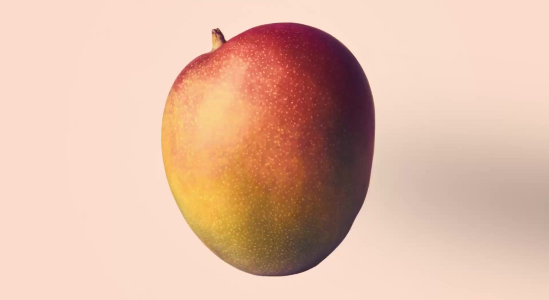
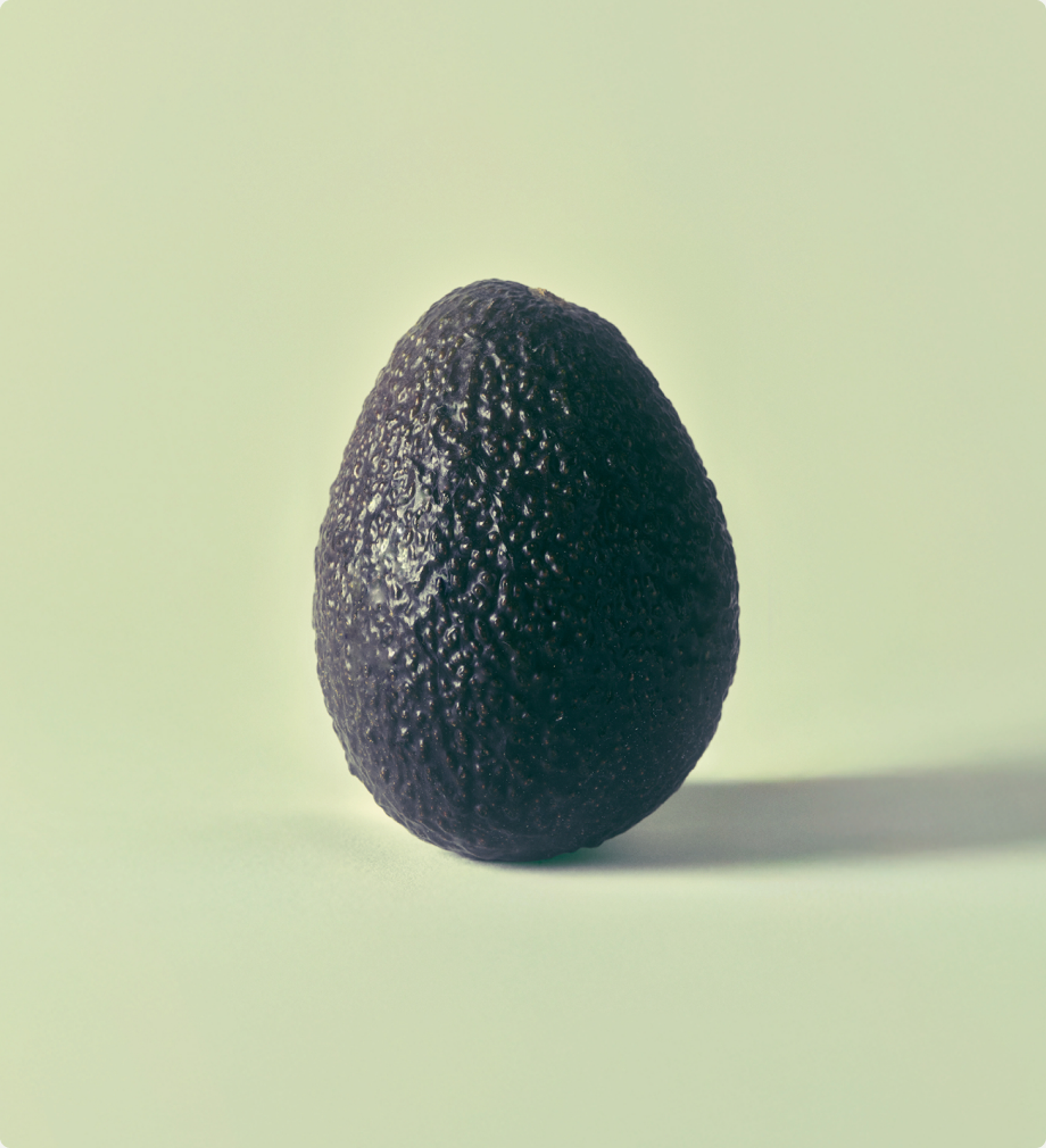
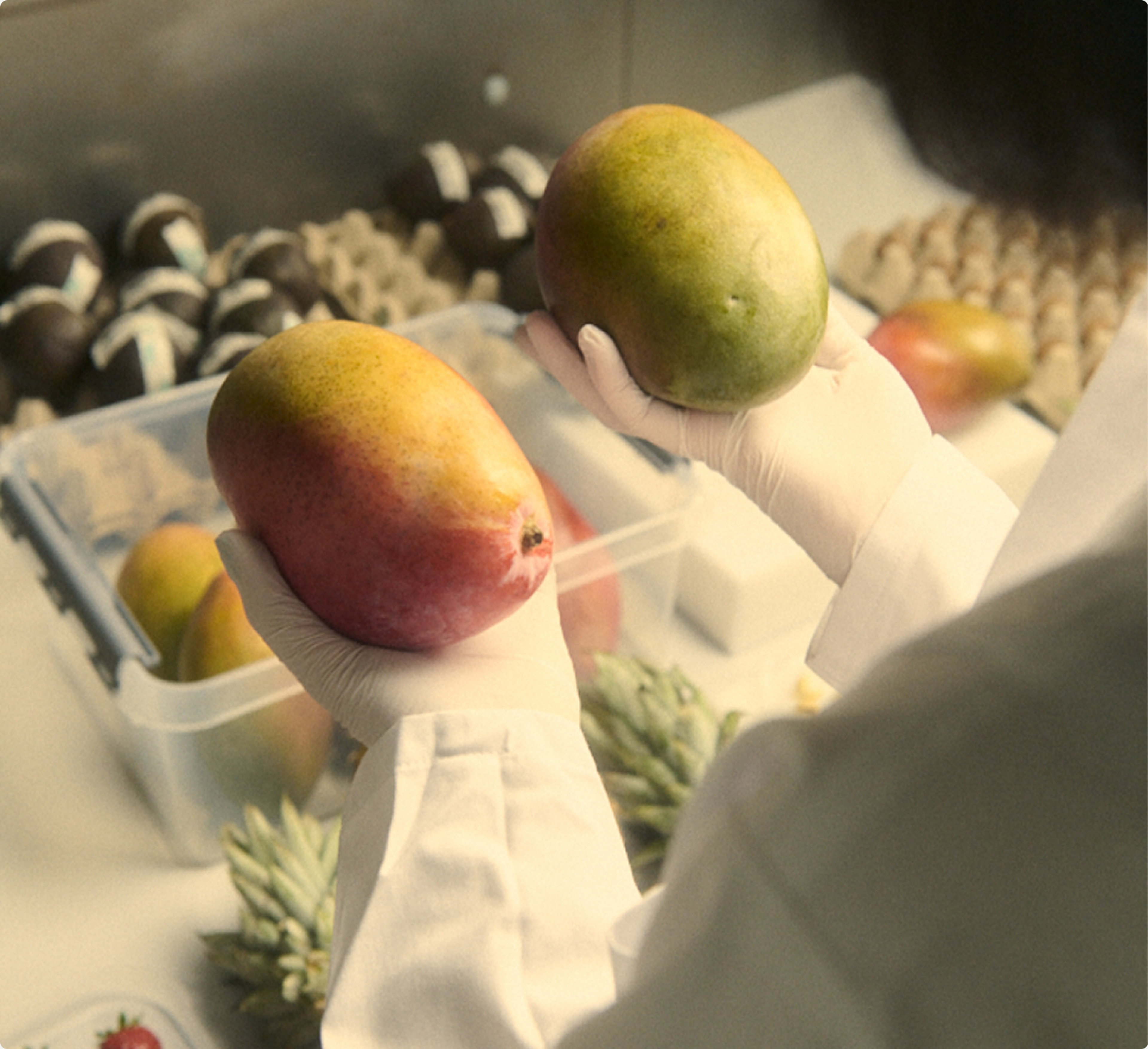
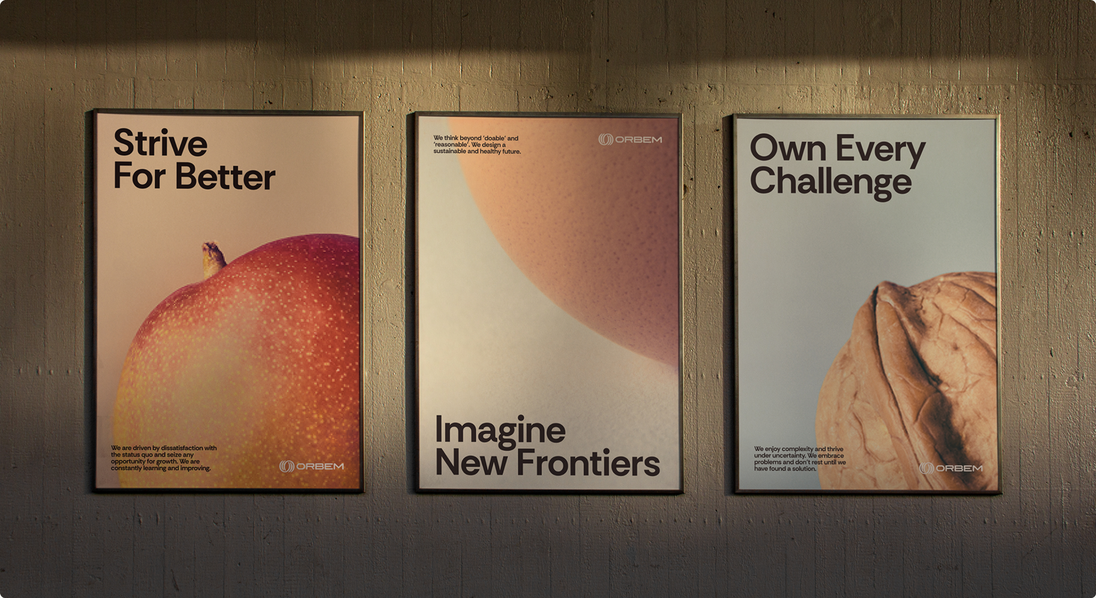
Still-life photography of the produce itself, shot like portraits. Everyday things, elevated until you look twice.
The scan
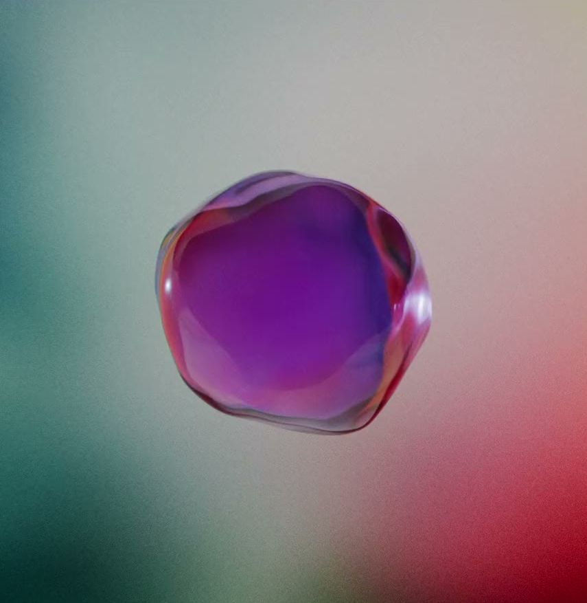
Any MRI company can show you a grayscale scan, so we borrowed from sommerso instead, the Venetian technique of submerging glass within glass. Orbem’s subjects became translucent layered forms, one opacity for the skin, another for the flesh, another for the seed.
The data
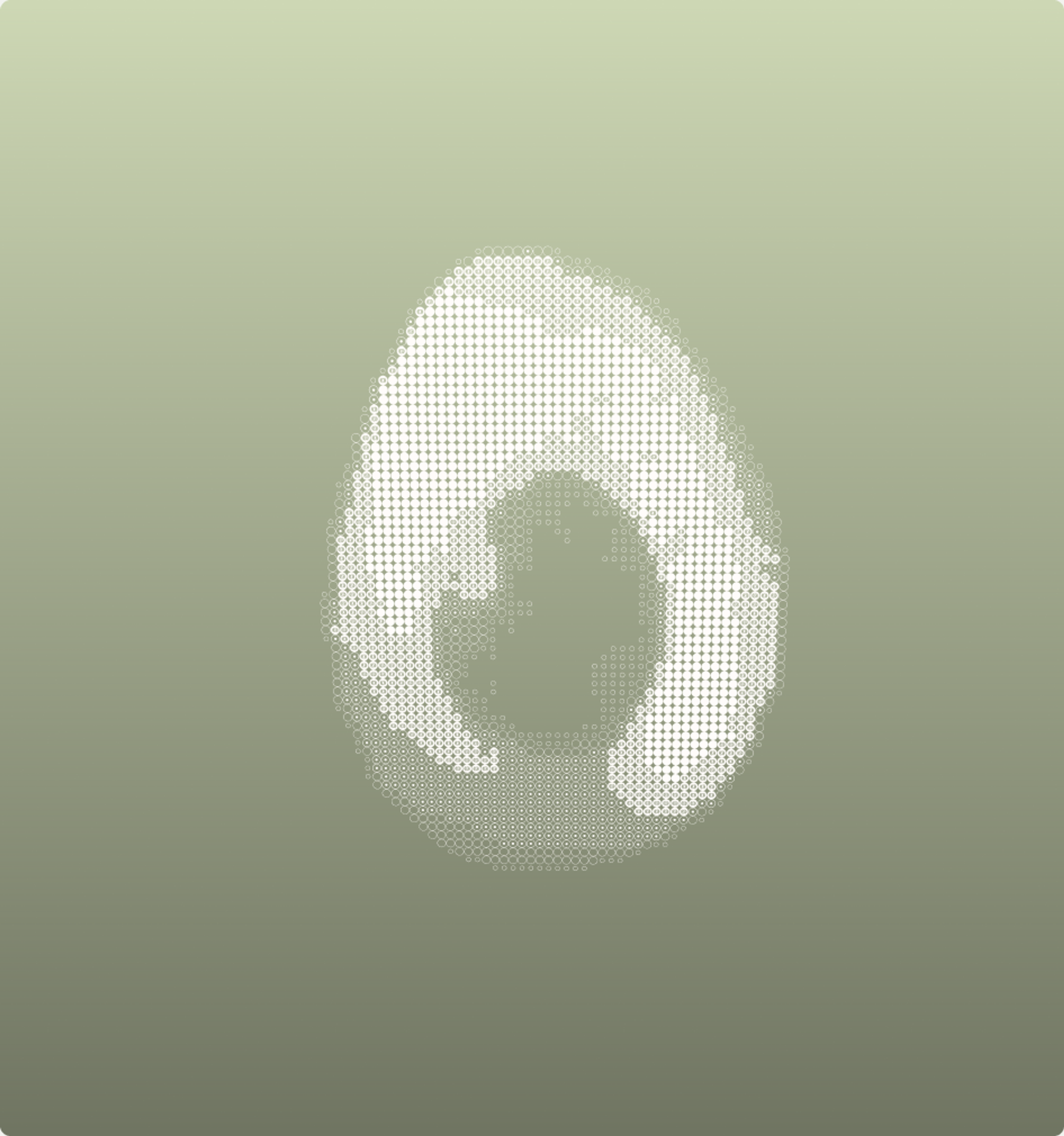
Instead of the usual rain of ones and zeros, an ASCII-style rendition of every product Orbem scans, built from tiny Orbem logos. Zoomed out it reads as digital pattern, zoomed in it’s an Easter egg.
The Look
Symbol
The symbol expresses the three layers as a dynamic, magnetic-field-like form, inspired by the Penrose circle, the famous impossible shape. Fitting, for a company whose whole premise is seeing something from the inside and outside at the same time. It took a few rounds to earn. The first version drew feedback that it resembled an egg conveyor belt, a little too on-the-nose for a company with actual egg conveyor belts. A later round read as tire-like. We opened up the negative space and softened the endpoints, at which point everyone noticed it also reads as an eye. For a company that looks through things, we’ll take that happy accident.
Type
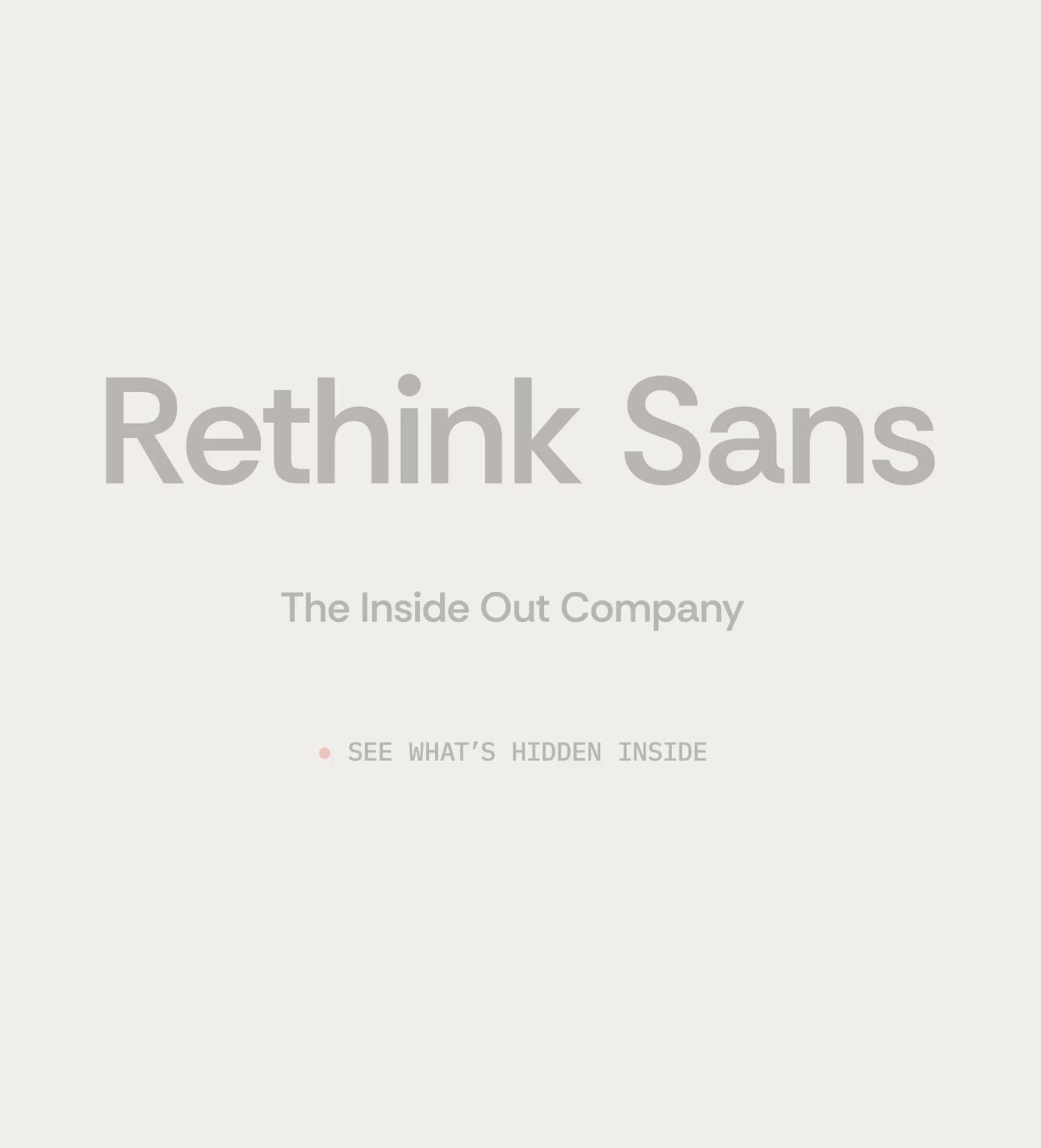
The wordmark is fully custom-drawn: rounded, geometric letterforms that echo the symbol’s layered motion. For the wider system we paired Rethink Sans with IBM Plex Mono, both chosen to work natively in Google Workspace and on the web with zero licensing friction.
Color
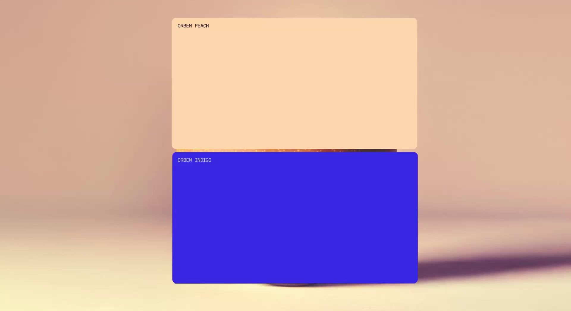
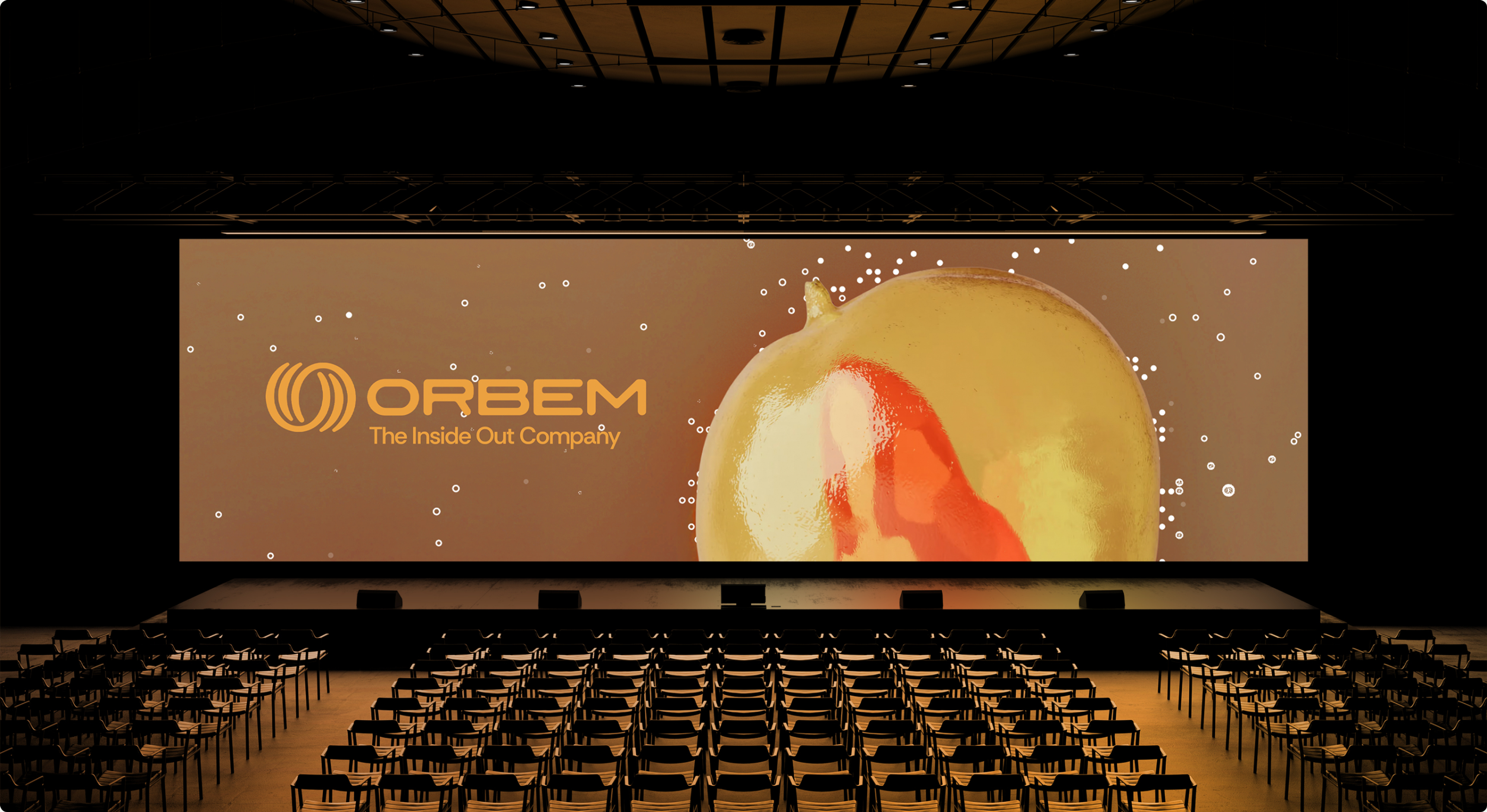
We broke a rule on purpose. Instead of one sacred logo color, Orbem's logo lives inside a range of approved pairings, with Indigo on Peach as the hero combination. A range of colors keeps the brand alive and gives every business line room to breathe. Team photography is treated in soft greyscale so the people anchor the palette instead of competing with it.
The Shoot
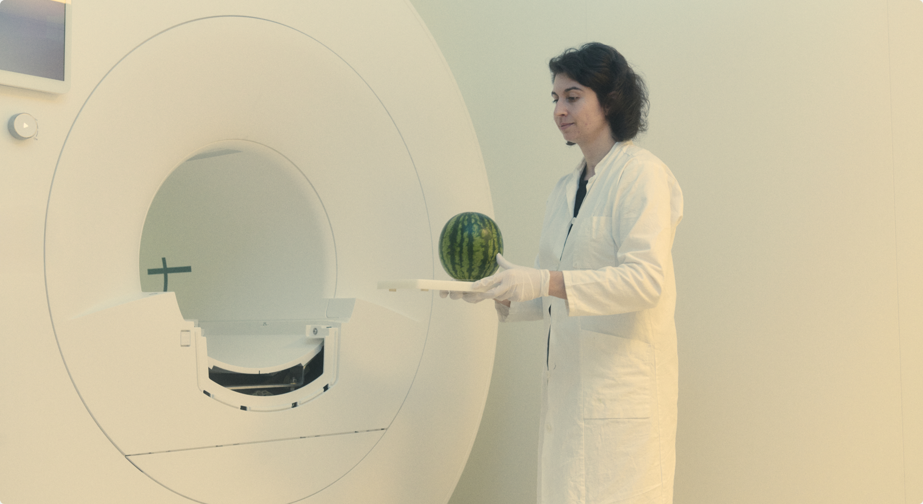
We flew to Munich for a two-day shoot to capture the team, the lab, and the machines. Production note: an industrial MRI is an extremely powerful magnet that does not care about your camera equipment. Every lens change became a small tactical operation. All cameras, and all photographers, made it home. The result, together with the custom 3D work, is a full asset library built on the three-layer logic, so Orbem’s team can keep producing on-brand content long after we've left the building.

The Film
The script asks the audience to see the invisible, and no stock library was going to get us there either. So this became our first fully AI-integrated production. We wrote the manifesto script first, then built the film shot by shot. Real footage from Munich for everything true: the team, the lab, the machines. Custom 3D or AI-generated visuals for everything impossible. Each generated shot was art-directed against the identity, prompted and iterated like any other design comp, then graded together with the live footage until the seams disappeared. The approach opened creative territory no shoot budget could reach, and it felt right: an AI-made film for the company teaching AI to see inside the world. At the first screening, the client team told us they got chills. So did we, but we’re professionals, so we wrote it down for the case study instead.
The Website
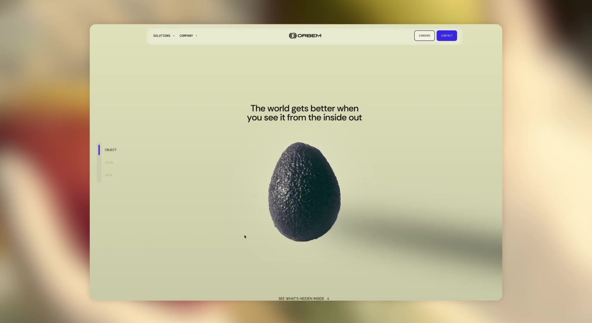
The new orbem.ai puts the three-layer system into motion: as you scroll, pages unfold from object to scan to data, so you experience the technology's logic rather than reading about it. Built in Webflow and developed by our brilliant partners at GRANDst., the site carries the full weight of the brand: the glass renders, the icon texture, the photography, and copy written collaboratively with the Orbem team in the new voice. Plain words, concrete outcomes, zero jargon-fog.
The Result
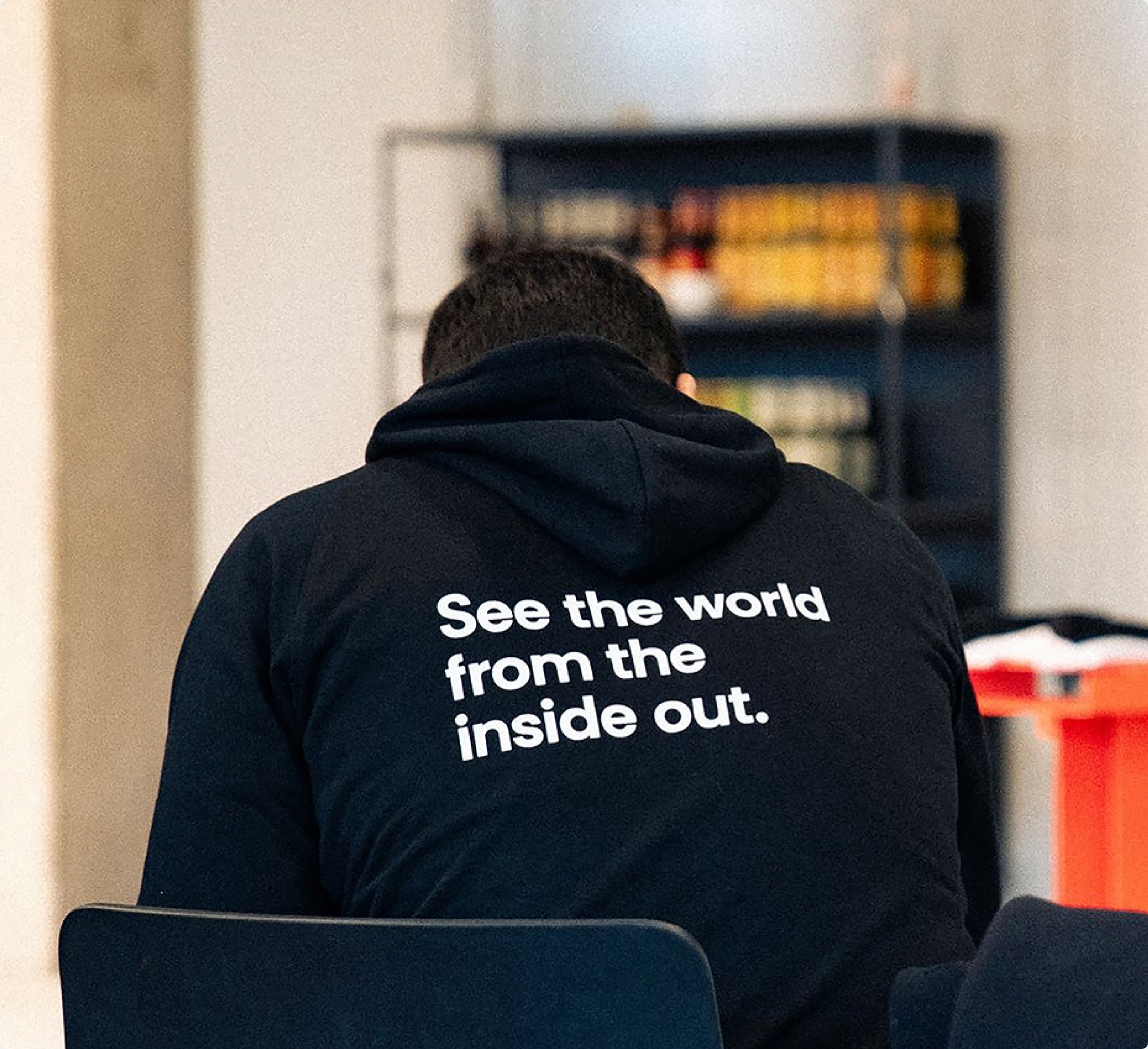
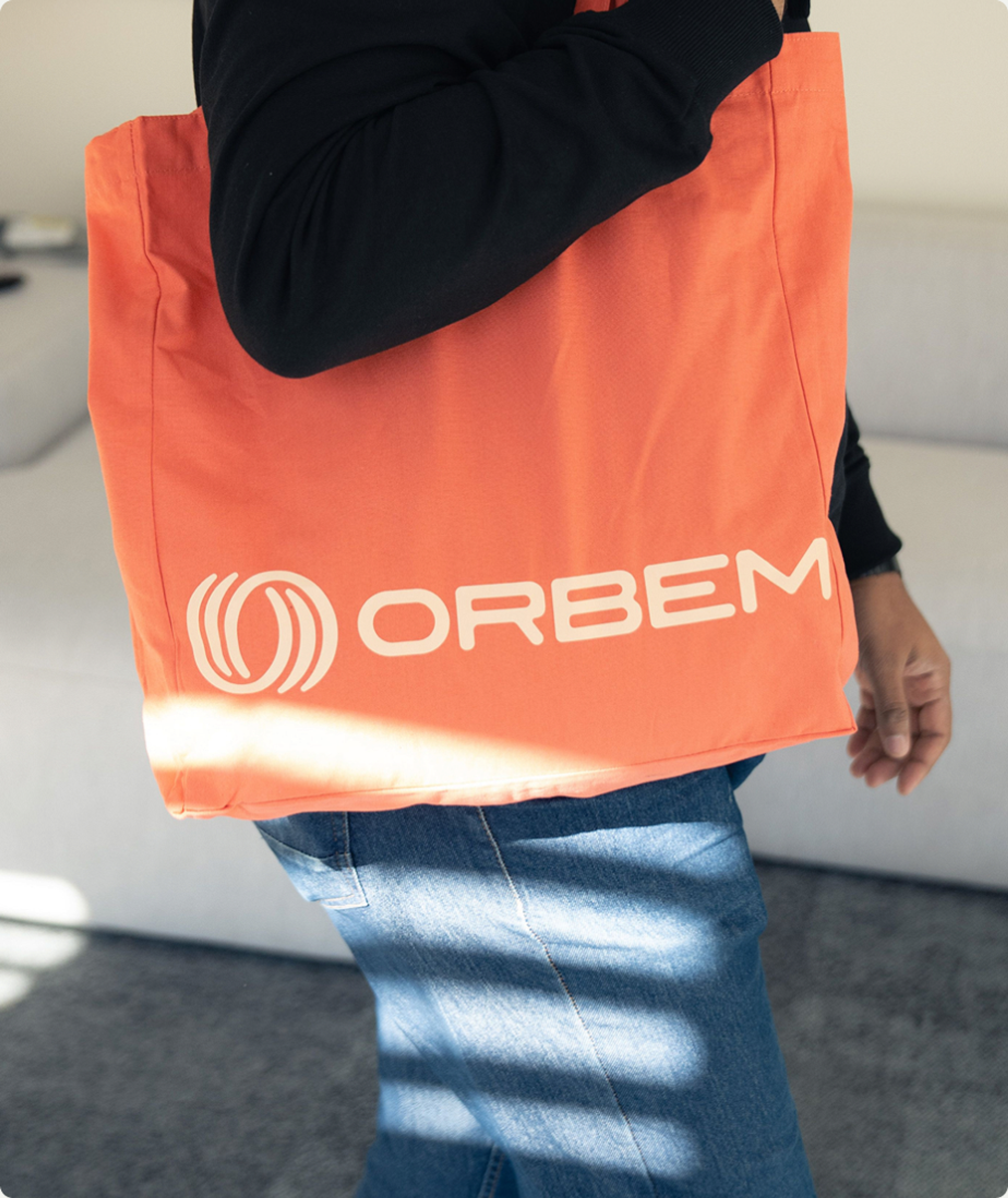
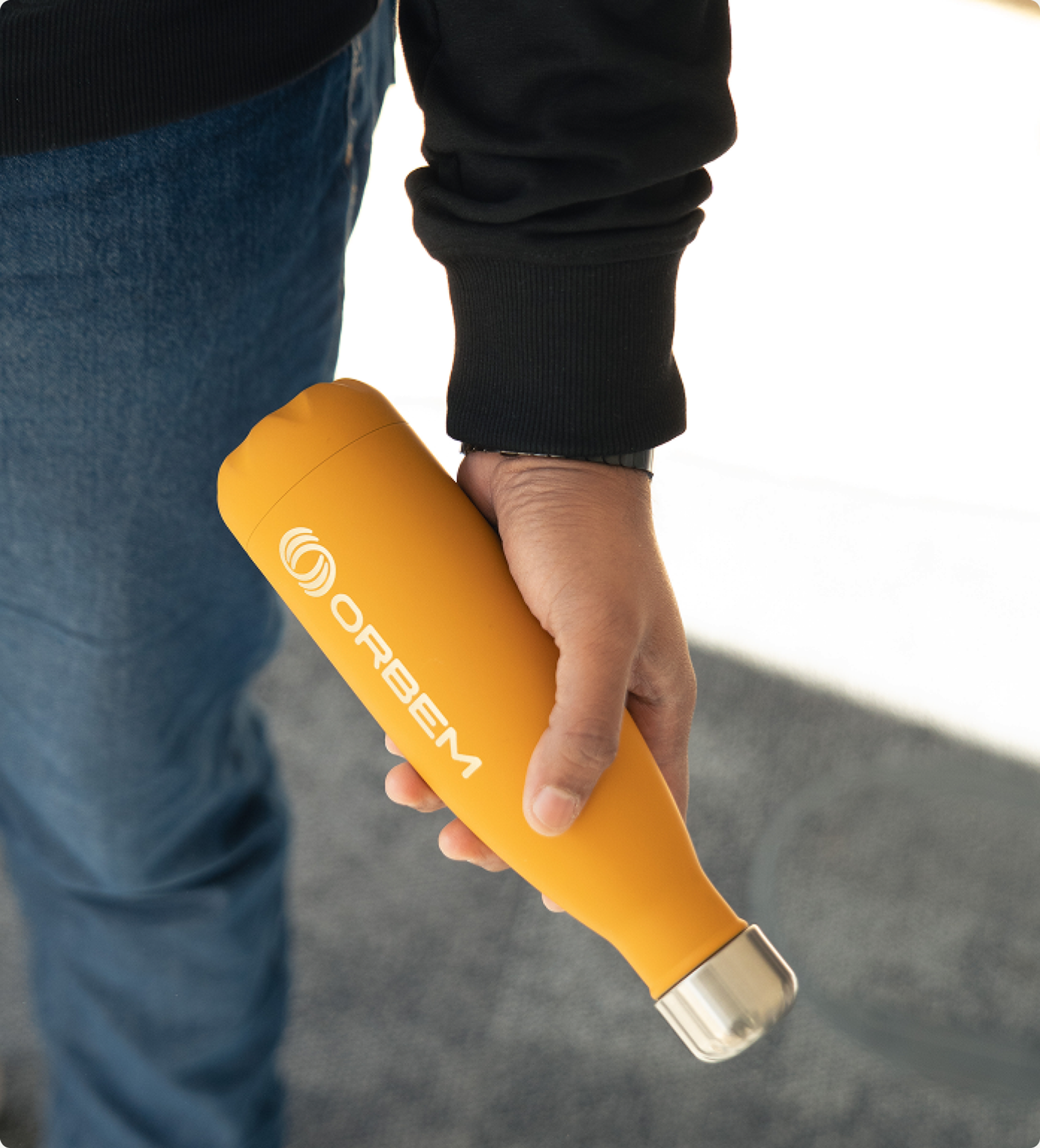
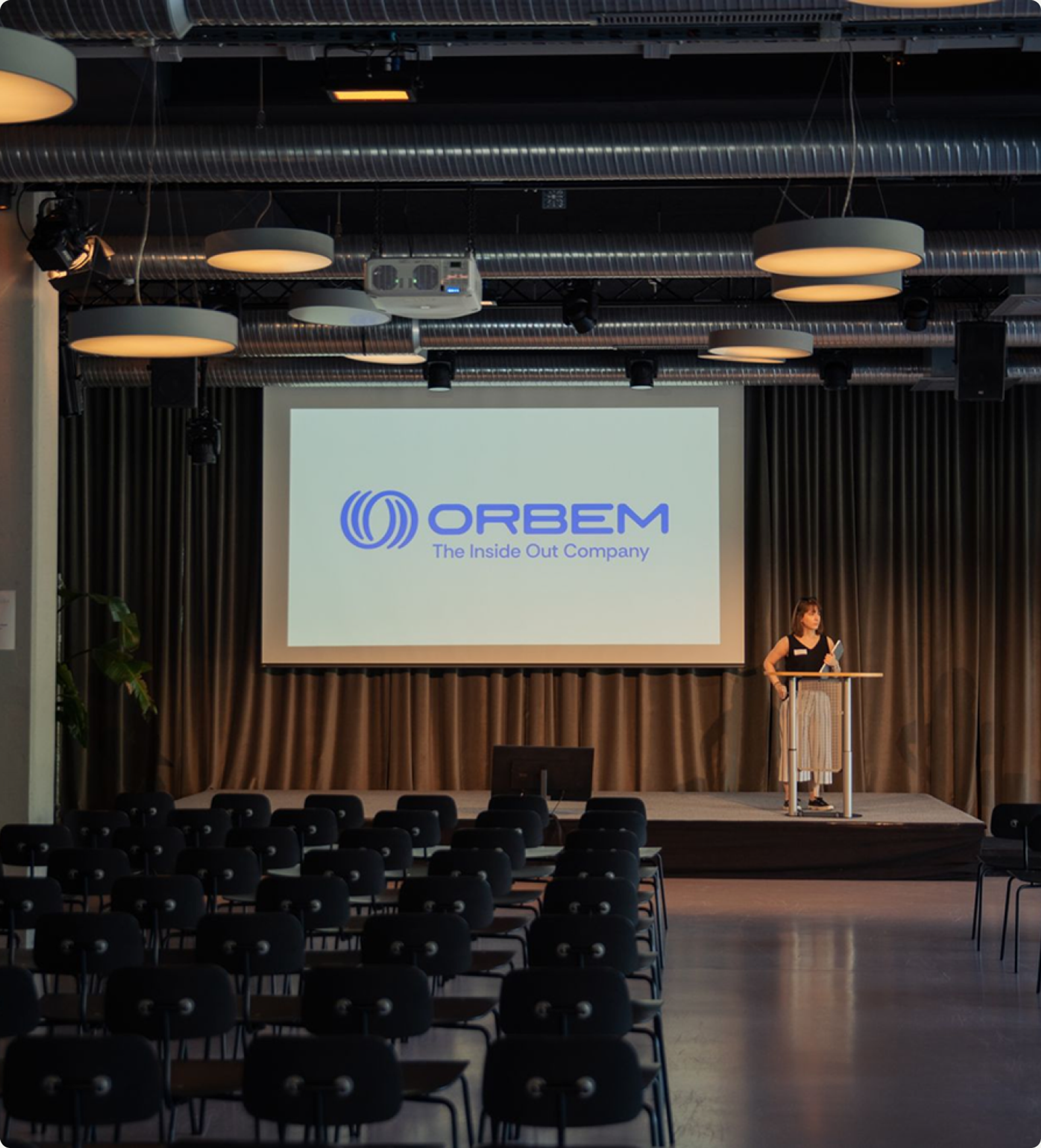
Orbem launched the brand internally during their December OKR week, then took it public in January alongside their €55.5 million Series B, one of Europe’s biggest deep-tech raises of the moment. What's happened since is our favorite part. A brand only works if the team behind it picks it up and runs, and Orbem has the kind of culture that runs fast. They’ve carried the identity across every channel, kept the voice sharp without us, and produced enough merch to stock a small boutique. Watching your work show up in the wild, on hoodies and hatchery floors and keynote stages, is the best acceptance test there is. We’re proud of where Orbem landed, and even prouder of what they're pointed at next: from eggs to ecosystems, from produce to people. The world really does get better when you see it from the inside out.
We’re stoked with the new brand identity. Everyone at Omoi did fantastic work. I’ve done this exercise before and never seen such a powerful mix of raw creative talent, strong messaging, and on-time delivery. You usually get one or two of those, never all three. Thanks again for the outstanding work.
Pedro Gómez, CEO
Orbem
Creative Direction
Carl Versfeld, Monica Kelly
Strategy & Copywriting
Carl Versfeld, Monica Kelly, Carl Jannerfeldt
Graphic Design
Hélder Pina, Clara Norborg, Jane Kukharchuk
UX/UI Design
Alba Panyella, Mikaela Thimmig
Motion
Hélder Pina, Jane Kukharchuk
3D
William Norberg
Photography
Nicolas Kern
Film Director
Tom Malmros
Video Editing
William Norberg
Producer
Naima Lorentzon
Project Management
Monica Kelly, Brittany Whyte
Web Development
GRAND St.