




Syntetica
Using science to make nylon go on and on and on.
NarrativeIdentityVisualsWebsiteFilm
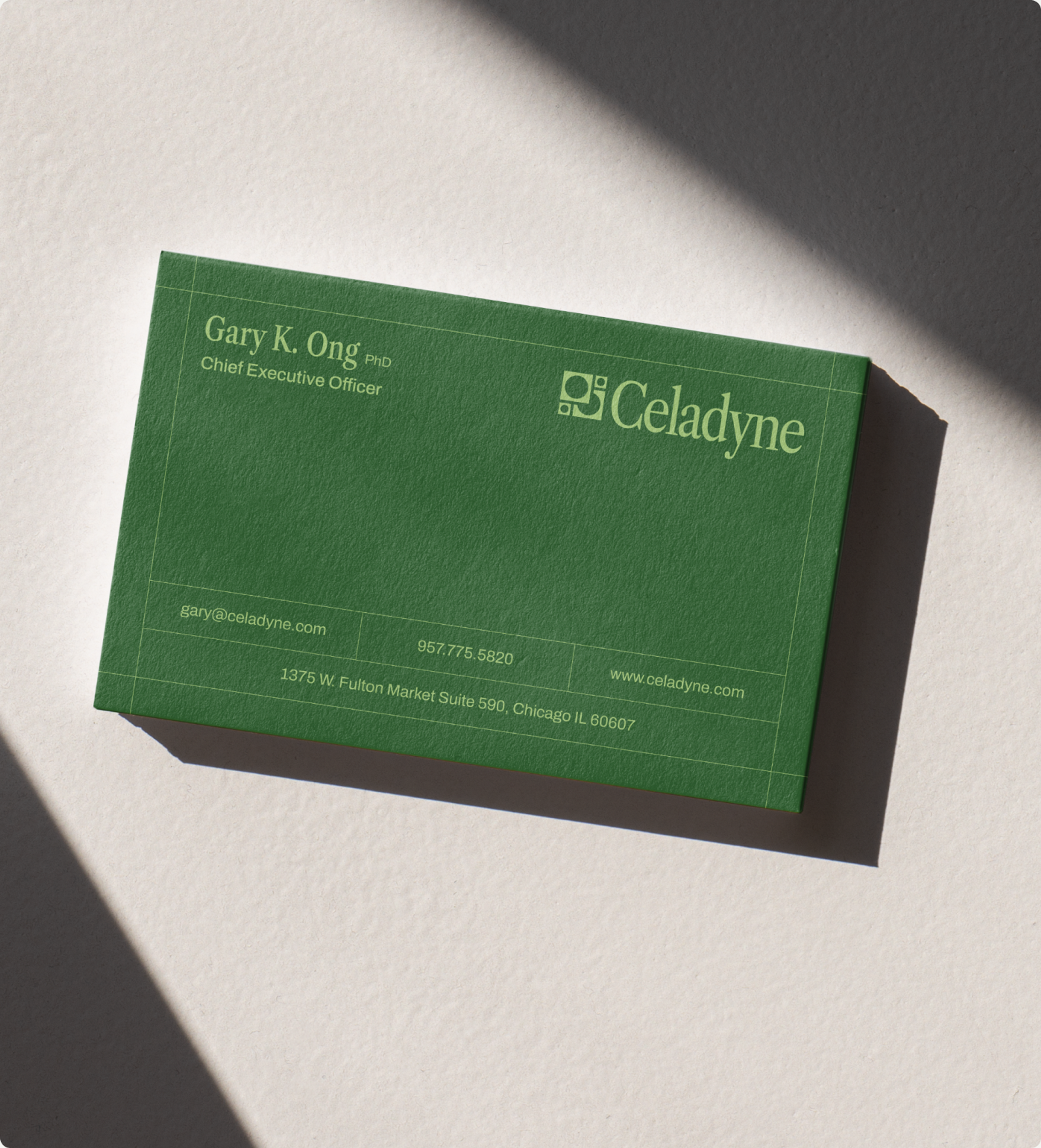
Celadyne is a Chicago-based energy company that builds the membranes at the center of fuel cells and electrolyzers. The thin layer that decides whether hydrogen is efficient, durable and affordable, or just a good idea on a whiteboard. Ahead of their Series A, we built the brand, the deck, the site and the visual language that makes the case.
Industry
Energy, Climate
Deliverables
Brand Strategy, Visual Identity, 3D Visuals, Website, Pitch Deck
The Challenge
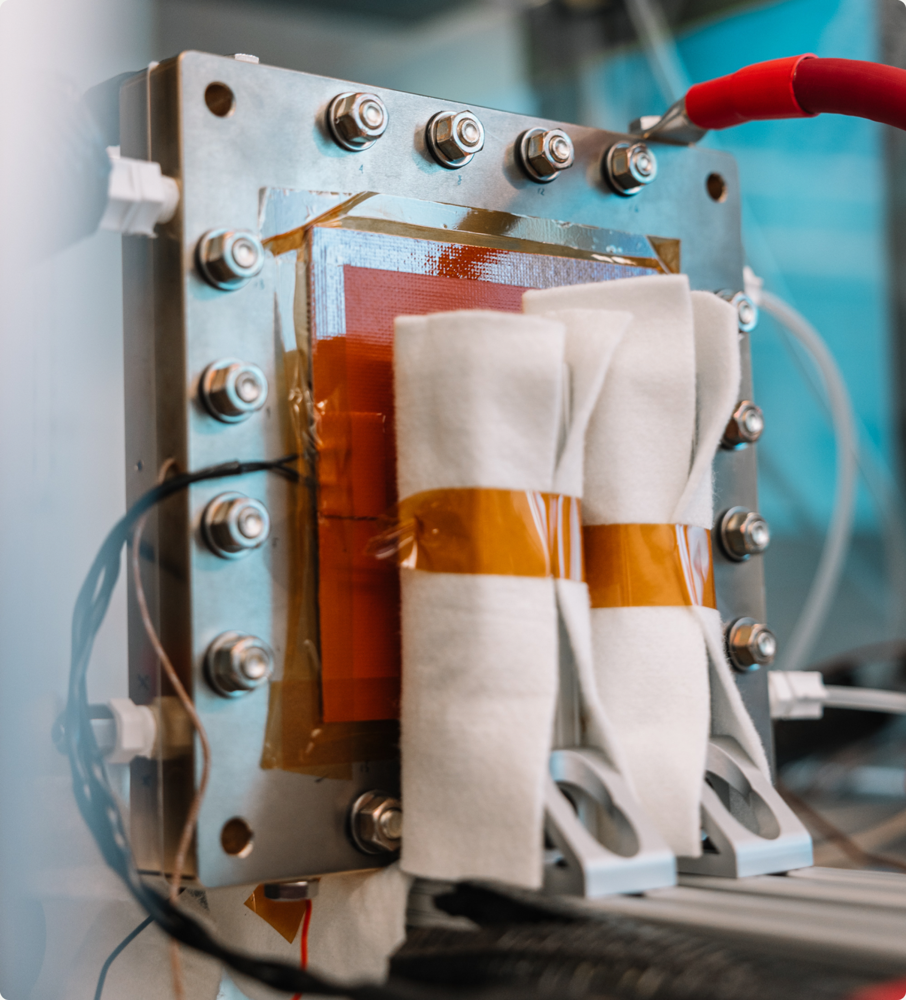
A membrane does its work at molecular scale, inside a sealed stack, in a category most investors have never had to picture. The pictures that do exist are not helping. Search for how a fuel cell works and you get diagrams that have not been meaningfully redrawn since school textbooks. Celadyne had a real materials breakthrough and no way to show it. The available move in deep tech B2B is to go sterile and hyper technical. To the founder it looks impressive, to the investor it is impenetrable. The job was translation, from chemistry into consequence, for a room that will never read the molecular diagram and would not be moved by it if they did.
The Bet
There was a period when American industry pointed itself at hard problems. Bell Labs, the Apollo program, fission reactors, Buckminster Fuller, the industrial campuses built to make things rather than measure engagement. Then a great deal of that ambition went to work on the attention economy instead. Celadyne belongs to the older tradition, so we built the brand as a return to the great age of American innovation.
The Look
Symbol
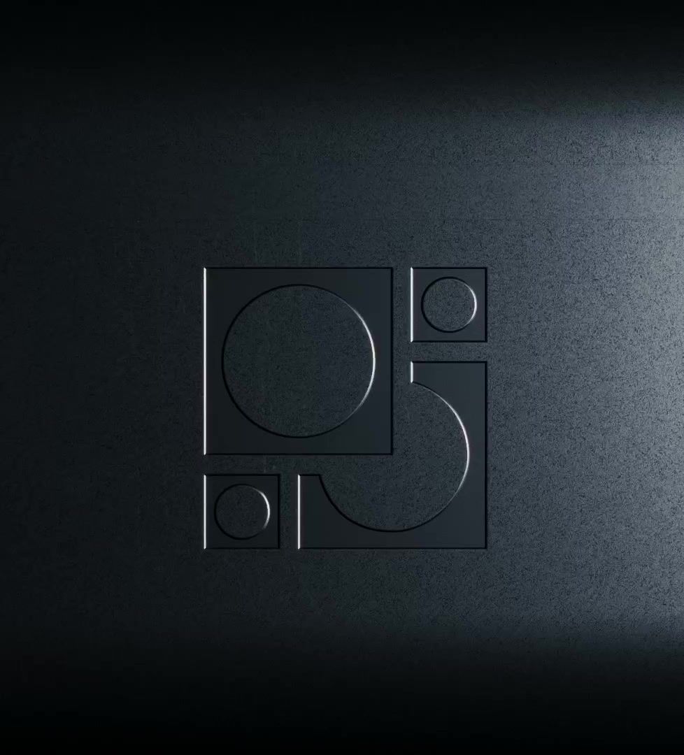
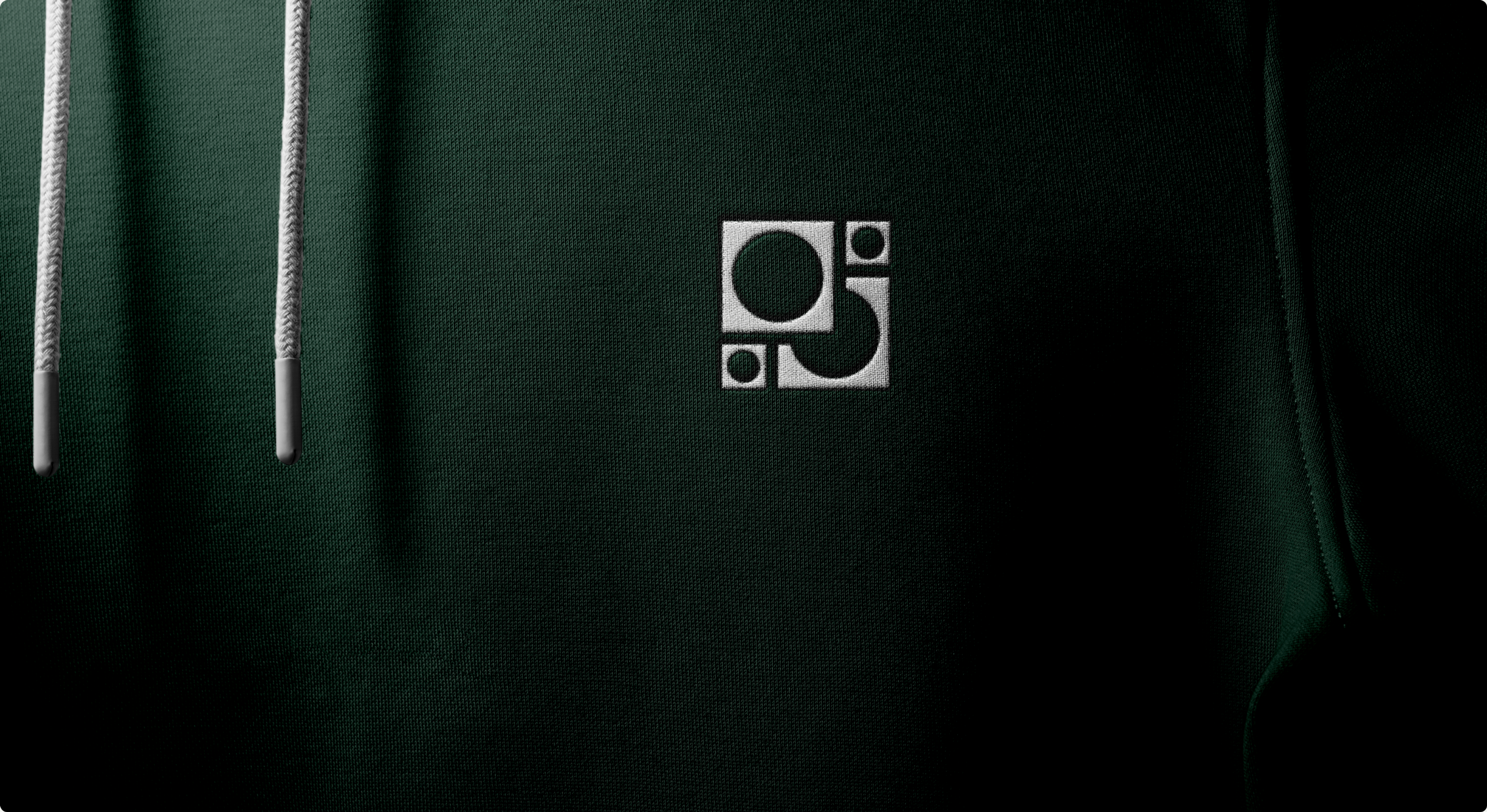
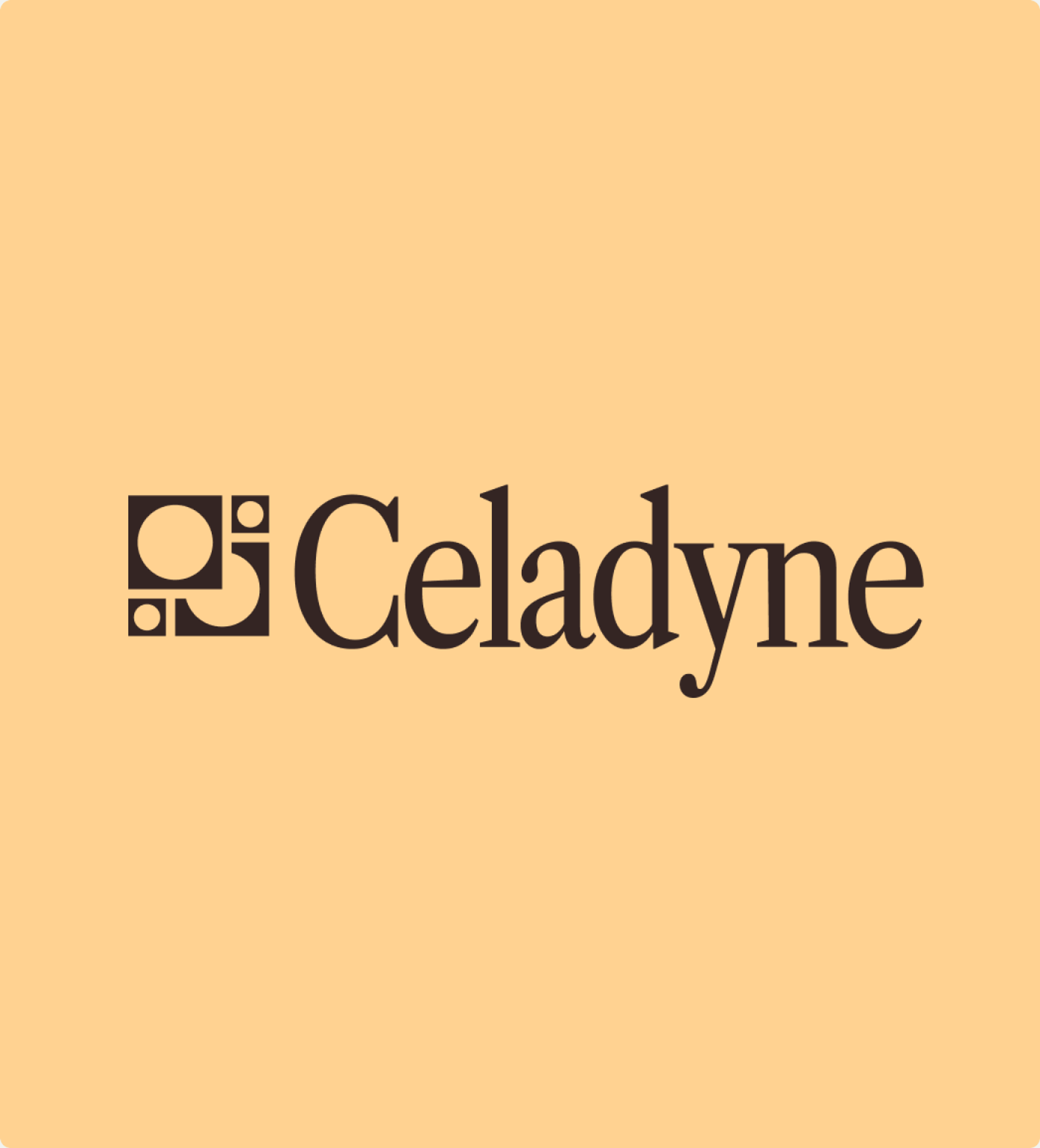
The symbol is the hydrogen molecule drawn honestly. Hydrogen is the simplest thing in the universe, one proton and one electron per atom, so the molecule has exactly four parts. Two large circles for the atoms, two small ones for the electrons, held inside a square standing in for the membrane plates they have to cross. The entire company in four dots and a frame.
Type
The custom wordmark is drawn from Libre Caslon Condensed, which also sets the headlines. A Caslon compressed to display width reads like period advertising without dressing up as it. Archivo carries subheads and body, a grotesque with American newsprint in its lineage. DM Mono handles labels and small details. Open source, all three.
Color
The palette runs pastel and duotone, closer to a mid-century laboratory than a modern energy deck, warm enough to keep the science from going cold. Brutalist architecture and early Apple ads stayed on the reference wall throughout.
The Imagery
How the Membrane Works
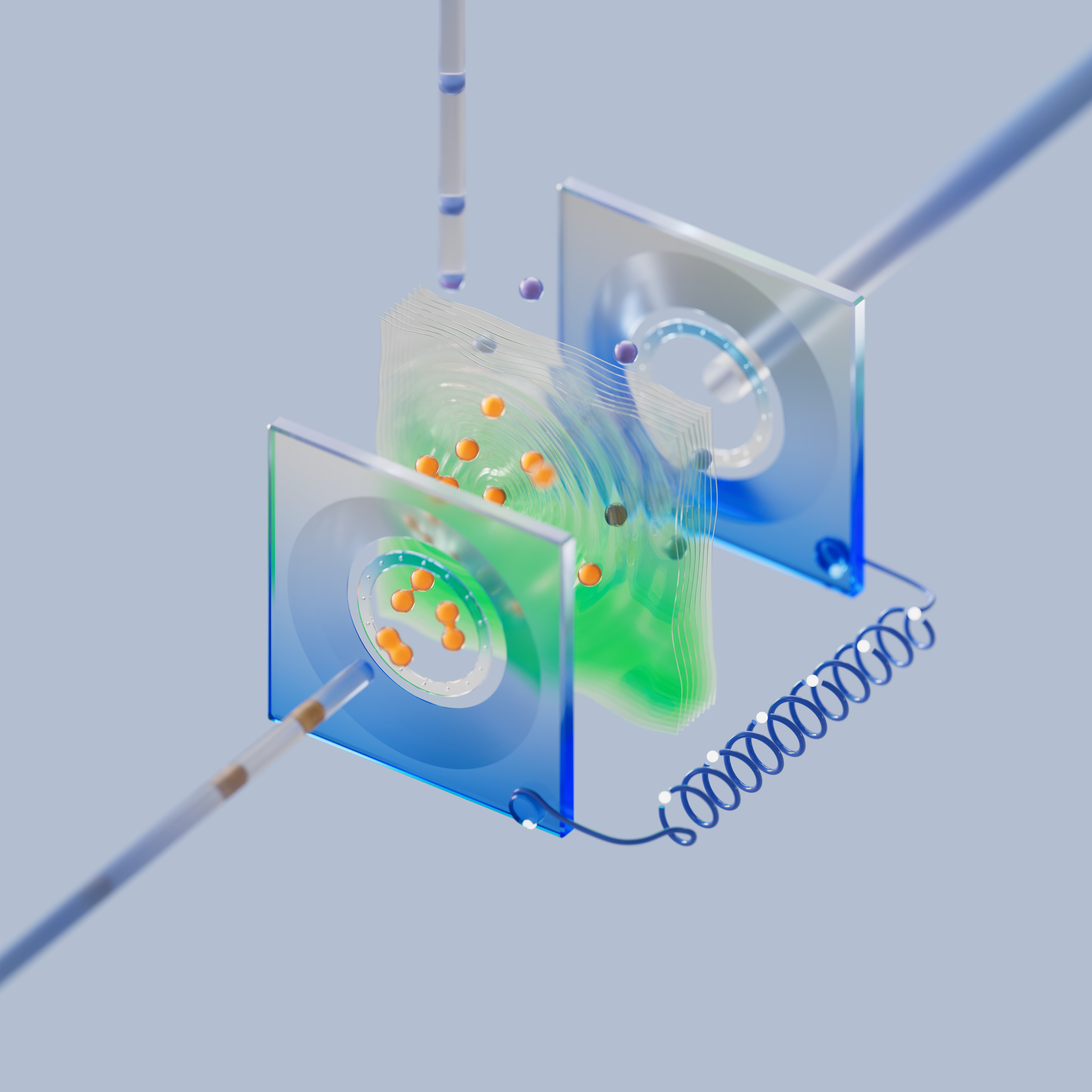
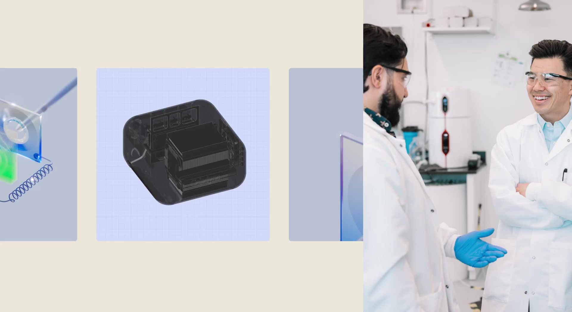
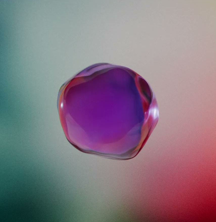
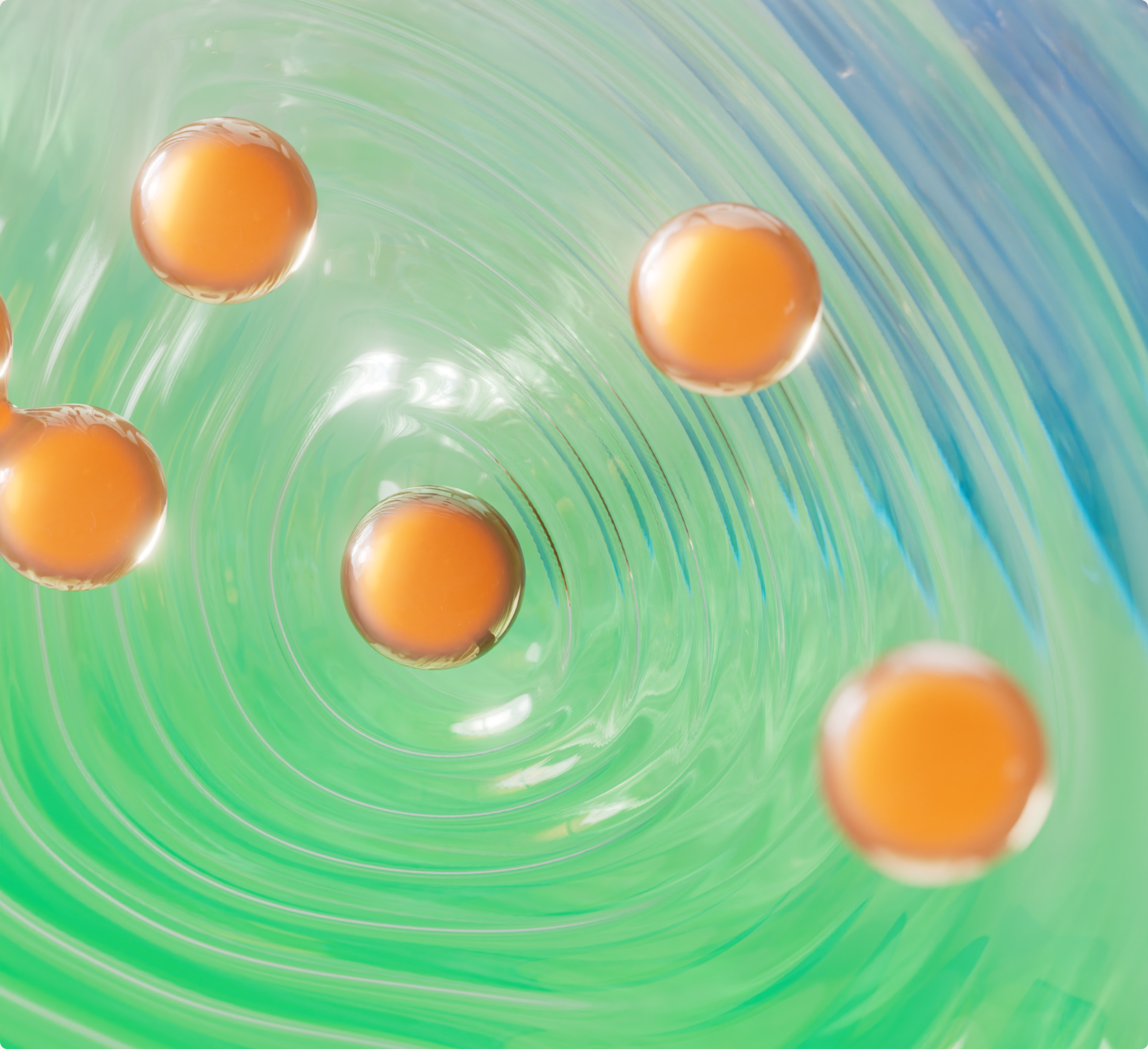
We built the explainer system Celadyne never had. A hydrogen molecule enters the fuel cell, splits, the protons cross the membrane, and on the far side they recombine with oxygen as water. The palette does the teaching. Green for Dura, the fuel cell membrane. Purple for Electra, the electrolyzer membrane. Orange for the incumbent, drawn thick and spongy and slowly opening holes as hydrogen crosses through it. Everything surrounding the membrane is rendered in transparent gradient plexiglass, so only the components that matter to the explanation are legible.
Building the Electrolyzer
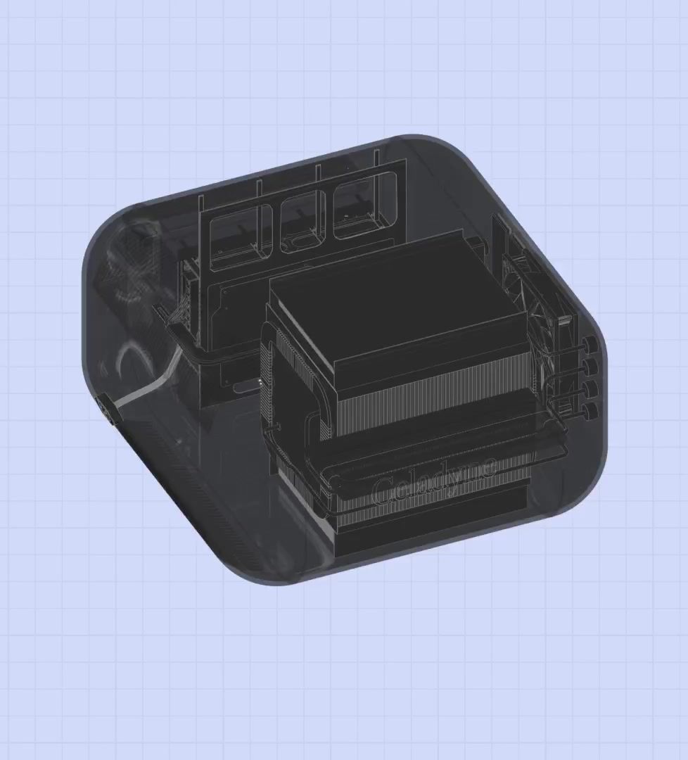
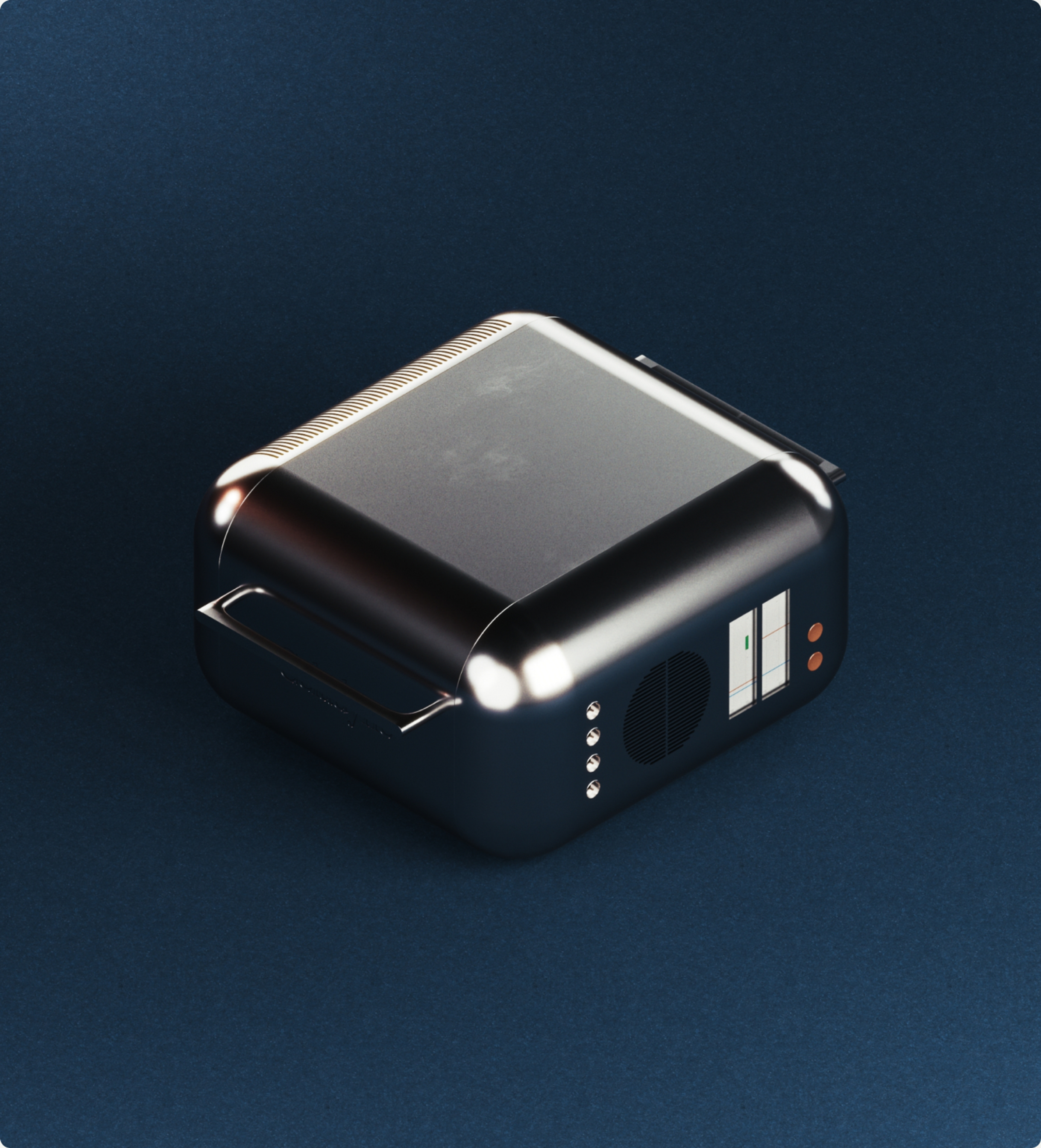
Then we built the machine. Working from the innards of their prototype, we designed a physically correct electrolyzer in a new anodized aluminum case, with real buttons and real screens, buildable rather than decorative. Dieter Rams, in a hydrogen plant.
Heavy Industry Footage
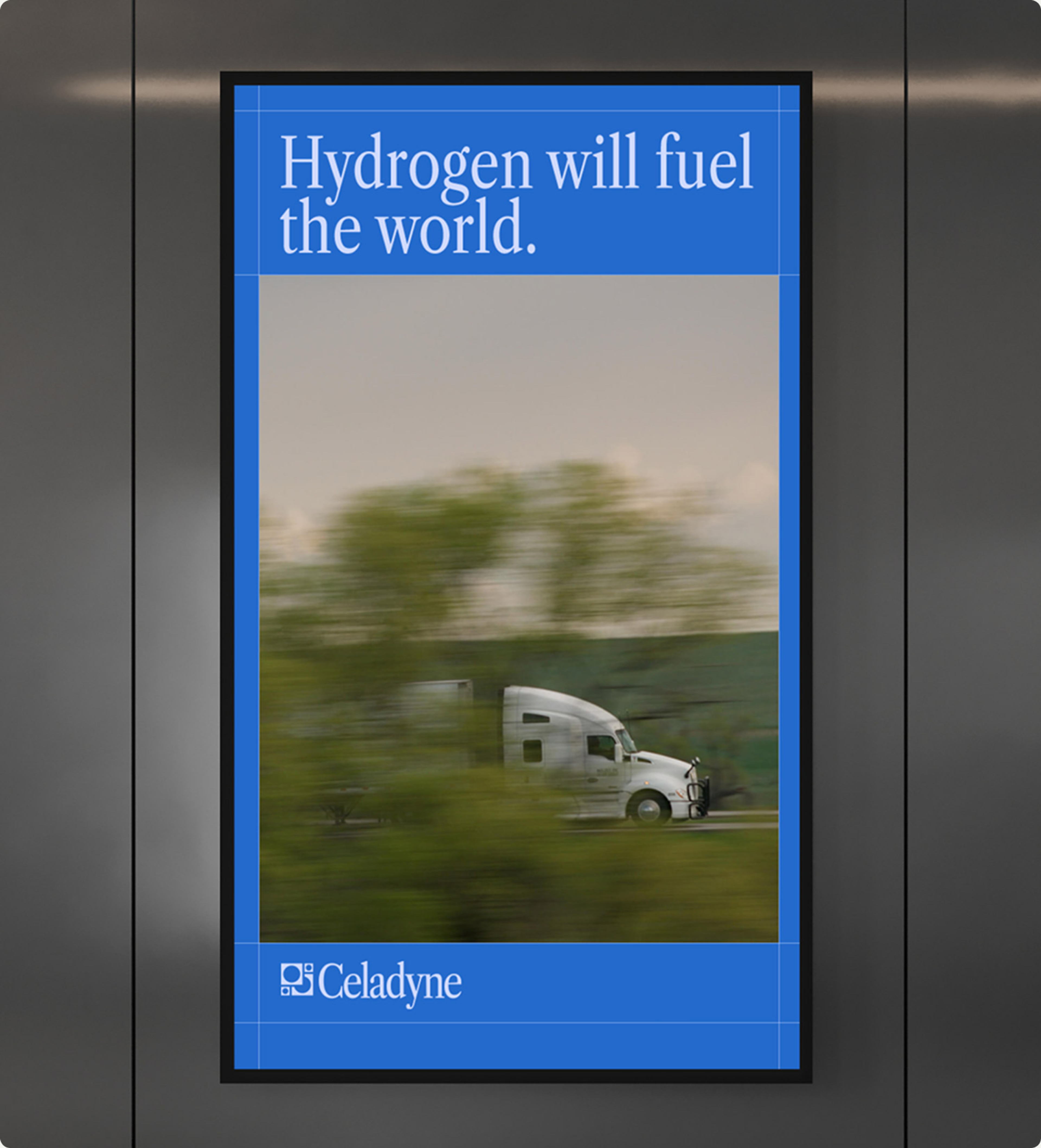
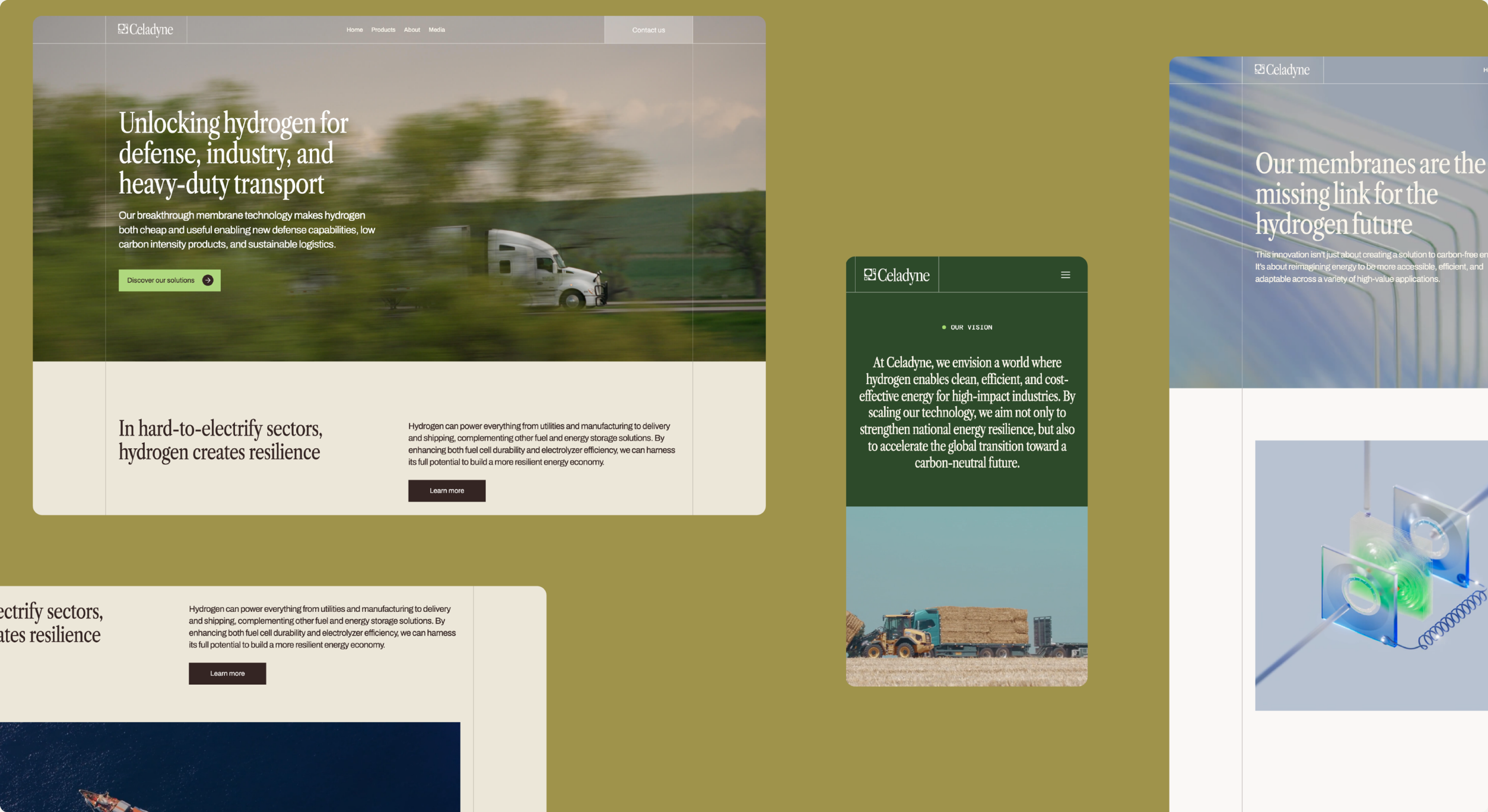
All of it runs against heavy industrial footage: trucks, cargo ships, defense, the places a fuel cell actually earns its keep. Molecular scale and port scale in the same cut.
The Rollout
We shaped the Series A narrative alongside the identity, tying one material to the whole shift toward hydrogen infrastructure, so that brand, deck, site and collateral carried Celadyne into those conversations as something other than a supplier of parts. Investors do not need to follow proton transport to understand where a company is placing itself. The membrane is the smallest thing in the machine and the reason the machine works, which turns out to be a fair description of the company too.
Creative Direction
Carl Versfeld, Monica Kelly
Art Direction
Hélder Pina
UX/UI Design
Hélder Pina, Anuja Tripathi
Web Development
Stefan Grubacic
Graphic Design
Hélder Pina, Monica Kelly
Strategy & Copywriting
Carl Versfeld, Monica Kelly
Project Management
Monica Kelly
3D
William Norberg