
The Climate Brick
The missing manual for scaling climate tech.
Brand RefreshVisualsWebsite
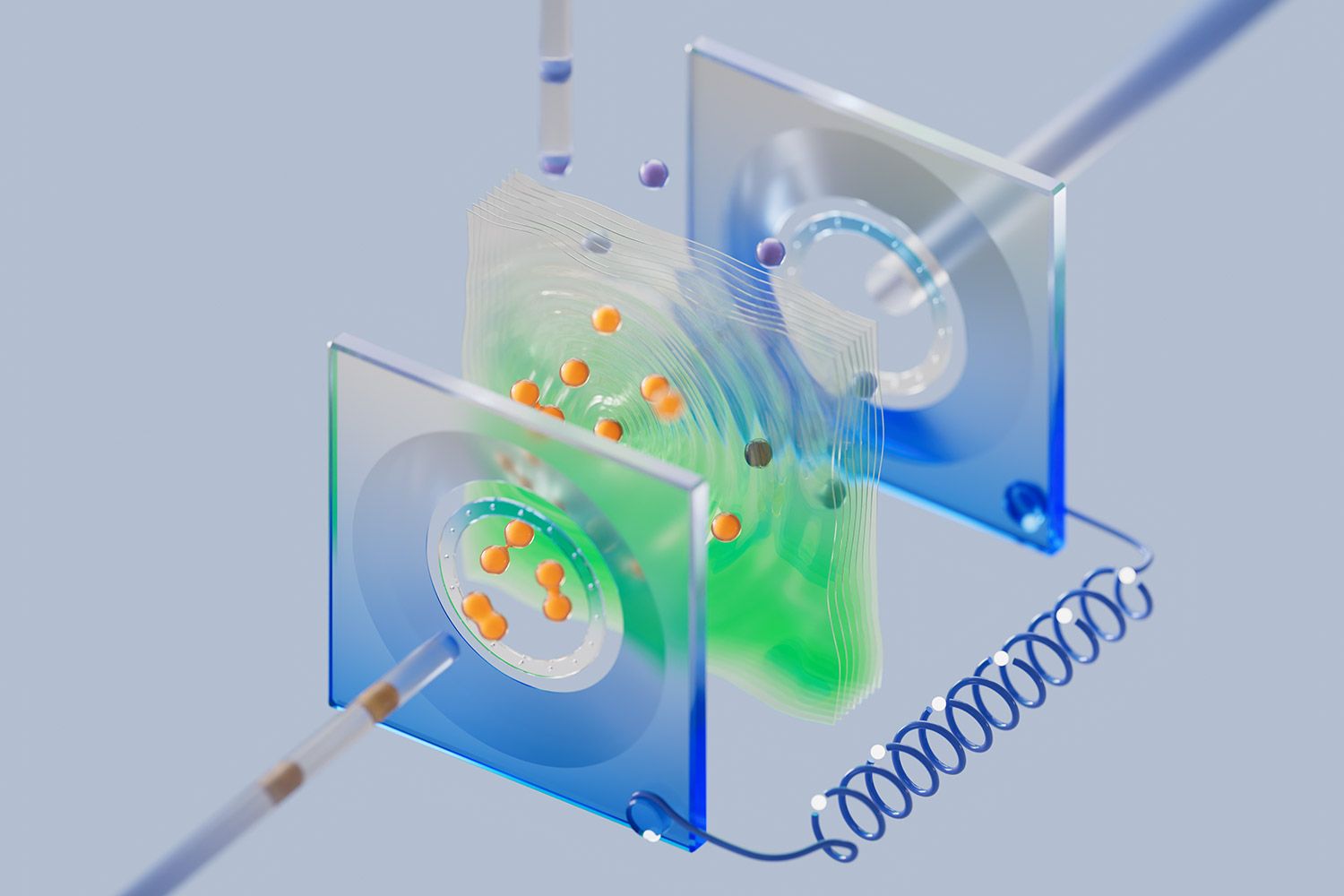
HyWatts builds the Power-Plant-in-a-Box™, a modular energy platform that runs on sun and atoms and can be dropped wherever power is needed. It generates renewable energy on site, stores the surplus as hydrogen, and converts it back to electricity on demand. We partnered with the Berkeley team on their brand, website, and Series A raise.
Industry
Energy, Climate
Deliverables
Brand Strategy, Visual Identity, 3D Visuals, Website, Pitch Deck
The Challenge
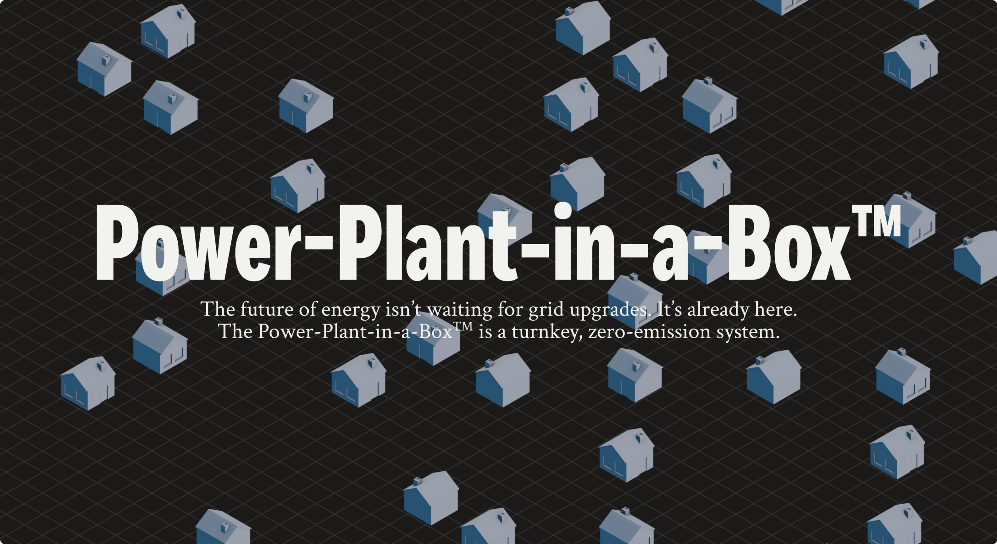
Power is getting slow, expensive, and unreliable at exactly the moment everything wants more of it. EV charging and data centers alone will draw as much power as fifty million homes by 2030, and grid connections take years. HyWatts solves that by putting the plant on site, which means their product does not live in a substation somewhere out of town. It lives behind a housing development, next to a charging hub, in view of the people it serves.
Which is a branding problem as much as an engineering one. Hydrogen has spent two decades being explained badly, usually by companies that look like engineering firms because they are engineering firms. HyWatts needed the opposite.
The Look
Wordmark
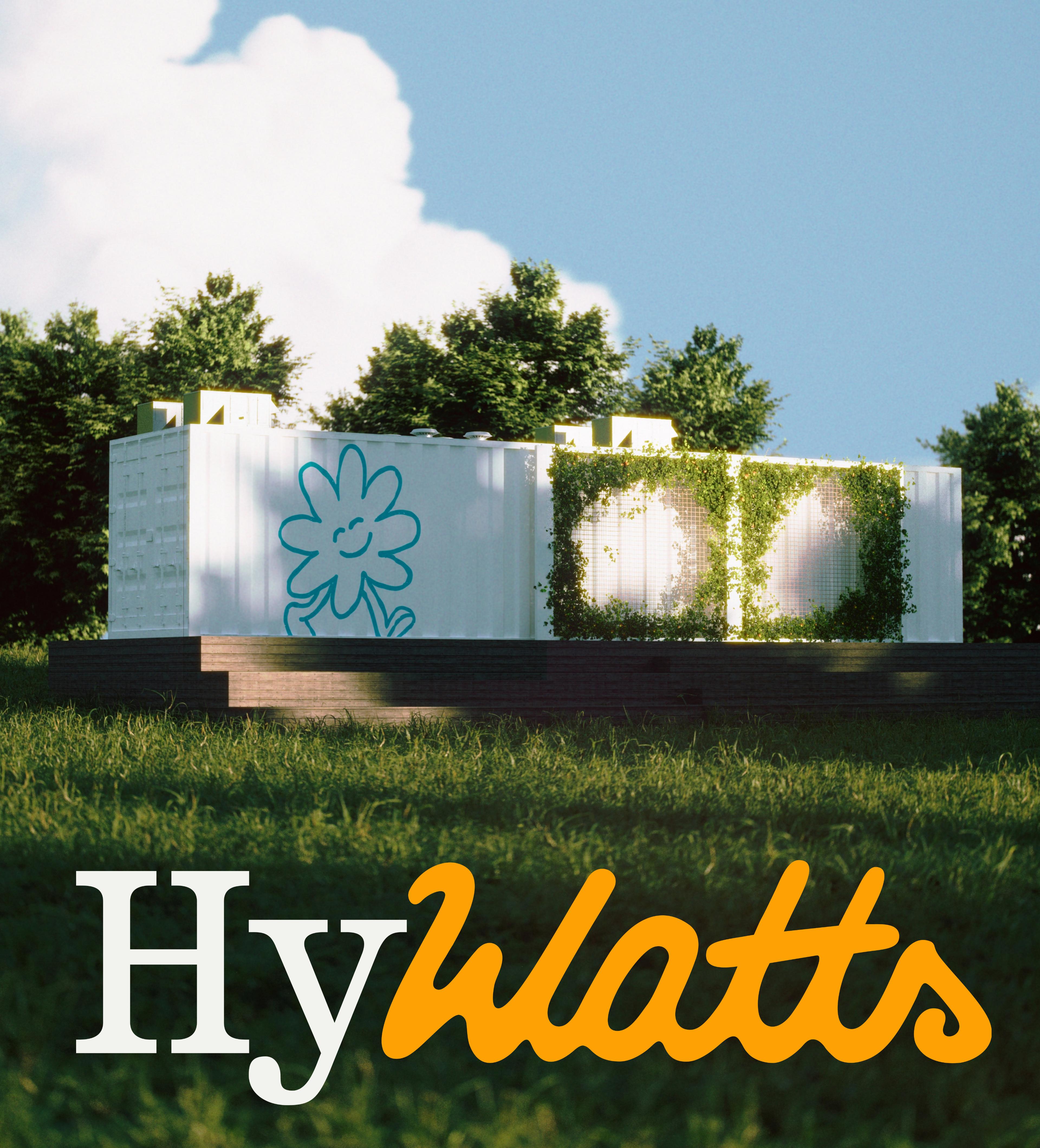
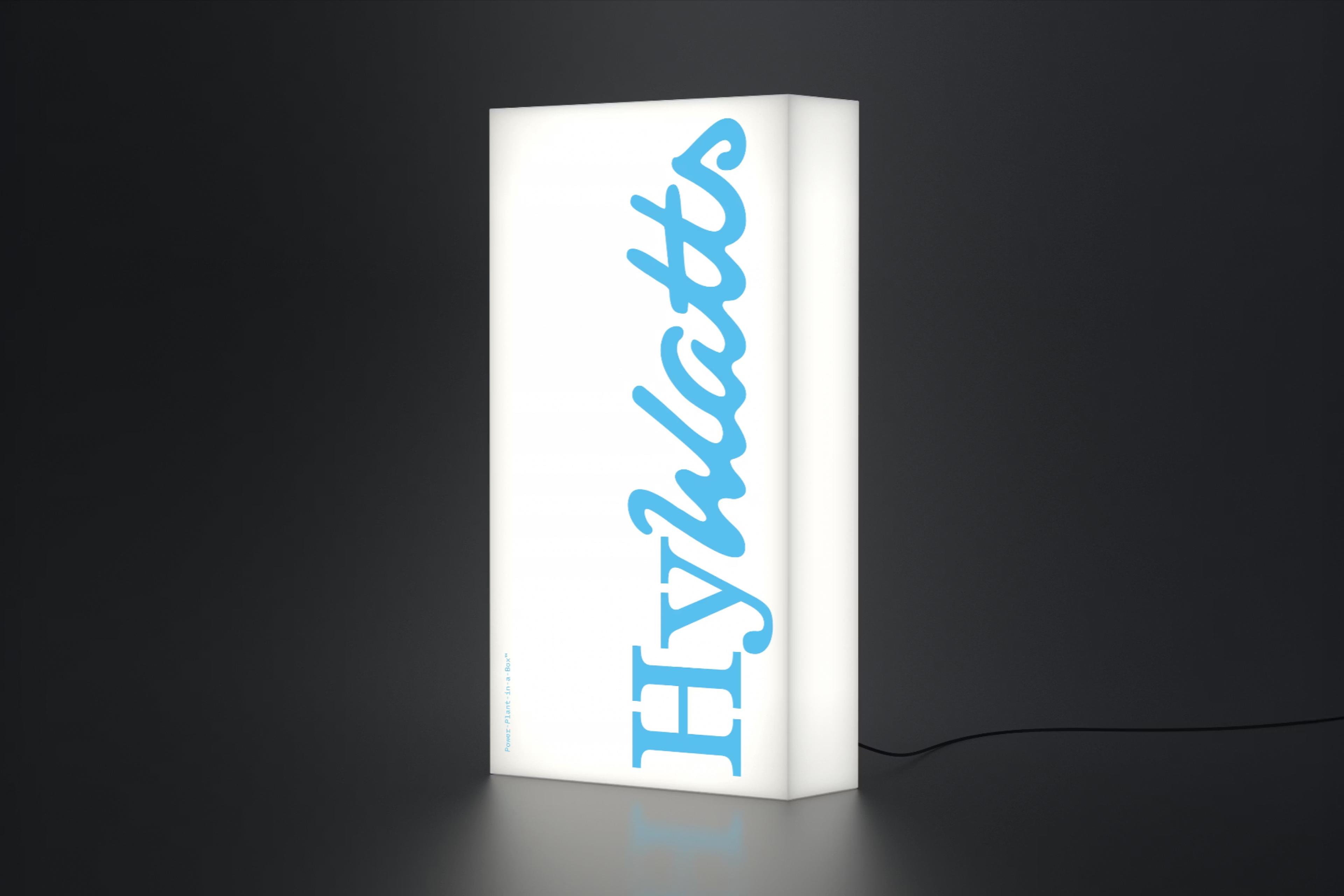
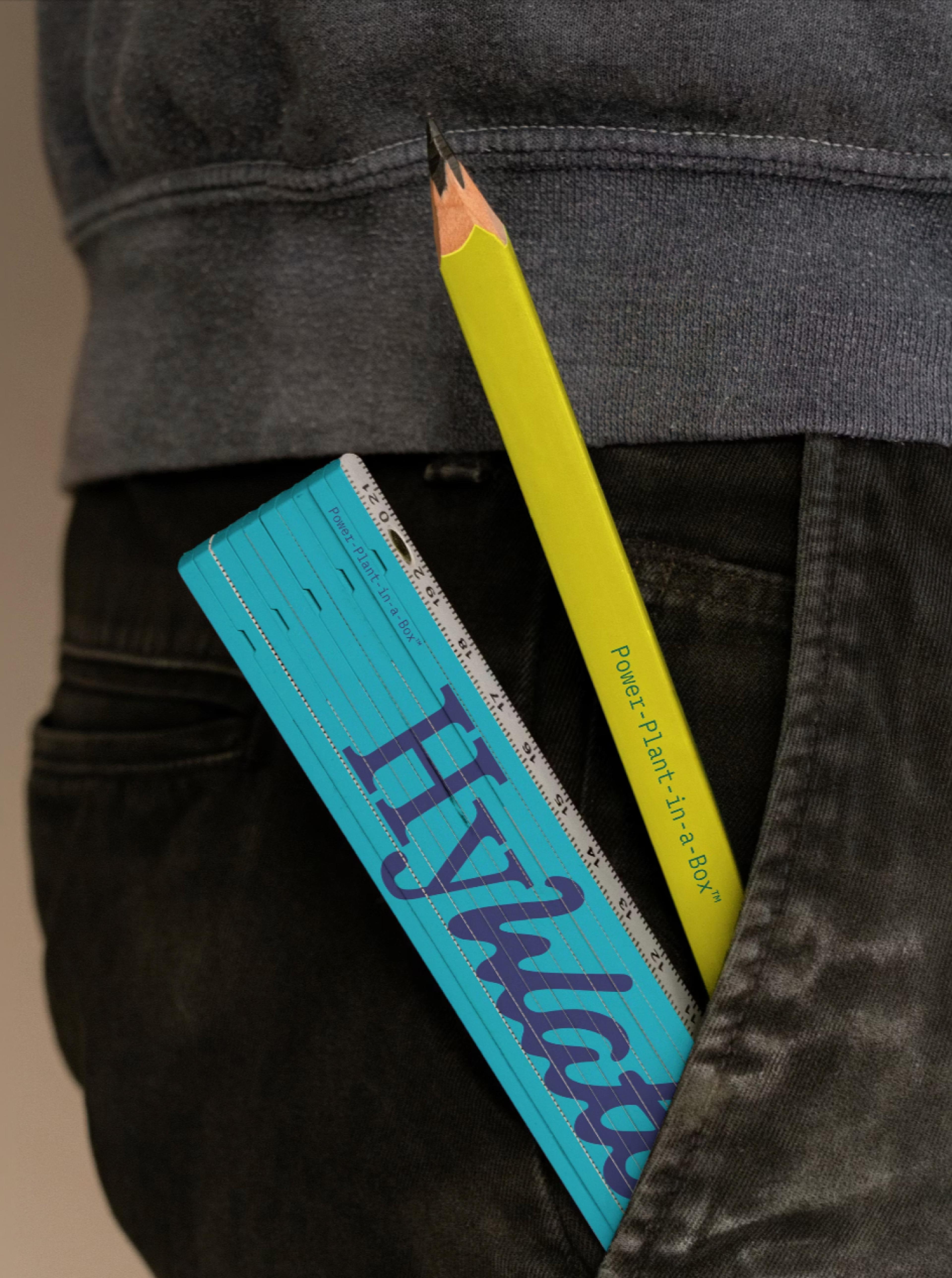
A slab serif Hy, solid and engineered, joined to a hand-drawn script Watts. Hy does a lot of work in two letters: hydrogen, hybrid, hyperlocal, hyperefficient. Watts also does double work, a nod to a unit of energy and a naming opportunity for a mascot. Speaking of which.
Mascot
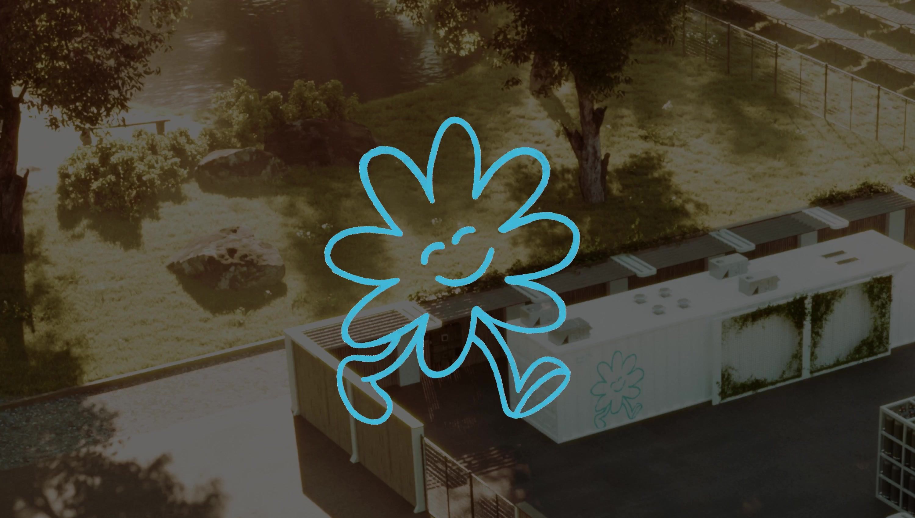
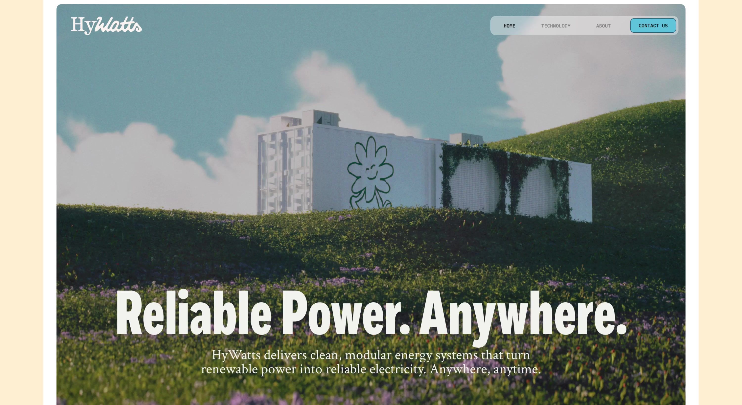
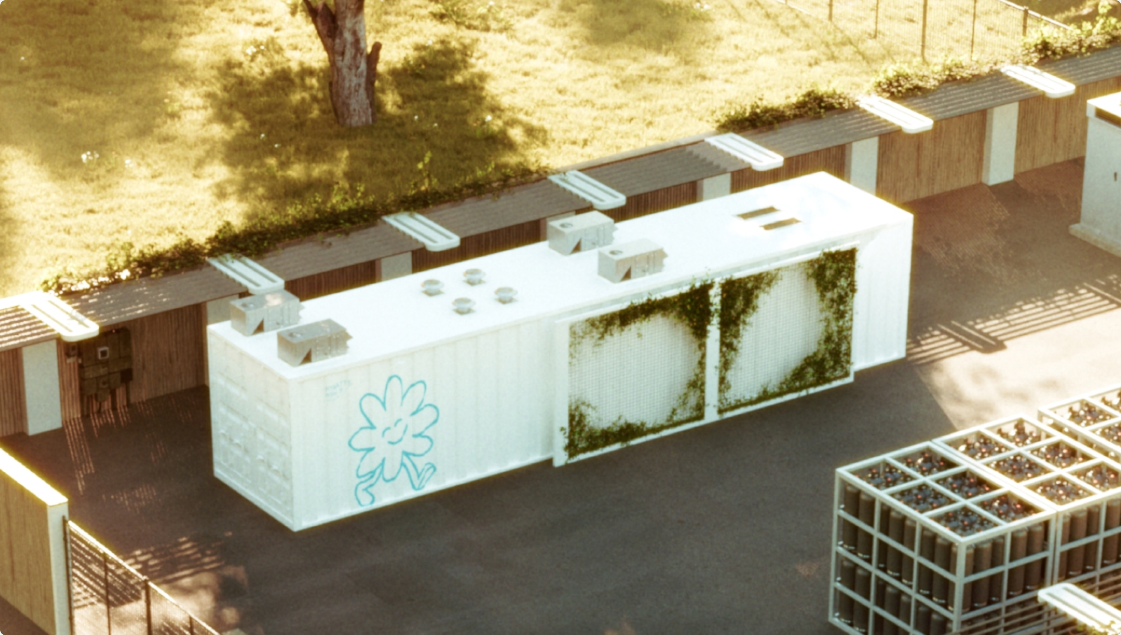
A literal power plant. The pun is fully intended. Wattson is a hand-drawn flower with a face and a walk, and he is a power plant. He shows up on the side of the unit, in the app, on the site, wherever the brand needs a face rather than a diagram. When friendliness is the brief, it’s hard to go wrong with proper hand-drawn illustration.
Type
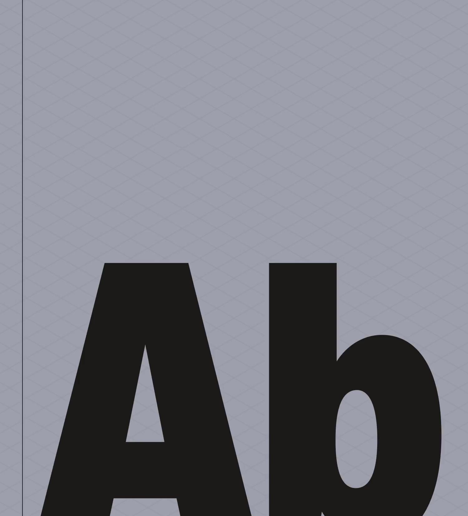
Fort Extrabold Condensed sets the headlines, squared and engineered. Crimson Text carries the body, an old style in the Garamond tradition and not the font anyone expects from a hydrogen company, which is the point. It reads like something written rather than specified. IBM Plex Mono handles the labels and buttons.

Color
The palette follows the same logic. Orange and a bright sky blue carry the optimism, cream and pale lime keep it warm, and a dark navy with a run of greys sits underneath for the moments the material turns technical. Closer to a public park than a power station, and still able to hold a spec sheet.
3D
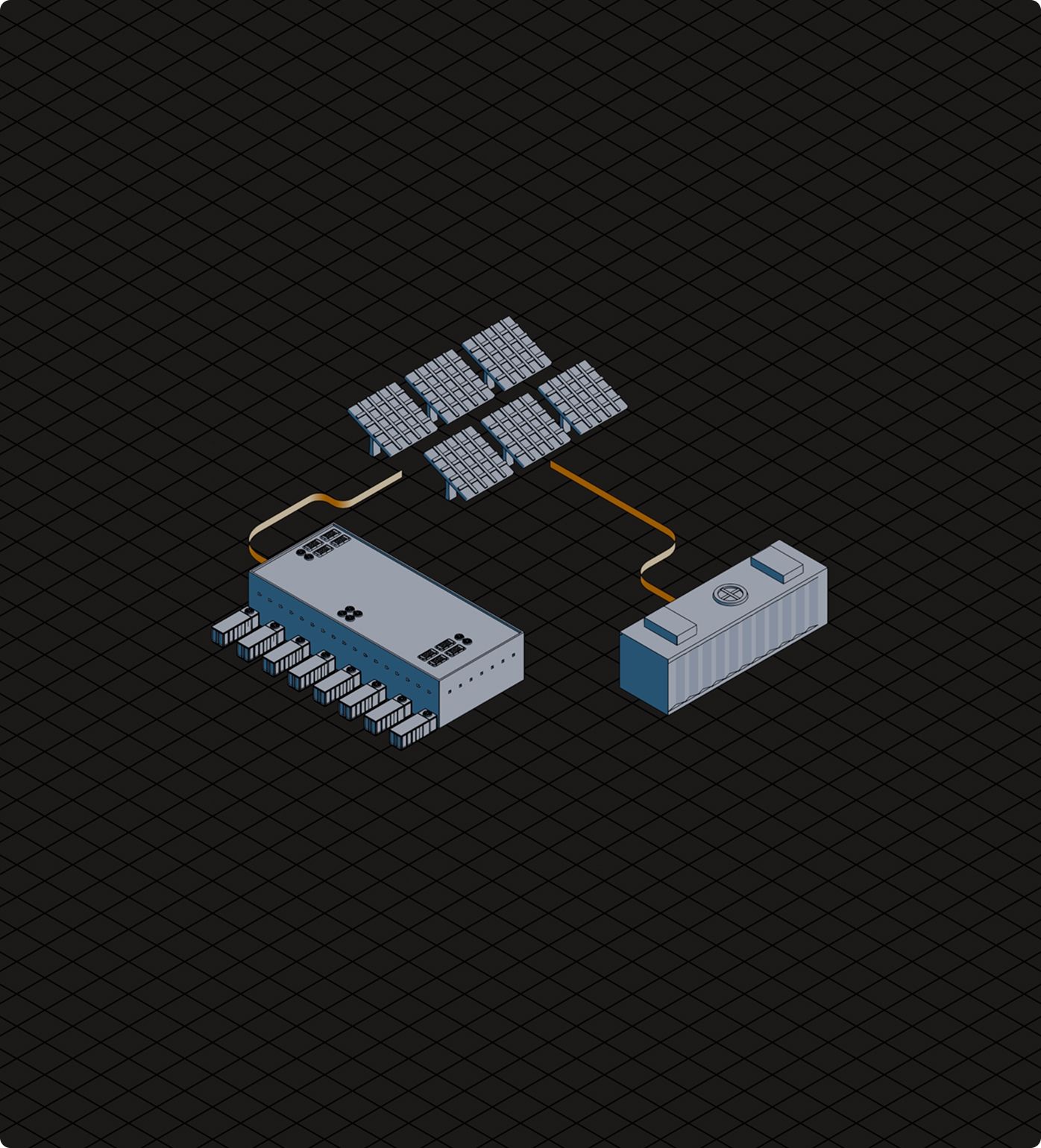
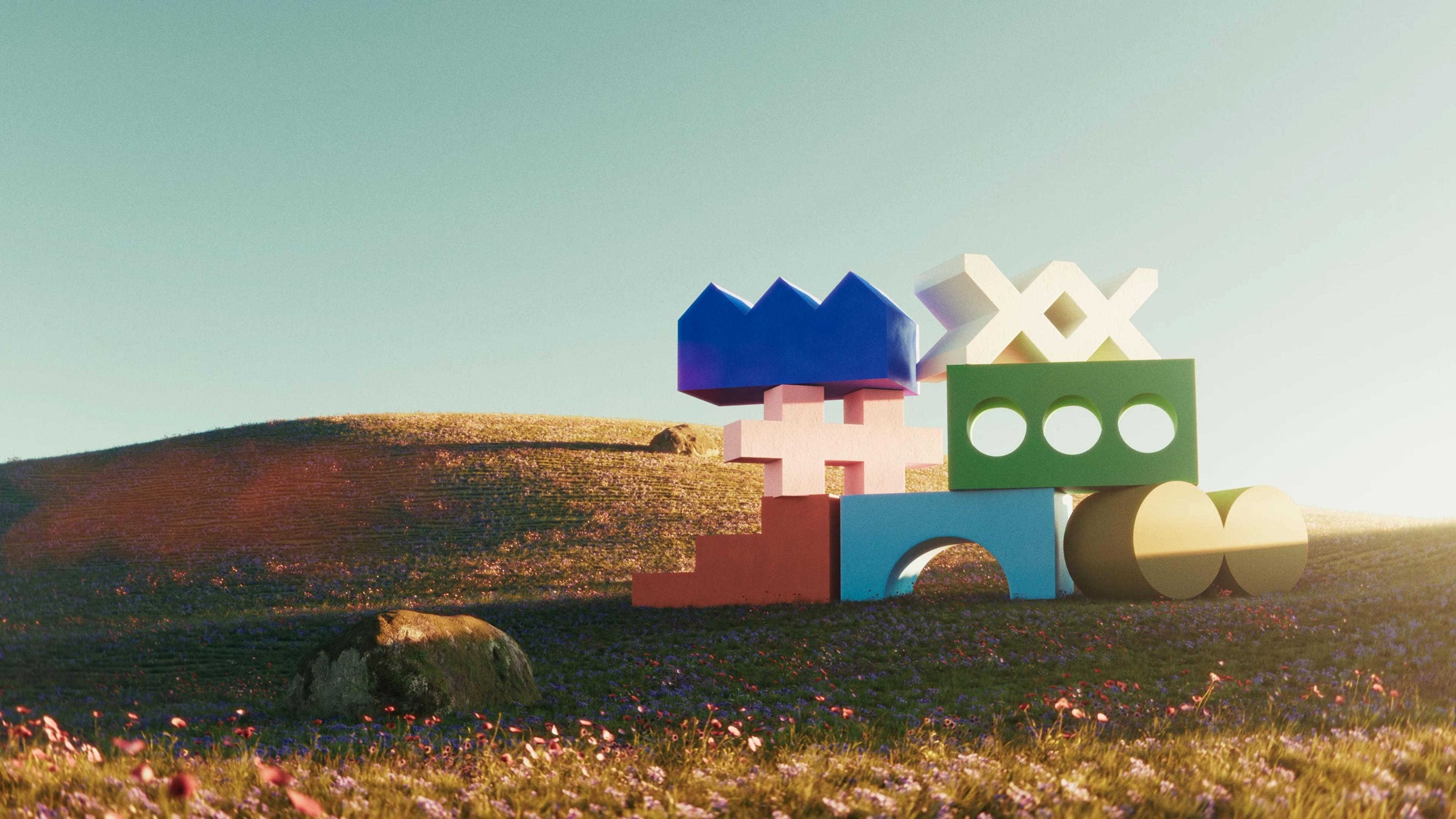
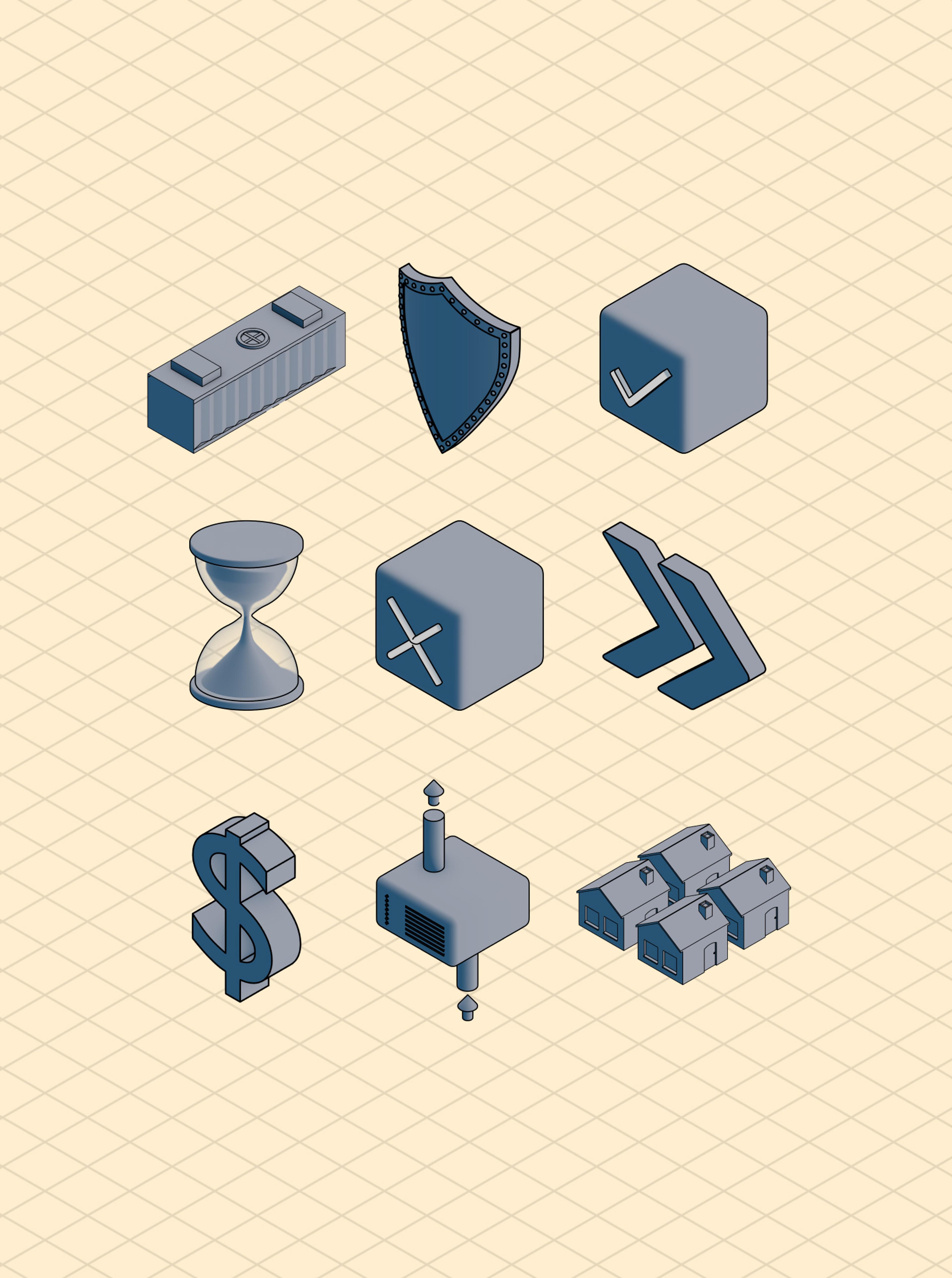
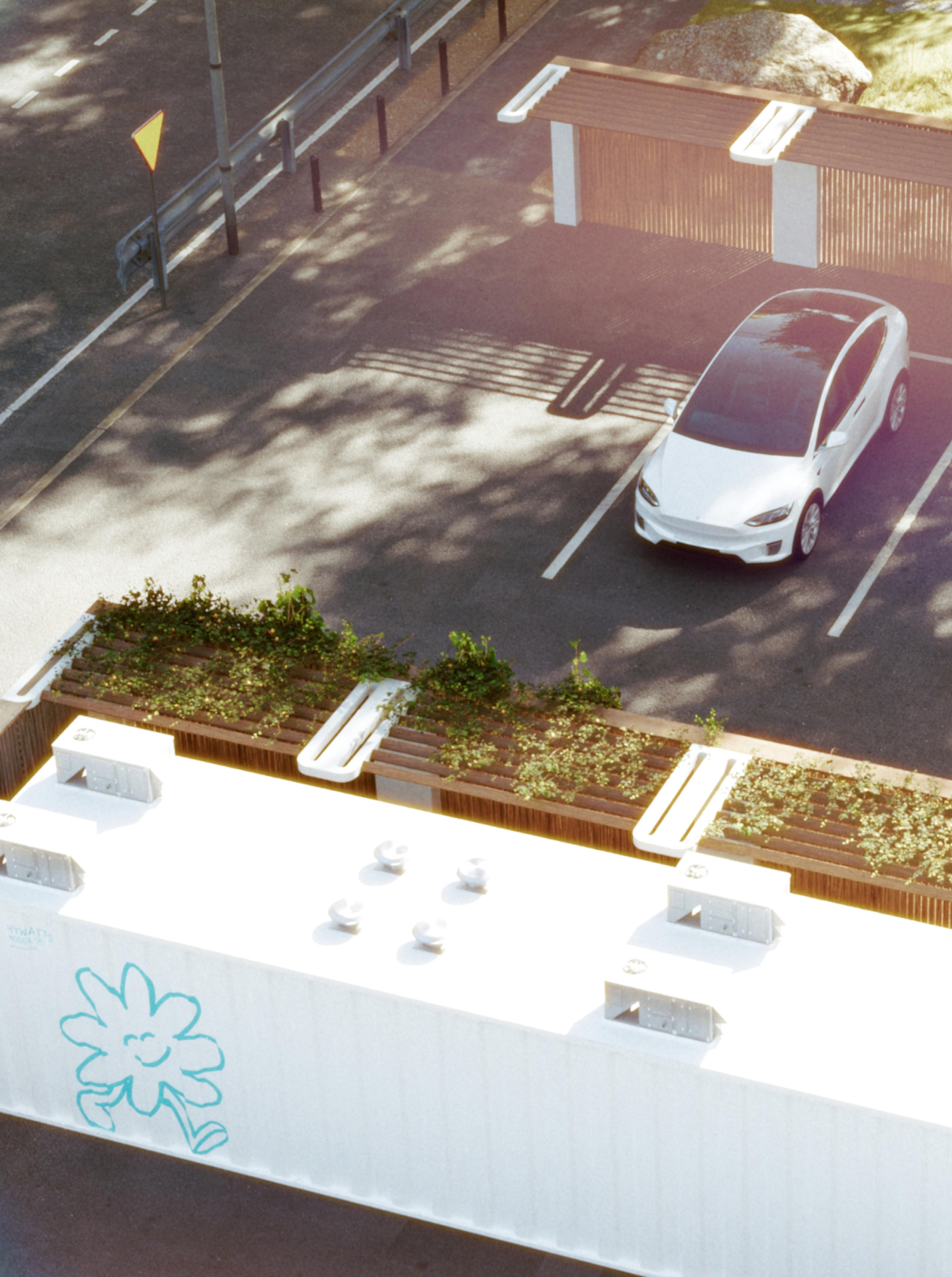
We built a 3D system with three registers. Isometric for the explainers, turning generation, storage, and conversion into something a non-engineer can follow in one pass. Aspirational for the hero work, the box sitting in a green hillside under a very good sky. We are not going to pretend the reference is anything other than the Windows XP desktop. It sets the tone in one frame: this thing is welcome here. Realistic for the proof, showing the box in context and at scale, powering off-grid communities and charging stations, for the investors and developers who need to picture it on their own site.
The Rollout
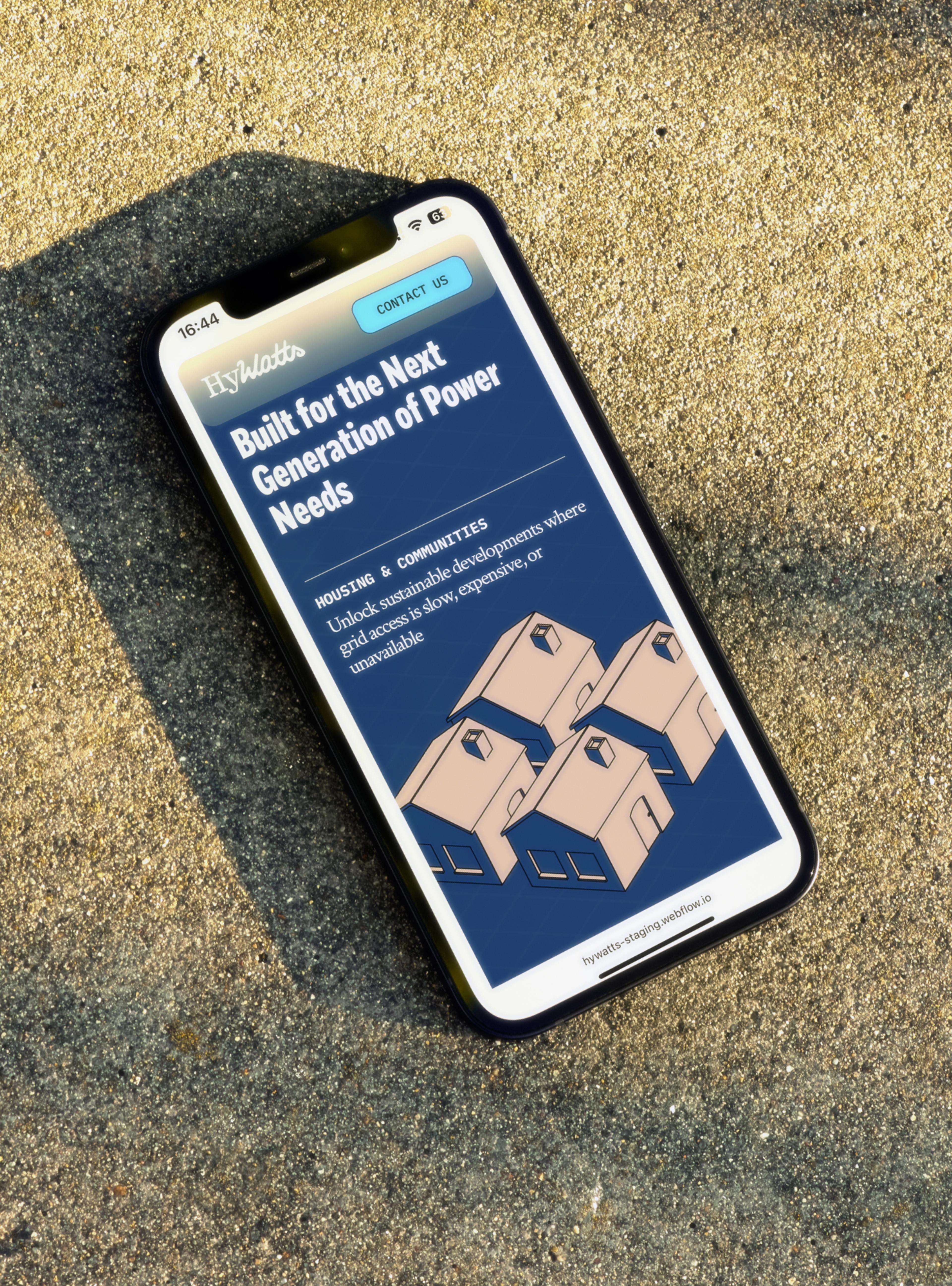
We applied the look across a new website—www.hywatts.com—and pitch deck to allow HyWatts to emerge into the world with the energy it needed to get investor buy-in and bring power to the people. The work transformed the brand from one you wouldn’t want in your backyard into one that is friendly and easy to understand.
Creative Direction
Carl Versfeld, Monica Kelly
Art Direction
Hélder Pina
Strategy & Copywriting
Gabe Stuart, Monica Kelly
Graphic Design
Hélder Pina, Clara Norborg, Jane Kukharchuk, Anuja Tripathi
UX/UI Design
Alba Panyella, Hélder Pina
Illustration
Clara Norborg
Motion
Hélder Pina, Jane Kukharchuk
3D
William Norberg
Project Management
Brittany Whyte, Naima Lorentzon
Web Development
GRAND st.